

The Problem
You've invested in your product photography. You've written careful copy. You've run A/B tests on your homepage hero. And yet your bounce rate sits at 65–75% on mobile, and the average session lasts under forty seconds. Visitors are arriving and leaving before they've seen anything.
This isn't a product problem. It's a navigation problem — and it happens in the first two seconds.
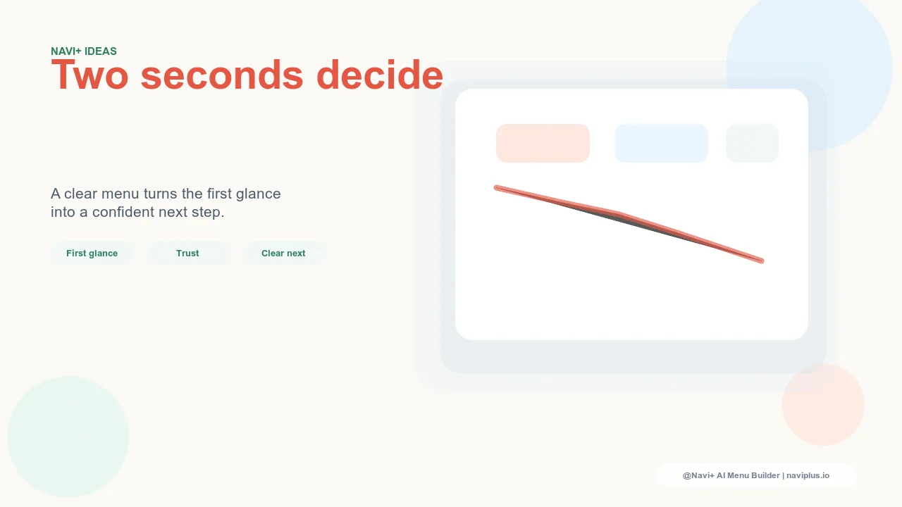
Research from Google's UX team and multiple independent conversion studies confirms what most shop owners sense but can't pin down: visitors form a lasting first impression of a website within 50 milliseconds of landing. Within two seconds, they've made a subconscious decision about whether this store is worth their time. The single biggest visual signal driving that decision isn't your hero banner, your headline, or your brand color palette. It's whether the navigation makes the store's structure immediately legible.
Can a new visitor tell, in two seconds, what kind of store this is and where to start? If the answer is no — if the navigation is a hamburger icon waiting to be tapped, or a flat row of eight category names that all look the same — most visitors default to the one action that requires no decision at all: they leave.
"I spent weeks redesigning my homepage banners thinking that was why people weren't converting. Then I replaced the default hamburger menu with a Tab Bar and Mega Menu through Navi+ — and session duration went up almost immediately. People were actually browsing categories they couldn't see before."
— A Navi+ customer, apparel store
Why two seconds is everything in ecommerce
The two-second window isn't arbitrary. It's the result of how humans process visual information. When someone opens a new page, the brain processes the overall visual layout before any text is read. This pre-attentive processing takes about 200–500ms. What it's looking for: structure, hierarchy, and affordances — visual cues that signal "I know how to use this."
For ecommerce, the affordances that matter most are navigation cues: visible categories, recognizable menu patterns, clear pathways from landing to browsing to buying. When those cues are absent or buried, the brain doesn't conclude "I should explore more." It concludes "this will take effort." And in a world where the back button is one tap away and competitors are one Google search away, effort kills intent.
The default navigation patterns that most Shopify themes and WordPress templates ship with were designed to meet minimum standards — not to win that two-second test. A single-level dropdown, a hamburger icon, a flat list of links: these patterns are technically functional, but they don't communicate hierarchy, brand personality, or "start here." They put all the cognitive work on the visitor.
Here's what that costs in practical terms:
- Higher bounce rates — Visitors who can't immediately see a path forward leave before engaging with any content. Industry benchmarks suggest optimized navigation alone can reduce bounce rates by 15–30% for ecommerce stores.
- Lower average order values — Stores where visitors can easily discover categories sell more items per session. When categories are hidden, visitors see only what they already knew to look for, missing adjacent products that could have completed a purchase.
- Wasted paid traffic — Every ad click that lands on a store with confusing navigation is a partial waste. The targeting can be perfect; if the navigation doesn't immediately make sense, the visit ends before conversion.
- Weaker brand recall — A navigation that communicates nothing about your store's identity is a missed opportunity. The first impression a visitor forms is the impression that sticks. A blank hamburger icon leaves nothing to remember.
How Navi+ turns first impressions into first steps
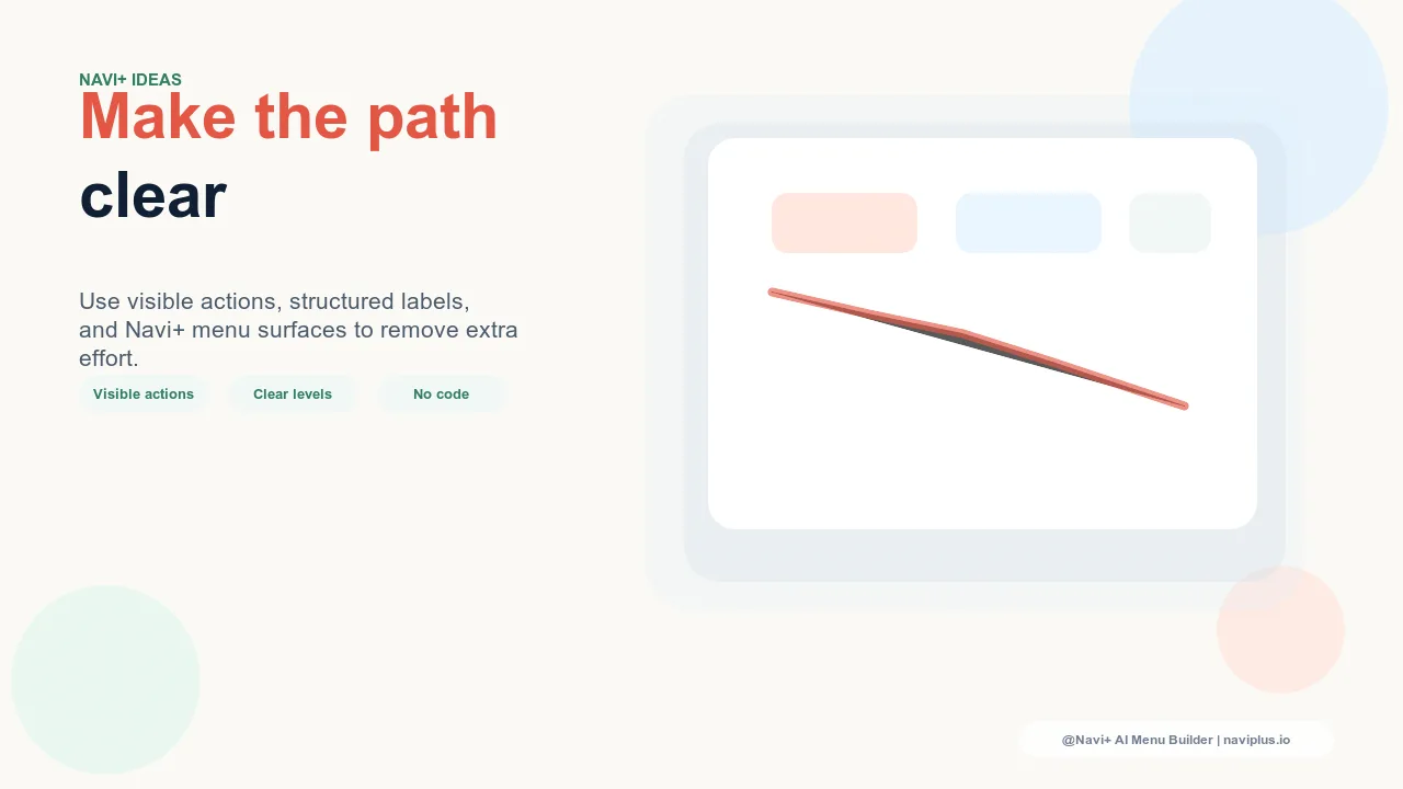
Navi+ AI Menu Builder gives you the tools to pass the two-second test — across device types, catalog sizes, and business models. Instead of a static, structure-less menu, you get a navigation system that communicates store structure at a glance.
On desktop, the Mega Menu opens a full-width panel organized into columns that visitors can read like a map of your store. Your top-level categories become headers. Sub-categories group under them. Product images or banners can appear alongside text. A visitor landing on your homepage for the first time sees, without clicking anything, what your store sells and how it's organized. That information is the answer to the two-second question: "Is this store worth my time?"
On mobile, the Tab Bar replaces the hidden hamburger with a persistent row of icons and labels pinned to the bottom of the screen. The visitor lands and immediately sees: Home, Shop, Sale, Search, Cart. Those five labels tell them the store is organized, familiar, and navigable. The decision to stay or leave shifts — staying now has an obvious first action attached to it.
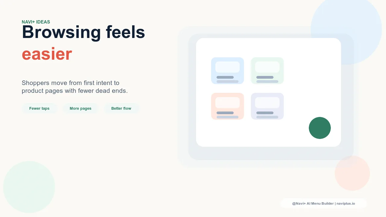
For stores with deep catalogs or complex product hierarchies, the Grid Menu presents categories as a visual grid with thumbnail images — essentially a visual sitemap for your store that loads instantly and requires no prior knowledge of your product organization to use. It's particularly effective for fashion, home goods, and multi-category general retailers.
| Navigation signal | Default menu | Navi+ AI Menu Builder |
|---|---|---|
| Store structure visible on landing | ✗ Hidden behind a tap | ✓ Visible immediately — no interaction required |
| Category hierarchy legible at a glance | ✗ All items at same visual weight | ✓ Multi-level columns, grouped logically |
| Visual cues (images, icons, badges) | ✗ Text only | ✓ Product thumbnails, icons, color highlights |
| Persistent navigation on mobile | ✗ Scrolls away, tap to open | ✓ Tab Bar pinned to bottom of screen |
| Communicates brand at first glance | ✗ Generic template default | ✓ Custom colors, fonts, layout |
| Setup without developer or code | ✗ Theme editing required | ✓ Visual drag & drop dashboard |
What to do with the two seconds you now have
Passing the two-second test doesn't just reduce bounce rates. It changes what visitors do next. When navigation is legible, visitors take the next step — they click a category, scroll a collection, tap a tab. Each of those actions generates behavioral data and builds session momentum. Stores with clear navigation tend to see not just lower bounce rates, but longer sessions, more pages viewed, and higher conversion rates across the board.
A practical starting point: open your store on a phone you haven't used before, set a two-second timer, and look at the landing page. What do you know about the store's structure when the timer runs out? What would a new visitor's answer be? If the answer is "not much," you've found your most impactful conversion problem — and it has nothing to do with your products.
Navi+ lets you fix this yourself, in an afternoon, without a developer, on any platform. Install the app or plugin, configure your menu types for mobile and desktop separately, and publish. The next visitor who lands on your store will have an answer to the two-second question before they've even finished reading the headline.
Try it free — no code, no developer needed
Install in minutes on Shopify, WordPress, or any website.