

The Over-Built Navigation Problem
When store owners build navigation, the instinct is comprehensiveness. Every product category deserves representation. Every subcategory should be one click away. The navigation should, in theory, be a complete map of the store — accessible to every possible visitor intent from a single menu interaction. The result is frequently a navigation that is technically complete and practically unusable: too many options, too much visual noise, too many decisions for a visitor who arrived with a specific purpose and just wants to find it fast.
Decision fatigue is a well-documented phenomenon in consumer behavior research. When people are presented with too many options, their ability to choose decreases rather than increases. The same principle applies to navigation: a menu with 12 top-level categories forces the visitor to read and evaluate each label before identifying the relevant one. A menu with 5 top-level categories, each clearly named for a distinct customer intent, is scanned and acted on significantly faster.
The stores that convert the highest on minimal navigation are not the stores with the smallest catalogs. They're the stores whose teams made the deliberate editorial decision to surface fewer, better destinations rather than every possible destination. Minimalist navigation is a product decision, not a constraint.
"We went from 11 top-level navigation items to 5. It was uncomfortable — it felt like we were hiding products. But click-through rates on every navigation item went up when we reduced the number of options. Visitors were spending less time deciding where to go and more time actually browsing. Our session depth increased and conversion went up. Fewer choices made for easier choosing."
— A Navi+ customer, artisan goods brand
What Minimalist Navigation Communicates About Brand
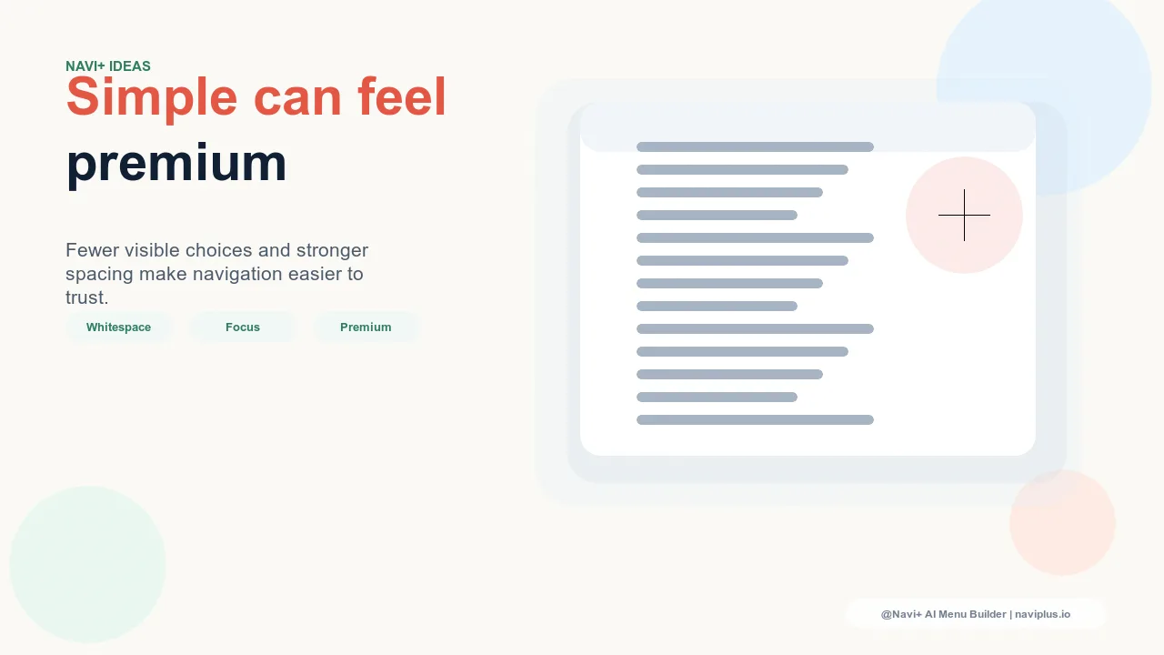
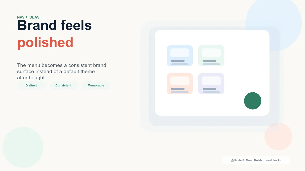
Beyond conversion performance, minimal navigation communicates something important about brand confidence. A brand that presents five focused navigation destinations is implicitly saying: these are the things that matter about us. We've made editorial decisions. We're not trying to show you everything at once. This is a very different message from a brand that lists 15 categories and subcategories in a dense navigation menu — which communicates comprehensiveness but not curation.
Premium, luxury, and editorial brands consistently favor minimal navigation for this reason. The visual whitespace, the confident small number of categories, the absence of clutter — these are aesthetic signals that reinforce premium positioning as powerfully as typography or color palette. A navigation that looks like a product catalog excerpt doesn't communicate the same brand confidence as a navigation that looks like a curated selection.
How to Simplify Without Losing Access
The practical concern with minimal navigation is catalog access: if you only show five top-level categories, where do the other fifteen go? The answer is architecture, not elimination. Minimal primary navigation doesn't mean hiding products — it means structuring access differently:
Merge related categories into a single top-level destination that resolves into more specific sub-navigation on click or hover. "Women's" as a top-level item that expands into Tops, Dresses, Trousers, Knitwear, Outerwear is minimal at the top level and comprehensive at the second level.
Rely on search for long-tail access. A prominent search function handles visitors who have specific product intent that doesn't fit neatly into primary navigation categories. Minimal navigation + excellent search coverage is a better architecture than comprehensive navigation with poor search.
Use the Slide Menu for depth. The Navi+ Slide Menu can contain the full catalog depth — all categories, all subcategories — accessible to visitors who want comprehensive browsing. The primary navigation surfaces the most important 5-6 destinations; the Slide Menu is the full directory for visitors who need it.
| Navigation Approach | Visitor Decision Speed | Brand Signal |
|---|---|---|
| Comprehensive (10+ top-level items) | Slow — must evaluate all options | Complete but uncurated |
| Minimal primary + Slide Menu depth (Navi+) | Fast — few clear choices at top level | Editorial, confident, premium |
Designing the Minimal Navigation System
A minimal navigation system built with Navi+ AI Menu Builder typically uses three layers: a small number of primary navigation items (3–6) that cover the highest-intent destinations, a Slide Menu that provides comprehensive catalog access for visitors who want full browsing, and a mobile Tab Bar that mirrors the primary navigation priorities in thumb-accessible format. This architecture is minimal at the most-seen level and comprehensive at the dig-deeper level — serving both the visitor who needs a quick path and the visitor who wants to explore everything.
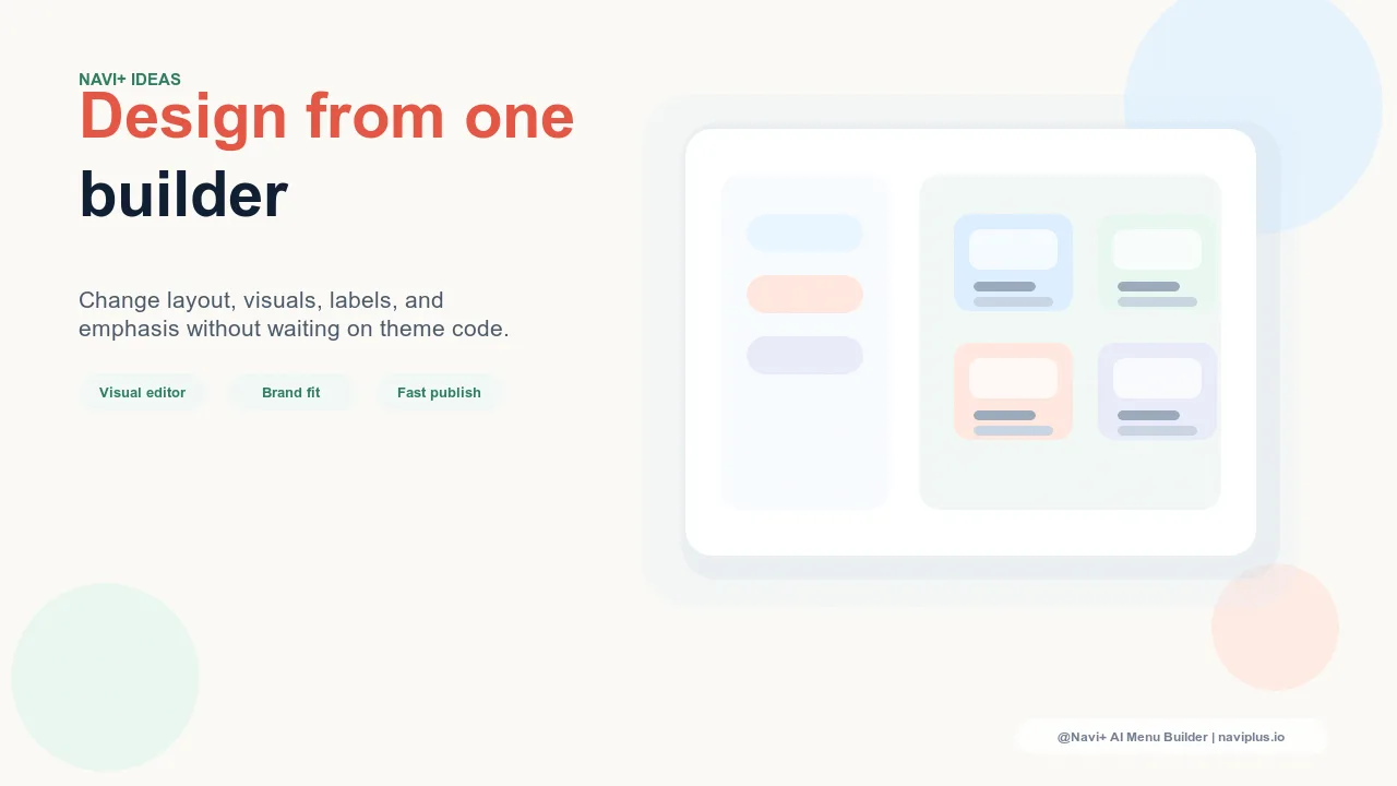
Navi+ gives you full control over which categories appear at each level, with no limits on how minimal or how comprehensive each layer is. The architecture that's right for your brand and your customers is the one you build, not the one your theme defaulted to.
Try it free — no code, no developer needed
Install in minutes on Shopify, WordPress, or any website.