

The Curb Cut Effect in Navigation
The "curb cut effect" — named after the urban planning observation that sidewalk curb cuts installed to help wheelchair users also benefit cyclists, parents with strollers, and delivery workers with carts — has a direct analog in digital navigation design. The design improvements that make navigation accessible for users with visual impairments, motor limitations, or cognitive differences also make navigation better for every other visitor.
This is not a platitude — it's a measurable commercial truth. Large tap targets (a minimum 44×44 points, as recommended by Apple's Human Interface Guidelines) that make navigation accessible for users with motor impairments are also easier to hit for any user navigating with one hand on a moving train. Sufficient color contrast (4.5:1 ratio for normal text, per WCAG 2.1 AA) that makes navigation legible for users with color vision deficiency also makes it legible in bright sunlight — a common context for mobile shoppers. Clear, descriptive navigation labels that provide orientation for users with cognitive disabilities also make navigation quicker to scan for every user who's making rapid category decisions.
The business case for accessible navigation isn't primarily legal risk mitigation — it's conversion optimization that also happens to serve visitors who rely on accessibility features.
"When we audited our navigation for accessibility, every issue we found also turned out to be a general usability issue. Tap targets that were too small for keyboard and switch device users were also frustrating regular users. Low-contrast navigation text that failed WCAG also looked washed out on mobile in any lighting. We fixed everything on the accessibility list and saw an improvement in mobile navigation engagement across all users — not just users with disabilities."
— A Navi+ customer, outdoor gear brand
Navigation Accessibility Principles with Commercial Impact
Several accessibility principles have particularly direct commercial impact when applied to navigation:
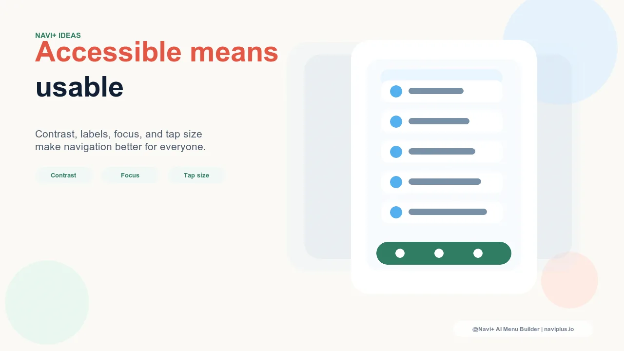
Sufficient tap target size. Navigation items — Tab Bar tabs, menu links, dropdown toggles — should have tap targets of at least 44×44 CSS pixels. Below this threshold, mis-taps increase, particularly on smaller phones and for users navigating one-handed. Mis-taps that open the wrong navigation destination create frustration and back-navigation friction. Right-sized tap targets reduce mis-taps for everyone.
Adequate contrast between navigation text and background. WCAG 2.1 AA requires a 4.5:1 contrast ratio for normal-size text. For navigation, which is often displayed in smaller font sizes than body content, meeting this threshold is both an accessibility requirement and a readability improvement that benefits all users. Navigation labels that strain to read slow category scanning and increase cognitive load.
Logical focus order for keyboard navigation. Users who navigate with keyboards or switch access devices depend on a predictable focus order — the sequence in which interactive elements receive focus when the user presses Tab. Navigation menus with illogical focus order (jumping from the third menu item to the footer before reaching the fourth) are broken for keyboard users and often indicate underlying HTML structure problems that can affect search engine indexing as well.
Visible focus indicators. Many stores suppress the default browser focus indicator (the outline that appears on focused interactive elements) for aesthetic reasons. For keyboard and switch device users, this makes navigation impossible — they can't see which element is currently focused. Visible focus indicators, styled to match the brand aesthetic, are a minimal-effort accessibility requirement that primarily affects a small subset of users but signals overall quality of navigation implementation.
| Accessibility Principle | Primary Beneficiary | Broader Benefit |
|---|---|---|
| 44px minimum tap targets | Motor impairment users | Fewer mis-taps for all mobile users |
| 4.5:1 text contrast ratio | Low vision, color deficiency users | Better readability in all lighting conditions |
| Descriptive navigation labels | Cognitive disability, screen reader users | Faster category scanning for all visitors |
| Logical focus order | Keyboard and switch device users | Indicates clean HTML structure (SEO benefit) |
Accessible Navigation as Brand Positioning
Beyond the conversion benefits, accessible navigation communicates something about the brand. A store whose navigation works for visitors across the full range of abilities — including older shoppers whose vision and motor precision may have declined, visitors shopping in challenging environments, and users with permanent or temporary disabilities — is a store that built its experience for its entire audience rather than a subset of it.
For brands whose audiences include older demographics, parents (who often shop one-handed with a child in the other arm), or communities with above-average rates of specific disabilities, accessible navigation is a retention and loyalty differentiator as much as a conversion optimization. Navi+'s navigation components are built with accessibility as a design principle — tap target sizing, contrast ratios, and semantic markup that supports screen readers and keyboard navigation are baked into the component defaults, not retrofitted as an afterthought.
Try it free — no code, no developer needed
Install in minutes on Shopify, WordPress, or any website.