

The Analytics Gap Most Store Owners Have
Most Shopify store operators have a clear view of their top-level business metrics: sessions, conversion rate, average order value, and overall revenue. Many also track product page performance and checkout funnel drop-off. What almost nobody tracks systematically is how visitors actually behave inside the navigation itself — and that's precisely where the signal that explains those other numbers lives.
Navigation is not a passive infrastructure component. It is the primary decision-making surface on your store. When visitors open your menu, they're actively trying to orient themselves and choose a direction. The data generated by those interactions tells you whether your structure, labels, and hierarchy are working — or quietly turning people away before they reach a product page. If you're optimizing product pages and ad targeting but ignoring navigation analytics, you're tuning the middle and end of the funnel while leaving the entry point unexamined.
The Four Key Navigation Metrics
Navigation analytics can be complex, but four metrics carry the majority of the diagnostic signal. Understanding what each one tells you — and what the combinations mean — is the foundation of data-informed navigation improvement.
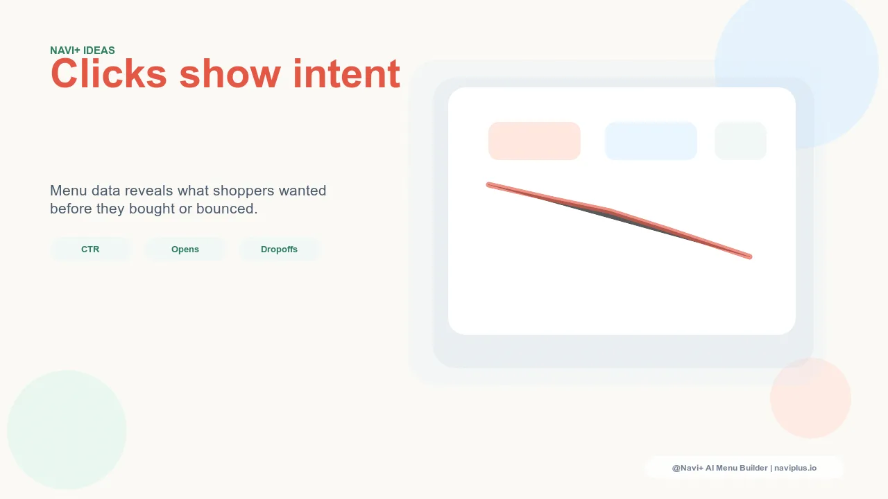
Click-Through Rate by Link
Click-through rate (CTR) by link measures the percentage of visitors who click a specific navigation link out of all visitors who had the opportunity to see it. This is the most granular metric available for navigation, and it reveals the actual demand distribution across your navigation structure. A navigation with ten top-level links will almost never have even click distribution — two or three links will capture the majority of clicks, and several will receive almost nothing.
Per-link CTR exposes which destinations your visitors actually want to reach versus which ones exist because of internal category logic or historical decisions. A link that consistently receives less than 1% of navigation clicks over a 30-day period is either misplaced, mislabeled, or pointing to a destination visitors don't perceive as relevant to them. That's a decision point: improve the label, move the link, or remove it to reduce cognitive load.
Navigation Drop-Off Rate
Drop-off rate measures how often visitors open the menu but don't click any link before closing it or moving elsewhere. A visitor who opens the menu and closes it without clicking has scanned the options and decided none of them matched what they were looking for — or found the structure too confusing to navigate confidently. This is a menu-level failure rather than a link-level failure.
High drop-off rate combined with high menu open rate is the clearest indicator that the navigation is being explored but not converting. Visitors are curious enough to look, but what they find doesn't match their intent. The problem is usually structural (too many options creating decision paralysis), linguistic (labels that don't match how visitors describe the products), or organizational (the expected category isn't where visitors look for it).
Menu Open Rate
Menu open rate measures how often visitors trigger the navigation menu at all — as a percentage of all sessions. Low menu open rate has a different cause than high drop-off rate: it means visitors either don't perceive the navigation as useful, don't notice it's there, or have found another way to orient themselves (usually search or direct URL entry). On mobile especially, where navigation is often tucked behind a hamburger icon, discoverability is a real issue that menu open rate makes visible.
If menu open rate is low across device types, the navigation placement or visual prominence may be the problem. If it's specifically low on mobile, the navigation trigger isn't being noticed or the mobile navigation experience is creating friction that discourages interaction.
Time-to-Navigation
Time-to-navigation measures how long into a session a visitor first interacts with the menu. On a well-structured store, visitors typically engage with navigation early in the session — within the first 15 to 30 seconds — because the navigation is their primary tool for orientation. Long time-to-navigation (visitors spending 60, 90, or 120 seconds before first engaging with the menu) suggests they're trying to orient themselves through other means first: reading homepage copy, scrolling through featured products, or looking for cues elsewhere on the page.
Long time-to-navigation often indicates that the navigation isn't positioned or presented as the primary wayfinding tool. Visitors should be able to look at your navigation immediately after landing and understand where they can go. If they're looking elsewhere first, the navigation isn't communicating its value clearly enough.
"We had assumed our navigation was fine because overall conversion was acceptable. When we actually pulled the per-link CTR data, we discovered that three of our eight top-level nav links were each getting under 0.5% of clicks — combined. We collapsed those three into one section, promoted two buried subcategories that search data showed were popular, and drop-off rate fell by almost a third within two weeks."
— A Navi+ customer, home goods brand
What High Open Rate + Low Click-Through Means
This is the most common navigation problem pattern, and it has a specific cause: the menu is being explored but the options aren't matching visitor intent. Visitors are curious and engaged enough to open the menu — the open rate is healthy — but when they scan the options, nothing clearly corresponds to what they came looking for, so they close the menu without clicking.
The diagnosis almost always points to one of two issues. The first is label language: the navigation uses internal or industry terminology that visitors don't use when they think about the products. A visitor looking for "summer dresses" might scan a navigation that says "Resort Wear," "Seasonal Arrivals," and "Women's Occasion" without recognizing any of those as the destination they want — even though all three might contain exactly what they're looking for. The second issue is structural depth: the category the visitor wants exists, but it's nested two or three levels deep and isn't visible in the top-level navigation scan.
Both problems have the same solution: align the visible navigation options with the destinations visitors most commonly need to reach, described in the language visitors use to describe them. Per-link CTR data and internal search query data together point directly at which destinations should be elevated and what language should be used to label them.
What Low Menu Open Rate Means
Low menu open rate is a discoverability problem. Visitors aren't using the navigation because they aren't finding it useful enough to open, or because they literally aren't noticing it's there. On desktop, this is uncommon with visible horizontal navigation — but if the main navigation is thin, low-contrast, or buried below a large hero image, visitors may scroll past it without registering it as a wayfinding tool.
On mobile, low menu open rate is much more common and more consequential. When navigation is collapsed behind a hamburger icon, visitors who haven't developed the habit of looking for that icon — particularly visitors from paid social who may be new to your store — often don't find the menu at all. They scroll the homepage, don't find what they're looking for, and bounce. Improving mobile navigation open rate sometimes requires making the navigation trigger more visually prominent, but more effectively it requires surfacing navigation options directly on the page — as sticky tab bars, featured category rows, or section headers — so that navigation is accessible without requiring the visitor to know to look for the hamburger icon.
Using Heatmaps for Navigation
Click heatmaps on navigation interfaces reveal something that aggregate CTR data doesn't: the spatial pattern of attention across the menu. In a Mega Menu with multiple columns and dozens of links, heatmaps show which columns receive the most interaction, which links draw eye and cursor movement even without clicks, and which sections are effectively invisible — receiving neither clicks nor apparent hover attention.
Heatmaps are particularly useful for diagnosing column-level and section-level problems within large menus. If one column in a Mega Menu panel is consistently darker (more activity) than others, visitors are finding that column's content more relevant — a signal to consider expanding it or promoting it to a higher position. If a column is consistently cold, the content there either doesn't match what visitors in that panel are looking for, or the column is positioned too far to the right to receive attention before visitors make a click decision.
Tab-level heatmaps in a Tab Bar navigation reveal which tabs are being explored and which are being ignored. A tab with low hover and click activity isn't necessarily less important — it may simply be labeled in a way that makes it seem irrelevant at the scan stage, before visitors have read it carefully.
Exit Rate Analysis by Navigation Entry Point
Exit rate by navigation entry point is one of the most actionable navigation metrics available, and one of the least commonly used. The analysis is straightforward: segment sessions by which navigation link was clicked first, then compare the exit rate and bounce rate for each segment. If visitors who click a specific category link exit the site at a substantially higher rate than visitors who click other category links, the problem is either the label (it's promising something the destination doesn't deliver) or the destination itself (the category page is thin, poorly designed, or mismatched with visitor expectations).
A navigation link that consistently generates high downstream exit rates is misleading visitors. They click it with a specific expectation, land on a page that doesn't meet that expectation, and leave. This is more damaging than a navigation link that simply gets low clicks — low CTR means the link isn't attracting visitors, but high post-click exit rate means it's attracting visitors and then disappointing them, which has a stronger negative effect on session quality and conversion rate.
Fixing this requires determining whether the label or the destination is the mismatch source. If the destination page is well-stocked with relevant products, the label is the problem. If the destination page is thin or generic, the destination needs improvement. Both are identifiable through exit rate analysis segmented by navigation entry point.
Prioritizing Navigation Improvements with Data
Once per-link CTR data is available, prioritization becomes systematic rather than intuitive. The process:
Step 1: Rank all navigation links by click share. Total the clicks across all navigation links for a 30-day period and calculate each link's percentage of total navigation clicks. This produces a ranked list from highest to lowest demand.
Step 2: Identify the bottom 20%. In most navigation structures, the bottom 20% of links by click share receive a disproportionately small fraction of total clicks — often under 2% combined. These links are creating visual clutter and cognitive load without delivering meaningful navigation value.
Step 3: Audit each low-performer. For each link in the bottom 20%, evaluate whether it should be removed entirely (the destination has low demand and the link adds noise), relabeled (the destination has potential demand but the current label doesn't communicate it), or repositioned (the destination is relevant but the link placement isn't visible enough).
Step 4: Elevate high-demand destinations buried in hierarchy. Cross-reference per-link CTR with internal search data. If a subcategory receives significant search volume but low navigation CTR, it's a candidate for promotion to the top navigation level — either as a Tab Bar slot or as a featured first-column item in the relevant Mega Menu panel.
This process converts navigation improvement from a design exercise into an inventory management exercise: keep what's working, remove or fix what isn't, and ensure that the highest-demand destinations are the most accessible.
Navi+'s Dashboard Analytics
Navi+ provides built-in click performance analytics for both the Tab Bar and Mega Menu components. The dashboard shows per-tab and per-link click data across sessions, making it possible to identify underperforming links without requiring custom event tracking setup in Google Analytics or a third-party heatmap tool. Click distribution data updates in real time, so the impact of navigation changes — a relabeled tab, a promoted subcategory, a reorganized Mega Menu column — is visible in the analytics within days rather than waiting for a monthly reporting cycle.
For stores that want deeper behavioral data, Navi+'s components are compatible with standard GA4 event tracking and tools like Hotjar, allowing heatmap overlays and session recordings to be layered on top of the click aggregates the Navi+ dashboard provides. The combination of built-in click analytics and external behavioral tools gives store operators a complete picture of navigation performance from the same interface they use to manage navigation structure and content.
| Dimension | Data-Informed Optimization | Intuition-Based Optimization |
|---|---|---|
| Change Confidence | High — changes are grounded in observed behavior | Low — changes reflect internal assumptions |
| Iteration Speed | Fast — metrics immediately show impact of changes | Slow — unclear which changes made a difference |
| ROI Predictability | Predictable — high-signal changes prioritized first | Unpredictable — effort may land on low-impact changes |
| Label Quality | Aligned with visitor language from search and click data | Aligned with internal category naming conventions |
| Hierarchy Decisions | Based on actual demand distribution across links | Based on perceived importance or catalog structure |
| Dead Link Detection | Identified quickly through CTR and heatmap data | Often missed until a major audit is conducted |
Try it free — no code, no developer needed
Install in minutes on Shopify, WordPress, or any website.