

The Opportunity Most Stores Miss
First-time visitors to an e-commerce store are explorers. They don't know your brand, your catalog, or your pricing. They need to orient themselves, build trust, and understand what you offer before any purchase makes sense. Conversion rates for first-time visitors reflect this: they're low, and rightfully so.
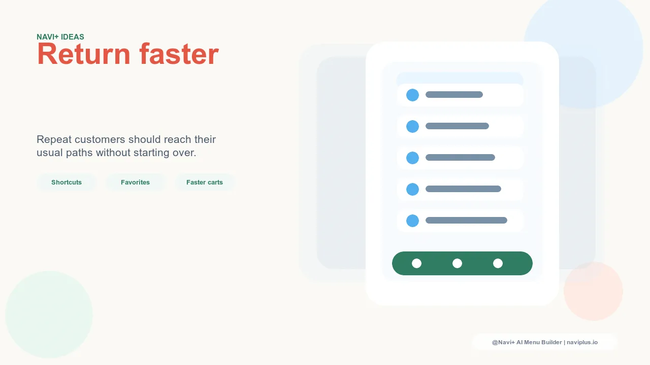
Repeat visitors are a fundamentally different audience. They already know you. They came back because something in their first visit stayed with them — a product they bookmarked mentally, a price point they need to revisit, a sale they want to check on. They arrive with a specific objective. The friction that costs you a first-time visitor is multiplied when it costs you a repeat visitor, because repeat visitors were already on the path to buying.
Yet most Shopify stores treat these two audiences identically. The navigation shown to a first-time visitor in London who has never heard of your brand is the same navigation shown to a customer in Singapore who has visited four times and added to cart twice. The store makes the repeat visitor start from scratch every single time.
"Our data showed that visitors who returned a second time converted at nearly three times the rate of first-time visitors — but their average session length was the same. They weren't spending more time because they needed to explore more. They were spending the same time because they had to navigate the same way. Navi+'s Tab Bar let us surface our top categories immediately on every return visit. Session time dropped; conversion went up."
— A Navi+ customer, apparel store
What Repeat Visitors Are Actually Doing
Understanding repeat visitor behavior requires looking at the specific paths that bring people back. These aren't random — they cluster into identifiable patterns that each have distinct navigation needs.
The price checker saw a product on their first visit, wasn't ready to commit at that price, and has come back because time has passed or they think there might be a sale. This visitor wants to land near the product they remember with minimal navigation steps. The longer the path from homepage to that product, the more likely they are to lose interest again.
The category browser found a product category they liked but didn't have time to explore fully. They're coming back to continue browsing, not to buy the same product they saw before. This visitor needs immediate access to category navigation — not a homepage that leads them back through the full discovery funnel.
The comparison shopper is evaluating your store against others. They may have visited multiple stores and come back to compare details. This visitor needs fast, frictionless access to specifications, shipping terms, and return policies — often things that are buried in secondary navigation in default Shopify themes.
The loyal customer has bought from you before and is checking for new arrivals. This is the most valuable repeat visitor, and also the one most likely to leave if the new-arrivals section requires more than two taps to reach on mobile.
How Navigation Design Serves Repeat Visitors
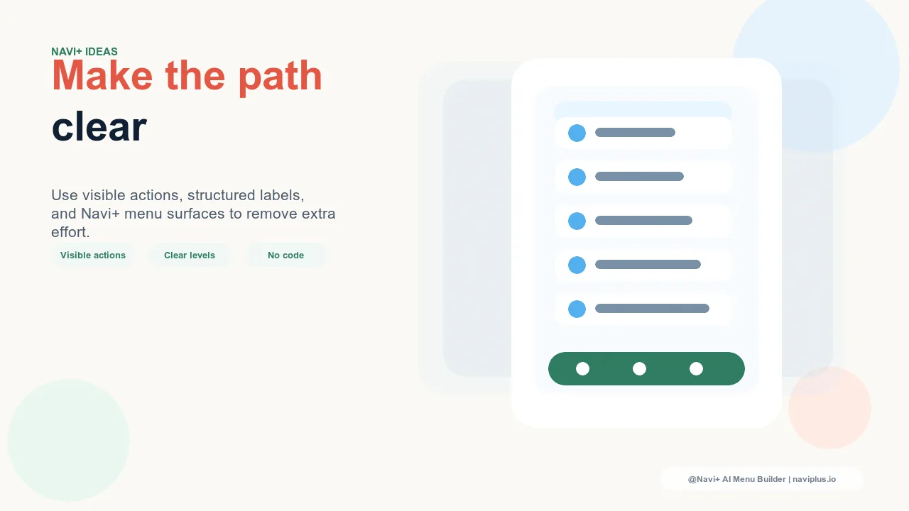
The most effective navigation for repeat visitors is navigation that's both instantly accessible and structurally organized around the high-value paths they actually use — not navigation that optimizes for first-time discovery at the expense of repeat-visit efficiency.
Navi+ AI Menu Builder addresses this through several complementary mechanisms. The Tab Bar on mobile can be configured with your highest-traffic categories as persistent, one-tap destinations. A visitor returning to browse women's accessories doesn't need to open a drawer menu and navigate through a hierarchy — the category is available with a single thumb tap, from any page, at any scroll depth.
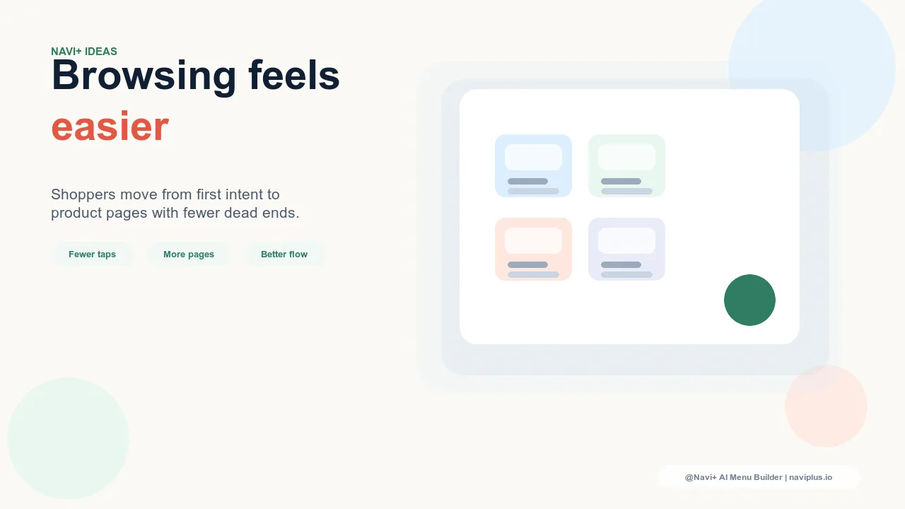
The Mega Menu on desktop provides the visual overview that repeat visitors use as a quick-reference map. When a returning visitor opens the menu, they should be able to spot their target category immediately without scanning through undifferentiated links. Mega Menu's grid layout, category images, and visual hierarchy make this possible — a returning visitor can identify their destination in under two seconds rather than reading through a long dropdown list.
For stores with distinct product lines, the Grid Menu creates a visual catalog overview that repeat visitors can scan rapidly. Instead of navigating through text-based category hierarchies, a returning customer sees a structured grid of their category options — faster to parse, easier to recognize on repeat visits.
The FAB (Floating Action Button) is particularly effective for repeat visitor engagement. A well-configured FAB can surface a time-sensitive promotion, a "New Arrivals" shortcut, or a loyalty rewards link — the kind of destination a repeat visitor wants to check quickly but that would otherwise require hunting through secondary navigation.
| Repeat Visitor Type | Default Navigation Problem | Navi+ Solution |
|---|---|---|
| Price checker returning for a specific product | Must navigate full hierarchy from homepage | Tab Bar puts category one tap away from any page |
| Category browser continuing previous session | Homepage optimized for first-time discovery | Mega Menu gives instant visual access to all categories |
| Loyal customer checking new arrivals | New arrivals buried 2–3 levels deep | FAB or Tab Bar shortcut directly to new arrivals |
| Mobile visitor on second or third visit | Same hamburger menu flow as first visit | Tab Bar provides instant persistent access, no menu needed |
The Compounding Effect of Repeat Visit Optimization
Optimizing navigation for repeat visitors isn't just about improving the experience for a subset of your traffic. It's about improving the efficiency of your entire retention funnel. Repeat visitors, by definition, are already engaged. Every friction point in their navigation is a leak in a funnel where you've already done the hardest part — getting them back.
Reducing the number of taps it takes a returning mobile visitor to reach their target category from five to one isn't a marginal improvement. It's the difference between a session that builds momentum toward purchase and a session that stalls at the navigation step and ends before reaching the product page.
Navi+ installs in minutes. The Tab Bar, Mega Menu, and FAB are configurable to match the specific categories and destinations your analytics show drive repeat purchase behavior. Once live, every return visit your store receives becomes meaningfully more likely to result in the outcome the visitor came back intending — a purchase.
Try it free — no code, no developer needed
Install in minutes on Shopify, WordPress, or any website.