Shopify Bottom Navigation & Tab Bar App
built for the
thumb zone.
Over 75% of ecommerce traffic happens on mobile, yet traditional navigation hides behind hard-to-reach hamburger menus. Navi+ Tab Bar adds a persistent, thumb-friendly bottom bar that keeps your top collections, cart, and search one tap away.

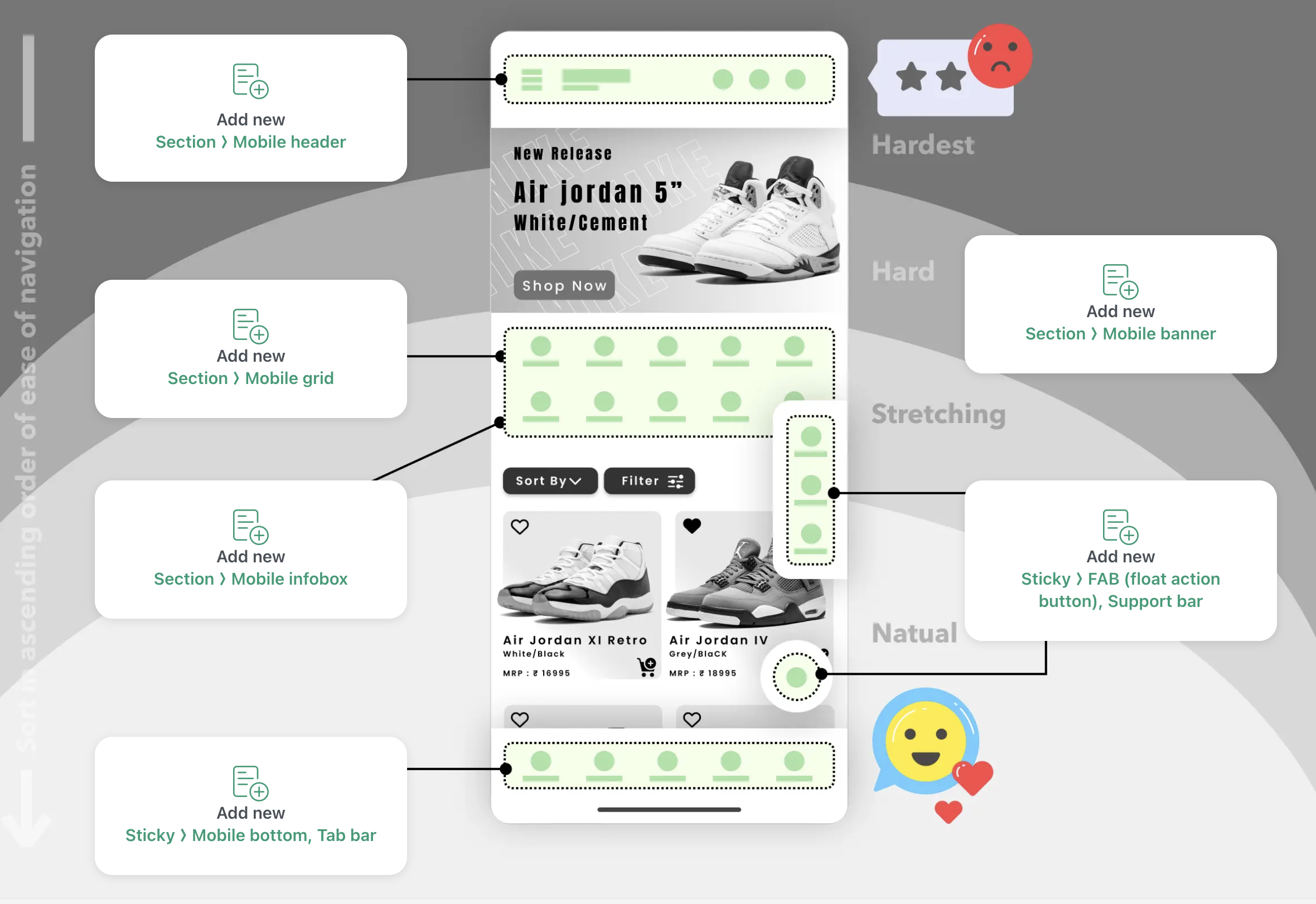
The hamburger icon is easy to miss
The ☰ icon at the top corner isn't where mobile users instinctively reach. Many visitors scroll past it without tapping — not because they don't want to explore, just because it's out of the natural thumb zone.
Categories are a few taps away
When collections are nested inside a collapsed menu, visitors sometimes don't find them. The fewer taps between a customer and your products, the better.
Apps have set an expectation
Your customers use Instagram, TikTok, and Amazon every day — all with bottom tab bars. Matching that pattern makes your store feel familiar and easy to navigate.
Tab Bar adds a fixed navigation bar to the bottom of the screen — always visible as customers scroll, no hunting required.
Placed in the thumb zone
The bottom of a phone screen is where thumbs naturally rest. Tab Bar puts your navigation there — reachable without stretching, always in view.
Show your categories, not just Home and Cart
Pin the pages that matter most to your business — collections, sale, new arrivals. Put them where customers are already looking.
Stays visible as they scroll
The bar remains fixed while customers browse. They can read a product page, scroll through images, and switch to another category without going back to the top.
Feels familiar, like a native app
Bottom tab navigation is a pattern customers already know from the apps they use daily. It makes your store easy to pick up and move around in.
Works on any website
Shopify, WooCommerce, WordPress, Wix, or plain HTML. One embed, live in minutes, no developer needed.
Exploring Shopify Canvas? Why Mobile Navigation Still Needs Navi+
Shopify Canvas introduces spatial design for desktop pages, but over 75% of sales happen on mobile. Read our technical breakdown on why AI-generated layouts need a persistent thumb-zone navigation engine.
Install Navi+
Add from the Shopify App Store in one click. No theme code, no developer needed. The app embeds itself automatically.
Configure your Tab Bar
Choose your icons from Remix Icons, set the destination links, and pick your colors to match your brand. Takes under 3 minutes.
Publish & watch engagement rise
Hit publish. Your Tab Bar goes live instantly via global CDN. Mobile visitors now have a clear, thumb-friendly way to navigate your store.
20+ pre-built templates
Start from a professionally designed template and customize to match your brand.
Live cart badge
Cart item count updates in real-time on the Cart tab icon — no custom code needed.
Multi-language support
Tab Bar adapts automatically to your store's active language. Works with Shopify Markets.
Lightning fast via CDN
Served from edge servers across 6 continents. Average load time <25KB. No slowdown.
AI-assisted design
Let AI suggest the best Tab Bar layout for your store type, products, and audience.
Zero conflicts
Built with pure lightweight HTML5/CSS3. Works with every Shopify theme, guaranteed.
Most mobile stores focus on a single path: product → cart → checkout. But shoppers also browse and compare. When your categories are always a tap away at the bottom of the screen, more of that browsing happens — which usually means more products seen and more reasons to buy.
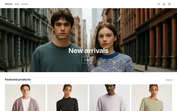
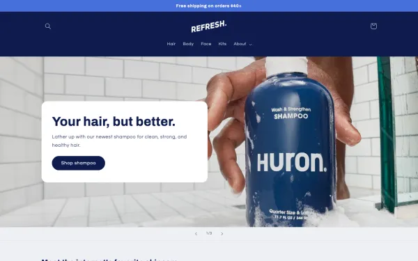
Native App Embed integration with Shopify's latest Horizon, Dawn, and popular mobile-first themes. Zero theme code changes required.


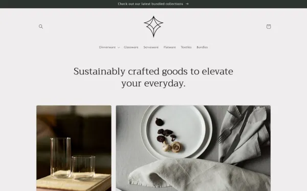
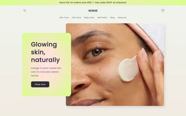
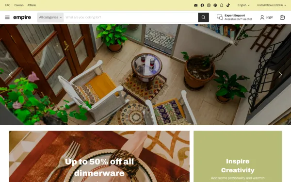
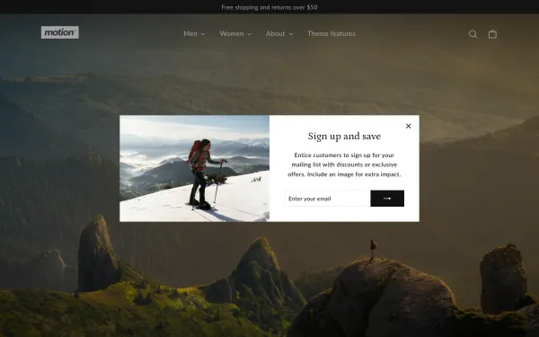
Mega Menu
Build a Shopify mega menu with columns, category images, and promo banners. 100% no-code, zero theme edits....
Mobile Menu
Replace your basic theme drawer with a multi-level Shopify mobile menu. Nested sub-categories, instant sear...
Floating Button
Add a sticky floating action button (FAB) for WhatsApp, phone, live chat and support. Smart page-targeting ...
Explore mobile navigation patterns, thumb zone ergonomics, and conversion benchmarks.
How to Add Bottom Navigation to Shopify Without Theme Code
Complete implementation guide for mobile tab bars, tap target sizes, and notched iPhone safe areas.
Read full guide → Mobile UXMobile Navigation Beyond the Hamburger: Why Bottom Navigation Converts
Why hiding key links in the top-left corner hurts conversions and how sticky tab bars solve it.
Read full guide → Checkout FlowMobile Checkout Flow: Why Navigation Matters More on Small Screens
Streamlining cart recovery, checkout access, and thumb zone interactions on smartphones.
Read full guide →Answers to common questions about setting up, compatibility, and performance.
No. Navi+ includes automatic smart padding that dynamically adjusts page footer spacing, preventing the sticky bar from obstructing sticky add-to-cart buttons, chat widgets, or cookie banners.
Yes. The cart icon automatically listens to Shopify's AJAX cart events and updates the badge counter in real-time whenever a customer adds or removes an item.
Yes. Navi+ uses native Shopify App Embeds and works out of the box with Horizon, Dawn, Prestige, and over 331 themes without modifying your theme files.
Yes. You can configure page-specific display rules to show, hide, or highlight specific tab destinations depending on whether the visitor is on the homepage, a collection, or a product page.
No. Navi+ is served from a global edge CDN with a lightweight runtime (<25KB) that loads asynchronously, ensuring 100% compliance with Google's Core Web Vitals.
Free to install. Live in under 5 minutes. No theme edits required.