

The Most-Read Copy on Your Site
Navigation labels are read more often than any other copy in the store. Every visitor reads them on every page — during initial orientation, during category browsing, during product discovery, and when navigating back. A visitor who spends ten minutes on a store will read the navigation labels dozens of times. Yet most stores treat navigation labels as purely utilitarian decisions: whatever word identifies the destination clearly enough is fine.
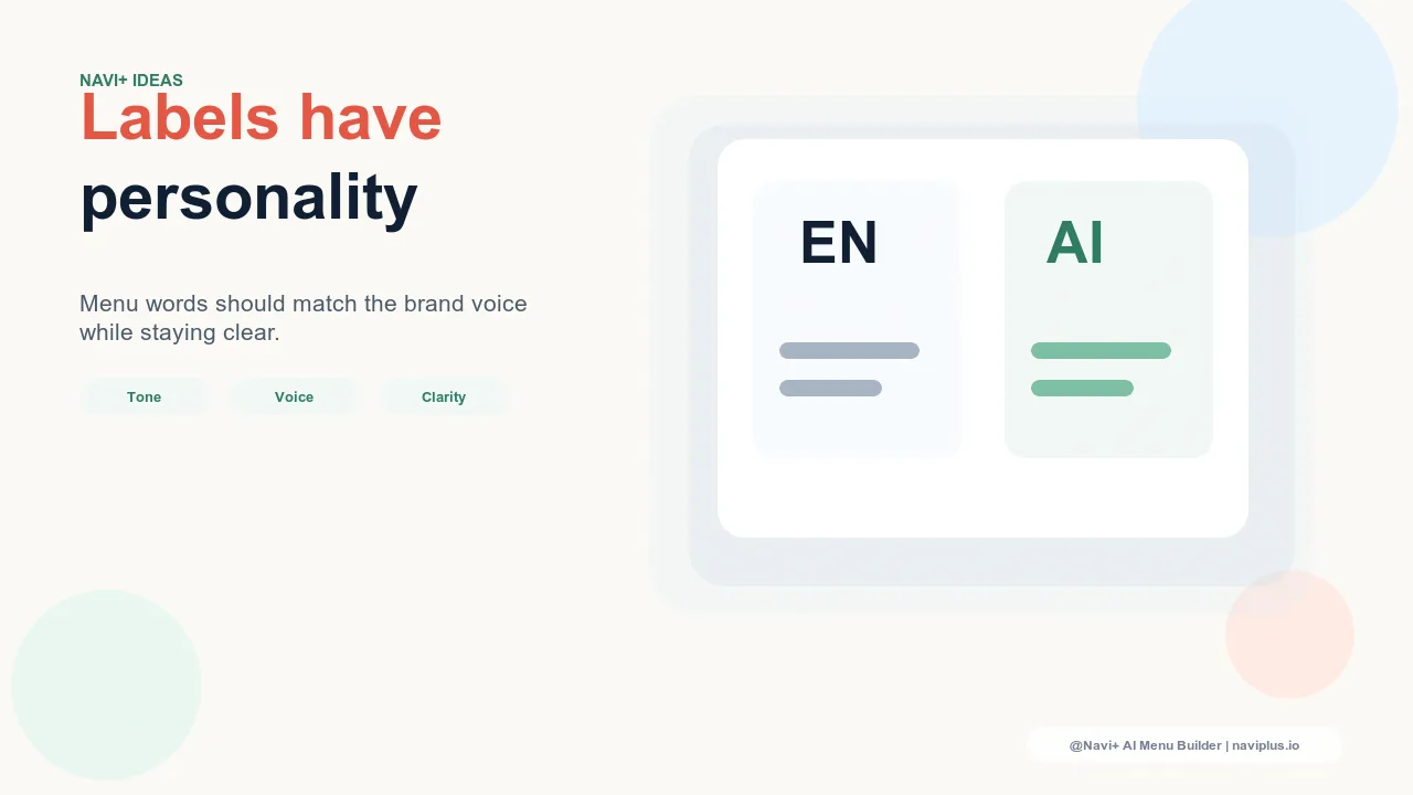
The problem with this approach is that brand voice does not pause at the navigation bar. A store that invests in warm, personal product descriptions and editorial storytelling in its hero banners immediately undercuts that voice with clinical navigation labels like "Products", "Information", and "Cart". The navigation label is not neutral — it carries tone. "Cart" and "My Bag" both navigate to the same page. They communicate very different things about the brand's relationship with the visitor.
Navigation labels are small decisions with outsized reach. A single label change appears across every page of the store, every session, for every visitor. This makes label tone one of the highest-leverage, lowest-cost brand voice improvements available to a store.
"We spent months on our brand story and product copy. We had a whole tone-of-voice guide. Then we noticed the navigation still said 'Products' and 'Account' — default Shopify labels that sounded nothing like us. We updated six labels in an afternoon. The navigation finally felt like it belonged to the same brand as the rest of the site."
— A Navi+ customer, lifestyle apparel brand
The Brand Voice Spectrum in Navigation
Navigation label tone exists on a spectrum from clinical to conversational. Understanding where your current labels sit — and where they should sit relative to your brand — is the starting point for any label rewrite.
Clinical labels are the default state of most e-commerce stores: Home, Products, About, Contact, Cart, Account. They describe destinations accurately and efficiently. They carry no warmth, no personality, and no brand signal. For brands where the relationship with the visitor is primarily transactional — price-competitive, commodity-focused — clinical labels are a defensible choice. For most brands, they are a missed opportunity.
Commercial labels shift the register slightly toward the sales floor: Shop All, New Arrivals, Best Sellers, Sale, Gift Ideas. These labels are familiar from physical retail and communicate a shopping-forward orientation without requiring distinctive brand voice. They are the right tone for most conversion-focused commercial stores.
Editorial labels position the brand as a curator or taste authority: The Edit, Discover, Our World, Stories, The Collection. These labels signal that the brand has a perspective, not just inventory. They work well for lifestyle, fashion, and beauty brands where the brand's editorial point of view is a primary purchase driver.
Conversational labels treat the visitor as a participant in a dialogue: What's New?, Find Your Fit, Gift Ideas, About Us, My Bag. These labels reduce the psychological distance between brand and visitor, signaling community and warmth. They are appropriate for brands with an inclusive, accessible, or community-oriented persona.
How Label Tone Signals the Brand Relationship
Navigation labels do not merely identify destinations — they communicate the brand's assumed relationship with the visitor. Clinical labels like "Products" or "Information" position the visitor as a database query: the navigation is a filing system, not a conversation. The implied relationship is transactional and arm's-length.
Conversational labels like "Find Your Fit" or "Our Story" position the visitor as a person the brand is speaking to. The implied relationship is warm and personal. For brands in categories where trust and affinity are significant purchase drivers — wellness, baby products, independent fashion, artisan goods — this warmth is commercially meaningful, not cosmetic.
Editorial labels like "The Edit" or "Discover" position the brand as an authority whose taste and curation the visitor has come to access. The implied relationship is that of a trusted guide. This works particularly well for brands with strong founder identity, distinctive aesthetic, or editorial content strategy — the navigation labels reinforce the brand's role as a curator rather than a vendor.
The label tone should match the relationship the brand actually wants to have with its visitors. A brand whose entire identity is built around being a trusted community — whose product descriptions use "you", whose social media is conversational, whose email is personal — undermines that identity the moment a visitor opens the navigation and reads clinical defaults.
The Consistency Test
Brand voice inconsistency is felt before it is understood. A visitor who reads warm, personal product descriptions and then encounters a navigation full of clinical labels registers something wrong — the store doesn't feel cohesive — without being able to identify the source of that impression. The navigation has contradicted the brand story that the product copy was building.
A simple consistency test: read three product descriptions on your store and note the tone — the words used, the warmth, the assumed relationship with the reader. Then read your navigation labels in the same session. If the register shifts significantly between the two — if the product descriptions feel like a friend talking and the navigation feels like a government form — that inconsistency is costing you brand equity on every page load.
The fix is not to make navigation labels as elaborate as product descriptions. Navigation labels should be concise — one to three words is ideal. The fix is to ensure the register is consistent: if your product copy is warm and personal, your navigation labels should be warm and personal. The words change, not the length.
Concrete Rewrites
Most clinical navigation labels have direct brand-voice equivalents that are equally scannable but carry more personality. Each of the following rewrites changes the brand register without changing the visitor's ability to navigate the store:
Products → Shop All. "Products" is a database term. "Shop All" is a retail invitation. The destination is identical; the tone shift moves from clinical to commercial.
Information → Why Us. "Information" is maximally generic. "Why Us" is a direct address that invites the visitor into a conversation about the brand's value. For brands where differentiation is important, this label change signals confidence.
Blog → Stories. "Blog" is a content format from 2004. "Stories" communicates that the brand creates narrative content rather than SEO articles. Editorial brands consistently prefer this rewrite.
Cart → My Bag. "Cart" is grocery store language. "My Bag" is fashion retail language. For brands in apparel, accessories, or lifestyle, this rewrite aligns the navigation with the shopping experience the brand is trying to create.
Account → My Account. The possessive "My" humanizes what is otherwise a functional menu label. Small shift, consistent warmth signal.
Sale → Last Chance. "Sale" is expected and generic — every store has a sale. "Last Chance" introduces scarcity and urgency without changing the destination. It also differentiates from the standard sale navigation label.
What Not to Do
The risk of distinctive navigation labels is that distinctiveness overrides function. Navigation has one primary job: help visitors find things quickly. When a label is so creative that the visitor cannot immediately infer the destination, the label has failed regardless of how on-brand it is.
The classic failure mode: replacing "About Us" with "The Universe" or "Our DNA" or "The Story of Everything". These labels may feel aligned with a brand that wants to project scale and ambition, but they create a moment of friction — the visitor hesitates, unsure what they will find. Navigation friction of even one second is costly. Labels should be distinctive within the range of clearly interpretable — not distinctive beyond it.
A useful test: if a first-time visitor could not correctly guess where a label leads within one second, the label is too clever. Brand voice in navigation is a calibration, not a competition. "The Edit" is distinctive and immediately interpretable as a curated collection. "The Universe" is distinctive and ambiguous. The former works; the latter works against the visitor.
Testing Label Tone
Navigation label rewrites are among the lowest-risk A/B tests available to a store. The navigation structure stays identical — the same links, the same hierarchy, the same destinations. Only the label language changes. This means the test isolates label tone as the variable, and the stakes are low: a label rewrite that performs worse can be reverted in minutes.
Useful metrics for navigation label tests include click-through rate on the tested label, bounce rate for visitors who enter via that label, and conversion rate segmented by entry point. Because navigation labels are read on every page, even small percentage improvements compound across the full visitor base.
Starting points for testing: the highest-traffic navigation labels (typically the top-level category labels), any label where the current language is a known default rather than a deliberate brand choice, and labels where the brand voice in adjacent copy is clearly warmer or more distinctive than the navigation equivalent.
The Internationalization Constraint
Playful, idiomatic, or culturally specific navigation labels often don't translate well. A label like "Last Chance" is immediately understood in English and carries urgency. In direct translation to several other languages, the same phrase may sound odd, lose the urgency, or have unintended connotations.
Stores serving multilingual audiences should evaluate label distinctiveness at each language level separately. The English navigation can carry brand-voice labels that are specific to English idiom; the localized navigation may need labels that are more literal in that language, with equivalent brand-voice distinctiveness found through that language's own idiomatic options rather than direct translation.
This is not an argument against distinctive labels — it is an argument for doing the label work in each language, not just translating the English originals.
Clinical vs. Brand-Voice Labels
| Label Approach | Brand Differentiation | Visitor Warmth Signal | Translation Complexity |
|---|---|---|---|
| Clinical (Home, Products, About, Cart) | None — identical to every default store | Low — transactional register | Low — universal vocabulary |
| Commercial (Shop All, New Arrivals, Best Sellers) | Moderate — familiar retail language | Moderate — shopping-forward, neutral warmth | Low — widely understood retail terms |
| Editorial (The Edit, Discover, Our World) | High — signals brand as taste authority | High — brand has a perspective, not just inventory | High — editorial idiom is culture-specific |
| Conversational (Find Your Fit, My Bag, Last Chance) | High — immediately signals brand personality | High — visitor feels addressed as a person | High — idiomatic phrases resist direct translation |
The right position on this spectrum is not the same for every brand. A brand competing on price in a commodity category may be well-served by clinical or commercial labels — distinctiveness is not a priority and translation simplicity is a real operational benefit. A brand competing on identity, aesthetic, or community — where visitors choose based on affinity as much as product — should be using every available tool to reinforce that identity, and navigation labels are a free one.
Try it free — no code, no developer needed
Install in minutes on Shopify, WordPress, or any website.