

What Visitors See Before They Scroll
The "above the fold" concept — borrowed from newspaper layout, where the most important content appeared on the upper half of the folded front page — remains one of the most reliable principles in web design. Users act on what they see immediately. Content that requires scrolling or interaction to reveal receives dramatically less attention and engagement than content visible on arrival.
Applied to navigation, this means: the navigation elements visible immediately when a visitor arrives on your store — without scrolling, without opening a menu, without any interaction — are the ones that reliably influence every visitor. Navigation elements that require opening a menu, scrolling past a header, or interacting with a dropdown reach only the subset of visitors motivated enough to take those extra steps.
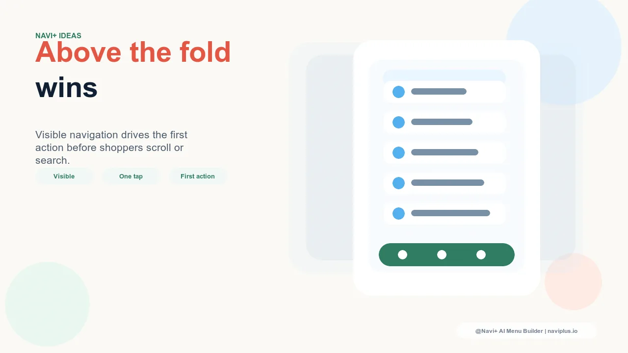
For mobile visitors — who represent the majority of most store's traffic — the above-the-fold navigation surface is even more constrained than on desktop. A standard mobile screen shows a header with a logo and hamburger icon. That's it. The entire navigational capacity visible above the fold is a single icon that, when tapped, opens a menu. The cost of this constraint is that every navigation action requires at least one additional tap before the visitor can begin navigating.
"We tracked which navigation elements were used by first-time visitors versus returning visitors. First-time visitors used the hamburger menu at a fraction of the rate that returning visitors did — they relied almost entirely on the Tab Bar. The Tab Bar was visible above the fold; the full menu required an interaction. What was immediately visible drove behavior. What required effort was mostly ignored."
— A Navi+ customer, multi-category lifestyle brand
The Above-the-Fold Navigation Inventory
Before making changes, it's worth auditing exactly what navigation elements are visible above the fold on your store right now. This means viewing your own store on a representative mobile device — not a browser window with developer tools showing a mobile viewport, but an actual phone — and noting exactly what navigation is present without any scrolling or interaction.
For most default Shopify theme configurations, this inventory is minimal: a header bar with a logo, a hamburger icon, and a cart icon. Three elements, two of which are icons. The hamburger opens a menu. The cart opens the cart. There is no immediate navigation to any specific product category, no shortcut to current promotions, no path to the store's most important destinations.
This is the navigation that shapes most first-session experiences on most Shopify stores. It is the baseline from which any improvement must start — and almost any improvement from this baseline will generate a measurable increase in navigation engagement.

Making the Most of the Visible Navigation Surface
The Tab Bar changes the above-the-fold navigation calculus entirely. A fixed bottom Tab Bar is visible on every page, at every scroll depth, without any interaction. It adds up to five navigation destinations to the above-the-fold visible surface — five specific paths a visitor can take with one tap, without needing to open any menu first.
Choosing what goes in those five Tab Bar slots is a strategic decision that should be informed by the same analytics that inform any navigation prioritization: which destinations generate the most revenue per visitor? Which categories have the highest conversion rates? What are the most common first navigation actions of visitors who go on to make a purchase?
The answers to these questions should directly determine Tab Bar slot allocation. If "Sale" drives the highest conversion rate among first-session visitors, it deserves a Tab Bar slot. If "New Arrivals" is the most common second page view after the homepage, it belongs in the Tab Bar. The five most valuable navigation destinations in the store should be immediately visible, immediately accessible, without any preliminary interaction.
| Navigation Element | Visible Without Interaction | Accessible in One Tap |
|---|---|---|
| Hamburger menu | Yes — icon visible | No — opens menu, then requires second tap |
| Hamburger menu contents | No — hidden until menu opened | No — requires two interactions minimum |
| Tab Bar slot (Navi+) | Yes — always visible at bottom of screen | Yes — one tap from anywhere |
| FAB (Navi+) | Yes — persistent floating button | Yes — one tap from anywhere |
The Compounding Effect of Immediate Visibility
Navigation elements that are immediately visible don't just get used more than hidden elements — they also get used earlier in the session. A visitor who uses navigation within the first 10 seconds of arriving is far less likely to bounce than a visitor who spends those 10 seconds trying to orient themselves on the homepage without a clear path forward. Earlier navigation engagement correlates strongly with deeper sessions and higher purchase rates.
Making your most important navigation destinations immediately visible — through a Tab Bar, a well-configured sticky header, or a FAB — effectively moves navigation engagement earlier in the typical session, which cascades into longer sessions, more category exposure, and higher conversion rates. Navi+ installs in minutes and makes this shift available to any Shopify store without theme modification.
Try it free — no code, no developer needed
Install in minutes on Shopify, WordPress, or any website.