

The Search Conversion Premium
Site search users are not typical visitors. Research published by the Baymard Institute and repeatedly confirmed by e-commerce analytics practitioners shows that visitors who use site search convert at 2–3× the rate of visitors who navigate by browsing. The explanation is straightforward: a visitor who types a search query has moved past the browsing stage — they have a specific intent, they know roughly what they want, and they're actively trying to locate it. This is high-purchase-intent behavior.
The conversion premium for search users is robust across store sizes, product categories, and traffic sources. It holds for first-time visitors and returning customers. It applies on mobile and desktop. A store that makes search easy to find and use is systematically directing its highest-intent visitors toward purchase faster than a store that buries search behind a small icon in the top corner.
Yet search is frequently the most deprioritized element in navigation design. In default Shopify themes, search is typically represented by a small magnifying glass icon in the header — present, but not prominent. On mobile, it's often in the top-right corner, competing for attention with the cart icon, hidden behind a hamburger menu, or simply too small to tap comfortably with a thumb. The store is sitting on a high-conversion pathway and making it unnecessarily difficult to access.
"We sell over 2,000 SKUs across 40 categories. Most of our customers know the exact type of product they want before they land on the store. When we moved search into the Tab Bar as a dedicated slot and replaced the small header icon, search usage increased by 60%. Revenue from sessions that included a search interaction went up proportionally. The product was the same. We just made search reachable."
— A Navi+ customer, specialty hardware store
Where Search Belongs in Navigation
The correct placement for search depends on the store's catalog size and its customer behavior profile. Two placement strategies cover most cases:
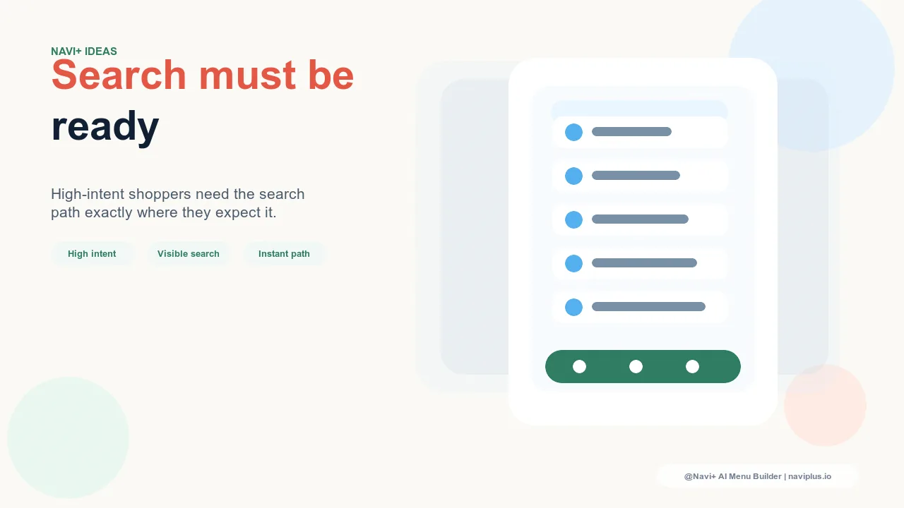
Tab Bar slot for large catalogs. For stores with deep catalogs — hundreds to thousands of SKUs — search is frequently the most efficient navigation path, and it deserves Tab Bar-level prominence. A dedicated "Search" tab in the mobile Tab Bar makes it visible on every page without requiring the visitor to look for it. It signals to visitors with specific product intent that search is the recommended way to navigate this store, which reduces friction for exactly the visitors most likely to convert.
FAB search trigger for medium catalogs. For stores with moderate catalog depth where browsing is the primary navigation mode but search is useful for precise lookups, a FAB configured to open the search interface provides persistent access without occupying a full Tab Bar slot. The FAB appears on every page, requires no scrolling to reach, and opens search with a single tap.
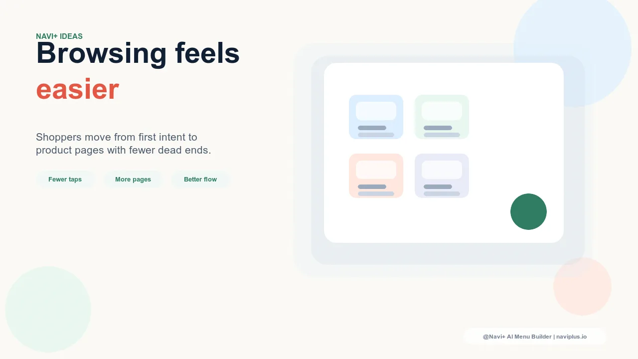
In both cases, the goal is the same: remove every step between the visitor's decision to search and the search interface appearing. Each additional step — find the icon, scroll to the top, navigate to the search page — is a decision point where a fraction of high-intent visitors abandon and don't come back.
Search Placement and Catalog Communication
There is a secondary benefit to prominent search placement that is easy to overlook: it communicates catalog depth to visitors who might not know how large your selection is. A visitor who sees a prominent search bar subconsciously registers that this store has enough inventory to warrant a search function. A store with 20 products doesn't need search — a store with 500 products does. Prominent search placement signals selection breadth before the visitor has browsed a single category.
This matters most for new visitors arriving from paid search or social advertising, who may not know your brand well. The navigation they see in the first seconds of a visit forms their impression of the store's scale and professionalism. A search bar that's easy to find is part of that first impression.
| Search Placement | Discoverability | Impact on Search Usage Rate |
|---|---|---|
| Small icon in header only | Low — competes with other icons | Baseline — visitors who know to look for it |
| Hamburger menu item | Very low — requires menu open first | Below baseline |
| Tab Bar dedicated slot (Navi+) | High — always visible on all pages | Significantly higher usage rate |
| FAB search trigger (Navi+) | High — persistent, no scroll required | Increased usage vs. header icon alone |
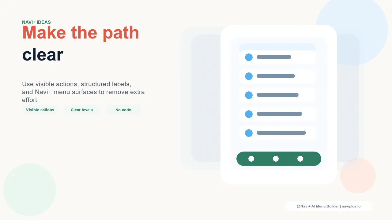
Making the Most of a Prominent Search Placement
Moving search into the Tab Bar or FAB is the structural decision. The quality of the search experience itself — result relevance, speed, the handling of zero-result queries — is a separate question. But placement is the precondition: a search experience that visitors don't easily find will never demonstrate its value, however good the underlying technology is.
Navi+ AI Menu Builder allows you to add a search slot to the mobile Tab Bar in minutes, with no code changes. It's one of the highest-leverage configuration decisions available to stores with larger catalogs — making a high-converting visitor pathway easier to access at zero marginal cost per visit.
Try it free — no code, no developer needed
Install in minutes on Shopify, WordPress, or any website.