Best Shopify Themes in 2026: We Compared the Top Themes for Design, Speed, Navigation & Conversion
Selecting a Shopify theme is one of the highest-leverage architectural decisions an ecommerce merchant makes. Your theme determines your visual identity, dictates your page speed baseline, shapes your mobile browsing ergonomics, and establishes the boundaries of how shoppers discover your products.
Yet, most online theme comparisons rely on superficial bulleted feature lists, stock screenshots, and generic praise. Few evaluations examine how these themes actually handle multi-tier category structures, whether their mobile menus create thumb-zone reach fatigue on modern smartphones, or what happens when a growing store scales from 50 to 5,000 SKUs.
In this comprehensive 2026 benchmark, our UX and engineering team audited 10 of the most widely deployed free and premium Shopify themes—spanning official Shopify reference architectures (Dawn, Horizon, Sense, Refresh, Craft) and market-leading premium themes (Prestige, Impact, Impulse, Enterprise, Broadcast, alongside reference benchmarks Symmetry and Warehouse).
We tested their Liquid templates, evaluated their Web Component implementations, measured their Core Web Vitals, and subjected their header systems to our empirical Navi+ Shopify Theme Navigation Score.
Below is the definitive, research-backed evaluation to help you choose the right theme—and understand why the smartest brands decouple their customer navigation from their visual template.
Quick Answer & Comparison Summary
For merchants seeking immediate guidance, here is our consolidated ranking across the top 10 themes:
| Theme | Developer | Tier / Price | Best Suited For | Speed Score | Nav Score (/100) | Primary Limitation |
|---|---|---|---|---|---|---|
| Broadcast | Presidio Creative | $420 | High-growth lifestyle DTC & conversion | 88/100 | 82.5 | Top-anchored mobile drawer only |
| Enterprise | Clean Canvas | $420 | High-inventory catalogs (1,000–50,000+ SKUs) | 89/100 | 86.0 | Utilitarian styling; dense mobile list |
| Horizon | Shopify | Free ($0) | Modern editorial brands wanting nested blocks | 94/100 | 63.5 | Plain global navigation; no mobile bottom bar |
| Prestige | Maestrooo | $400 | Luxury fashion, cosmetics & fine jewelry | 87/100 | 72.0 | Strict 2-promo image limit; rigid menu tree |
| Impulse | Archetype Themes | $500 | Multi-category athletic & promotional retail | 86/100 | 79.5 | $500 price; heavy vertical mobile scrolling |
| Impact | Maestrooo | $400 | Energetic streetwear, tech gadgets & Gen-Z | 88/100 | 72.0 | Navigation cramps easily with >5 columns |
| Dawn | Shopify | Free ($0) | Lean DTC startups & speed purists (<50 SKUs) | 98/100 | 45.5 | Flat text dropdowns; barebones mobile drawer |
| Sense | Shopify | Free ($0) | Curated skincare, beauty & wellness (<80 SKUs) | 95/100 | 49.0 | No visual routine or skin-concern menus |
| Refresh | Shopify | Free ($0) | Technical products & athletic gear (<30 SKUs) | 98/100 | 46.5 | Text-only menus cannot showcase spec cards |
| Craft | Shopify | Free ($0) | Artisans, makers & bespoke home decor | 98/100 | 45.0 | Minimalist text links; zero visual collection cues |
The Core Thesis: Why Theme Selection Has Shifted in 2026
For a decade, the conventional wisdom in ecommerce was: “Choose a theme that has every feature you could ever need built right into the code.”
In 2026, that monolithic approach has broken down for three distinct reasons:
- The PageSpeed & Core Web Vitals Penalty: Monolithic themes that cram mega menus, swatches, popups, currency converters, and size charts into a single Liquid codebase often carry immense DOM weight and script overhead. When Google’s Interaction to Next Paint (INP) became a core ranking factor, bloated storefronts paid an immediate SEO penalty.
- The Mobile Ergonomic Reality: Over 70% of consumer ecommerce sessions occur on smartphones. Yet, virtually every commercial Shopify theme continues to treat navigation from a desktop perspective—tucking your entire product catalog behind a small hamburger icon anchored in the top corner of the screen, completely outside the user’s natural thumb zone.
- The Theme Lock-In Dilemma: When a merchant relies entirely on their theme’s built-in mega menu settings, their category structure, promotional banners, and visual layouts are locked into that specific theme’s proprietary schema. When the merchant eventually wants to refresh their branding or migrate to a new theme, their entire navigation hierarchy is wiped clean, requiring weeks of manual re-configuration.
The Modern Strategic Rule:
Your theme should solve design aesthetic, typography, and page-body layouts. Your navigation should be a decoupled, portable layer that focuses exclusively on customer wayfinding, ergonomics, and catalog discovery.
Understanding this distinction changes how you evaluate every theme on this list.
How We Evaluated Themes: The Navi+ Navigation Score Methodology
To look beyond marketing claims, we evaluated each theme across seven weighted architectural pillars:
┌────────────────────────────────────────────────────────────────────────┐
│             NAVI+ SHOPIFY THEME NAVIGATION SCORE METHODOLOGY            │
├────────────────────────────────────────────────────────────────────────┤
│  1. Mobile Ergonomics & Reachability (20%)                             │
│     Thumb-zone accessibility, bottom tab bars vs top hamburgers        │
│                                                                        │
│  2. Menu Scalability (15%)                                             │
│     Handling catalog growth (50 to 5,000+ SKUs) without layout breaks  │
│                                                                        │
│  3. Information Scent & Category Depth (15%)                           │
│     Clarity of sub-department wayfinding within 1-2 interactions       │
│                                                                        │
│  4. Visual Merchandising in Menu (15%)                                 │
│     Support for in-menu imagery, collection thumbnails & promo badges  │
│                                                                        │
│  5. Product Discovery Speed (15%)                                      │
│     Predictive search integration, category chips & direct jumps       │
│                                                                        │
│  6. Merchant Maintenance Agility (10%)                                 │
│     Ease of updating seasonal campaigns without touching theme code    │
│                                                                        │
│  7. Navigation Extensibility (10%)                                     │
│     Ability to enhance navigation without breaking header templates    │
└────────────────────────────────────────────────────────────────────────┘
The resulting Navi+ Navigation Score (0–100) gives merchants an objective measure of how well a theme guides shoppers from landing page to checkout.
Detailed Theme Reviews: Free Shopify Themes
Shopify provides five primary free themes built on its Online Store 2.0 and Web Component architectures. While these themes boast pristine Core Web Vitals and zero licensing costs, their navigation layers reflect clear functional compromises.
1. Dawn (Version 15.x): The Speed Standard
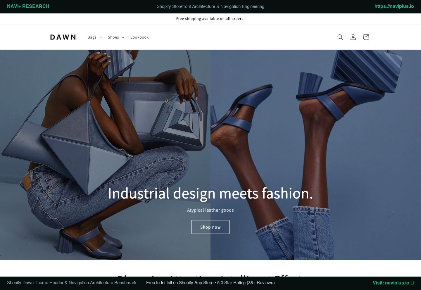 Figure 1: Dawn’s desktop header layout showing standard text-only multi-column dropdowns.
- Developer: Shopify
- Price: Free ($0)
- Target Merchant: Early-stage DTC brands, lean startups, and single-category boutiques with under 50 products.
- Best Suited Industries: Apparel, accessories, minimalist lifestyle products.
- Speed & Performance: 10/10 (Desktop: 95–98, Mobile: 88–94). Unmatched baseline speed with minimal script execution.
Architectural Overview
Dawn has been Shopify’s reference theme since the release of Online Store 2.0. Built with clean semantic HTML, lightweight vanilla JavaScript, and modern CSS, Dawn represents the purest implementation of Shopify’s core platform standards. It is rock-solid, fully accessible, and serves as the baseline against which all third-party apps are tested.
In-Depth Navigation & Header Review
Dawn provides four standard header arrangements (logo left/center, menu left/center) with optional sticky behavior (always sticky or reveal on scroll-up).
However, its native navigation capabilities are deliberately barebones:
- Desktop Mega Menu: When you nest items three levels deep in Shopify’s Navigation admin, Dawn can render them as multi-column text lists. There is no native mechanism to insert collection thumbnail images, promotional badges, discount cards, or custom HTML within these columns.
- Depth Constraints: Dawn is strictly a 3-level menu system. Fourth-level items are flattened or ignored.
- Mobile Menu UX: On mobile, Dawn opens a standard left-side slide-out drawer (
<details-modal>). Each subcategory requires a tap on a text chevron that pushes the previous view off-screen. For a store with 50+ categories, finding a specific sub-department requires 4 to 6 deliberate taps and extensive vertical scrolling. - Reach Ergonomics: The hamburger menu trigger sits in the extreme top-left corner. On an iPhone 15 Pro Max or Galaxy S24 Ultra (viewports exceeding 6.7 inches), triggering navigation requires shifting grip or using a second hand.
Large Catalog Suitability
Low (3/10). Dawn begins to strain as soon as a store passes 100 SKUs or 12 sub-collections. The text-only columns lack visual information scent, forcing shoppers to read through lines of uniform typography to locate products.
Strengths vs. Weaknesses
- Strengths: $0 price, blazing-fast load times, flawless app compatibility, zero technical debt.
- Weaknesses: Stark and plain aesthetic, zero visual merchandising in menus, clunky mobile drill-downs for large inventories.
- Who Should NOT Use It: Multi-category stores with over 150 products or merchants who rely on visual lifestyle imagery to direct shoppers to seasonal collections.
Navi+ Strategic Fit
- Navigation Limitation: High
- Navi+ Opportunity: High
The Strategy: Pairing Dawn’s free, 98-speed baseline with Navi+ creates a modern ecommerce powerhouse. Merchants gain enterprise-grade visual mega menus, multi-column category cards, and a mobile bottom tab bar—achieving a luxury storefront experience for $0 in theme licensing fees.
2. Horizon: Shopify’s Modern Component-Driven Future
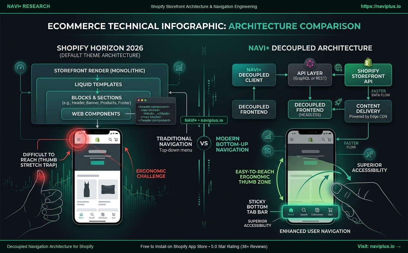 Figure 2: Shopify Horizon’s modular Web Component and nested block structure.
- Developer: Shopify
- Price: Free ($0)
- Target Merchant: Modern direct-to-consumer brands that prioritize magazine-style editorial layouts and rich media storytelling.
- Best Suited Industries: Fashion, cosmetics, designer homeware, high-end wellness.
- Speed & Performance: 9/10 (Desktop: 92–96, Mobile: 85–90). Fast hydration via native Web Components.
Architectural Overview
Introduced to succeed Dawn as Shopify’s technological flagship, Horizon replaces flat section schemas with hierarchical nested blocks (allowing blocks inside blocks up to 8 levels deep) and standardizes interactive elements on browser-native Web Components (customElements.define).
This architectural shift allows merchants to assemble intricate, magazine-like page layouts—such as tabbed product specifications, nested accordion dossiers, and asymmetrical editorial grids—directly inside the visual Theme Editor without writing a single line of Liquid code.
In-Depth Navigation & Header Review
While Horizon revolutionizes in-page body layouts, its global wayfinding system remains rooted in conventional desktop paradigms:
- Desktop Mega Menu: Horizon introduces a Web Component
<header-menu>that supports modular blocks insections/header.liquid. Merchants can configure promo blocks within the header schema, but the menu remains tethered to Shopify’s traditional top-level link list. Building dynamic tabbed category switchers or live product feeds inside the menu is not supported natively. - Mobile Menu UX: Horizon’s mobile drawer uses clean CSS transitions and native custom elements. However, like Dawn, it is anchored entirely to the top header. It relies on a standard slide-out drawer triggered from the top-left corner, requiring multi-level vertical expansion to browse deeper collections.
- Ergonomics: Lacks native support for a persistent mobile bottom navigation bar, leaving mobile shoppers dependent on scrolling back to the top of long editorial product pages to reach the menu.
Large Catalog Suitability
Moderate (5/10). Horizon handles in-page discovery better than Dawn thanks to its rich collection grid blocks, but its global navigation hierarchy becomes cluttered once a catalog exceeds 200–300 products.
Strengths vs. Weaknesses
- Strengths: Groundbreaking nested block flexibility, modern Web Component architecture, sophisticated editorial aesthetic, completely free.
- Weaknesses: Global navigation configuration becomes tedious in the Theme Customizer for large catalogs; lacks mobile thumb-zone navigation.
- Who Should NOT Use It: Industrial B2B catalogs, mega-retailers with 1,000+ deeply nested SKUs, or merchants looking for an off-the-shelf Amazon-style department hierarchy.
Navi+ Strategic Fit
- Navigation Limitation: Medium
- Navi+ Opportunity: High
The Strategy: Horizon is arguably the most aesthetically capable free theme in Shopify history. Adding Navi+ Sticky Bottom Tab Bars and Visual Multi-Tier Mega Menus bridges the exact gap where Horizon’s editorial power stops: intuitive, single-handed mobile navigation.
3. Sense, Refresh & Craft: Niche-Specific Free Alternatives
Shopify’s three secondary free themes are specialized variations of the Dawn core engine, each styled for specific merchant verticals:
Sense (Beauty & Wellness)
- Design Focus: Soft curves, pastel gradients, clinical benefit badges, ingredient lists, and step-by-step usage sections.
- Navigation Reality: Despite its beauty-centric page layouts, Sense features the exact same flat text menu as Dawn. It cannot natively display visual “Shop by Skin Concern” cards (e.g., Acne, Hydration, Anti-Aging) or routine-based dropdowns.
-
Score: Speed: 9/10 Nav Score: 49.0/100 Nav Limitation: High.
Refresh (Technical & Athletic Goods)
- Design Focus: High-contrast, assertive typography, structured tabular layouts, and prominent product specification callouts.
- Navigation Reality: Designed for technical products, yet its navigation cannot display visual feature chips or comparison badges in the dropdown.
-
Score: Speed: 10/10 Nav Score: 46.5/100 Nav Limitation: High.
Craft (Artisans & Bespoke Makers)
- Design Focus: Elegant serif typography, generous whitespace, subtle hairline borders, and gallery-style maker showcases.
- Navigation Reality: Understated and delicate, but restricted to 3 levels of plain text links. Cannot display visual collection thumbnails (e.g., pottery by glaze finish or tableware by material).
-
Score: Speed: 10/10 Nav Score: 45.0/100 Nav Limitation: High.
Detailed Theme Reviews: Premium Shopify Themes
When merchants hit the functional ceiling of free themes, they typically turn to the Shopify Theme Store’s premium tier. These themes command one-time fees ranging from $400 to $500. Here is how the top commercial contenders perform under technical and architectural scrutiny.
4. Prestige (Version 7.x): The Luxury Fashion Benchmark
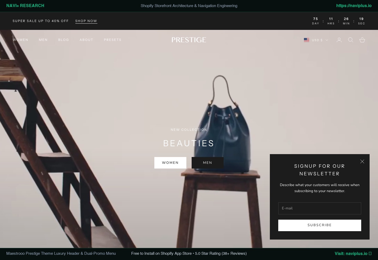 Figure 3: Prestige theme’s desktop mega menu featuring text columns and dual promotional image blocks.
- Developer: Maestrooo
- Price: $400 USD
- Target Merchant: Luxury fashion ateliers, designer apparel, premium cosmetics, and fine jewelry brands.
- Best Suited Industries: High-end luxury DTC, designer accessories, premium beauty.
- Speed & Performance: 8/10 (Desktop: 85–90, Mobile: 78–84). Clean vanilla JavaScript architecture by Maestrooo; minimal layout shifts.
Architectural Overview
Prestige is widely recognized as the gold standard of luxury ecommerce on Shopify. Developed by French studio Maestrooo, it embodies understated elegance: Didot/Bodoni-inspired serif typography, subtle 1px border dividers, immaculate whitespace ratios, and an image-first visual philosophy.
Beyond aesthetics, Prestige bundles an array of conversion features that typically require separate apps: image-swatch variant pickers, back-in-stock alerts, pre-order templates, and sticky add-to-cart bars.
In-Depth Navigation & Header Review
Prestige’s navigation is polished, but architecturally rigid:
- Desktop Mega Menu: Supports up to 4–5 columns of text links paired with up to two promotional image blocks (complete with custom headings, sub-headings, and call-to-action buttons). To activate a mega menu, merchants must create a block in the Theme Editor whose title matches the top-level menu link with 100% character-for-character accuracy.
- The 2-Promo Limit: While the two promo blocks look stunning for seasonal lookbooks, the theme cannot support more than two visual assets per dropdown. You cannot embed product carousels, dynamic discount countdowns, or tabbed sub-departments.
- Mobile Menu UX: Prestige employs a clean left-hand slide-out drawer with dedicated tabs to switch between the main catalog and customer account/help links. However, it remains a traditional text-based drill-down menu anchored to the top-left hamburger icon.
- Large Hierarchy Constraint: If your store has 20 sub-categories under “Women”, Prestige displays them as a tall, unbroken vertical list within the mobile drawer, inducing severe thumb-scroll fatigue.
Large Catalog Suitability
Moderate (6/10). Prestige thrives on catalogs between 50 and 500 SKUs. Beyond 500 SKUs or 30+ sub-collections, its 4-column mega menu limit causes link crowding and text wrapping that degrades its luxury aesthetic.
Strengths vs. Weaknesses
- Strengths: Unmatched luxury aesthetic, world-class product page conversion blocks, built-in color swatches, elegant predictive search drawer.
- Weaknesses: $400 upfront cost; strict 2-promo image limit in menus; lacks mobile bottom navigation; cannot handle complex multi-tier department hierarchies.
- Who Should NOT Use It: High-SKU discount warehouses, industrial supply stores, or electronics retailers requiring dense technical filtering.
Navi+ Strategic Fit
- Navigation Limitation: Medium
- Navi+ Opportunity: High
The Strategy: Luxury shoppers expect mobile ergonomics equivalent to native apps like Net-a-Porter or SSENSE. By overlaying Prestige with a Navi+ Sticky Bottom Tab Bar and visual category drawer, merchants preserve Prestige’s couture product pages while eliminating mobile wayfinding friction.
5. Impact (Version 6.x): High-Energy Streetwear & Modern Tech
- Developer: Maestrooo
- Price: $400 USD
- Target Merchant: Bold, energetic DTC brands targeting Gen-Z and millennial shoppers who demand dynamic visuals and animated micro-interactions.
- Best Suited Industries: Streetwear, consumer electronics, athletic nutrition, gaming gear.
- Speed & Performance: 8/10 (Desktop: 86–91, Mobile: 80–85). Modern rendering pipeline with deferred script execution.
Architectural Overview
Also developed by Maestrooo, Impact sits at the opposite stylistic pole from Prestige. Where Prestige is quiet and delicate, Impact is loud and assertive. It features oversized display typography, animated marquee tickers, vibrant color gradient palettes, and high-impact hover effects.
Its product pages are engineered for fast-paced impulse purchasing, equipped with quick-buy slide-out drawers, product bundle builders, and interactive specification badges.
In-Depth Navigation & Header Review
- Desktop Mega Menu: Shares the same underlying navigation framework as Prestige. Supports multi-column link groupings and dual promo blocks. Impact adds high-contrast badge overlays and bold typography styling to menu links.
- Mobile Menu UX: The mobile drawer is punchy and high-contrast, featuring large touch targets and direct social media links. However, like Prestige, it remains anchored to the top header and relies on multi-step text expansion.
- Sticky Navigation: Features smart auto-hide on downward scroll and instant re-emergence on upward flick.
Large Catalog Suitability
Moderate (6/10). Impact is optimized for stores with 30 to 300 high-energy products. Expanding beyond 400 SKUs causes its bold typography to crowd the navigation bar, forcing undesirable horizontal scrolling or awkward link truncation.
Strengths vs. Weaknesses
- Strengths: Unrivaled modern visual impact, exceptional quick-buy drawer, built-in bundling tools, fast loading despite heavy animation.
- Weaknesses: Visual design can easily feel chaotic if over-configured; navigation becomes cramped on deep catalogs; no native bottom navigation bar.
- Who Should NOT Use It: Conservative luxury brands, corporate B2B sellers, or quiet artisanal craftsmen.
Navi+ Strategic Fit
- Navigation Limitation: Medium
- Navi+ Opportunity: High
The Strategy: Impact’s mobile-heavy Gen-Z demographic browses almost exclusively with their thumbs. Adding a Navi+ Floating Action Button (FAB) and Bottom Tab Bar matches Impact’s app-like gaming aesthetic while slashing category abandonment.
6. Impulse (Version 8.x): The Multi-Category Promotional Powerhouse
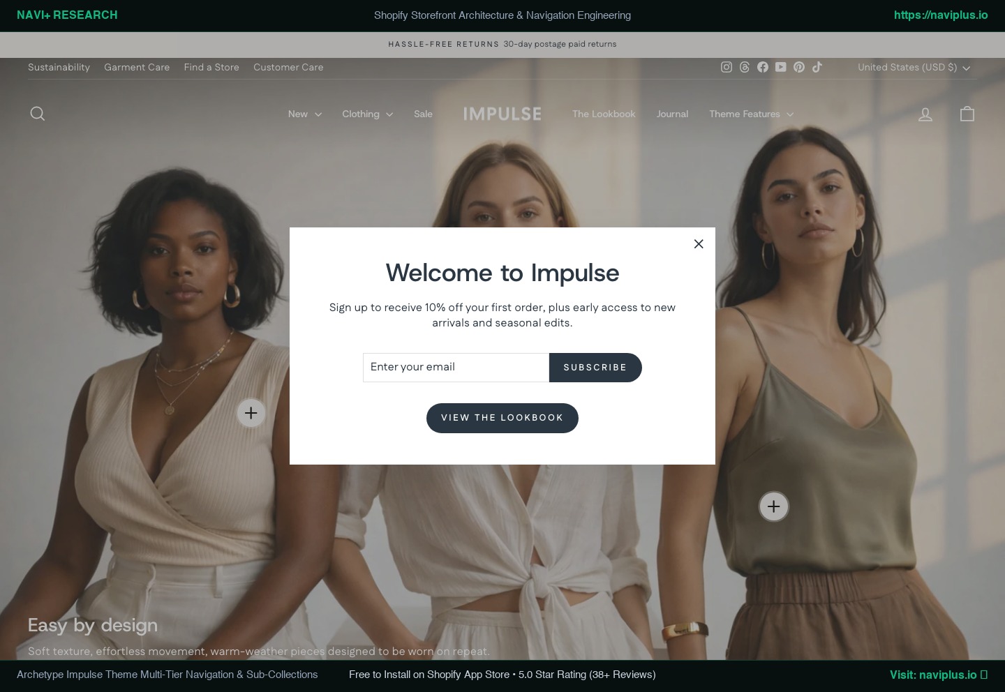 Figure 4: Impulse theme’s multi-tier mega menu featuring automated collection images and promo tiles.
- Developer: Archetype Themes
- Price: $500 USD (Adjusted from $380/$400 in official Theme Store)
- Target Merchant: High-volume retailers, sporting goods brands, multi-brand department stores, and merchants running aggressive seasonal promotions.
- Best Suited Industries: Outdoor apparel, athletic equipment, footwear, fashion retail, action sports.
- Speed & Performance: 8/10 (Desktop: 85–89, Mobile: 78–82). Well-architected modular JS by Archetype Themes.
Architectural Overview
Impulse has long been one of the highest-grossing commercial themes in Shopify history. Built by Archetype Themes, it is specifically engineered for commercial retail environments where inventory rotates rapidly and promotional sales are constant.
Its standout architectural feature is its deep integration of sub-collection merchandising: collection pages can display visual sub-collection tiles across the top of the grid, allowing shoppers to filter down from “Men’s Apparel” to “Waterproof Jackets” in a single visual tap.
In-Depth Navigation & Header Review
Impulse possesses one of the strongest native navigation systems among standard commercial themes:
- Automated Collection Images: In Impulse’s mega menu, column headers can automatically pull the featured image of the linked Shopify collection without manual image uploading in the theme customizer.
- Promotional Blocks: Allows up to two custom promotion blocks per mega menu, featuring image, headline, descriptive text, and a direct button link.
- Mobile Menu UX: Mobile navigation provides deep multi-level accordion lists. While functional, it remains a top-anchored drawer. For stores with 1,000+ products spread across 40 sub-collections, the mobile menu becomes a massive vertical list requiring extensive scrolling.
Large Catalog Suitability
Very High (8/10). Impulse is one of the few standard themes capable of managing 1,000 to 5,000 SKUs natively without immediate visual collapse.
Strengths vs. Weaknesses
- Strengths: Automatic collection image generation in menus, outstanding sub-collection tiles, robust promotional ribbon system, proven high-volume scalability.
- Weaknesses: Highest price tag on the Theme Store ($500); mobile navigation becomes deeply vertical and fatigue-inducing on large catalogs; lacks mobile bottom tab bars.
- Who Should NOT Use It: Minimalist boutiques or single-product drops looking for quiet, understated design.
Navi+ Strategic Fit
- Navigation Limitation: Medium
- Navi+ Opportunity: Medium
The Strategy: Impulse handles desktop mega menus admirably. However, its mobile drawer remains its Achilles’ heel on high-SKU stores. Introducing Navi+ Mobile Category Slide Drawers and Sticky Bottom Tabs provides the missing mobile app experience that a $500 theme surprisingly omits.
7. Enterprise (Version 2.x): The High-SKU Megastore Powerhouse
- Developer: Clean Canvas
- Price: $420 USD
- Target Merchant: High-inventory megastores, multi-brand electronics retailers, automotive parts distributors, and B2B wholesale suppliers.
- Best Suited Industries: Consumer electronics, auto parts, hardware, industrial supplies, large multi-category retailers (1,000 to 50,000+ SKUs).
- Speed & Performance: 8/10 (Desktop: 86–90, Mobile: 80–84). Specially engineered for low DOM weight and fast interaction on massive product databases.
Architectural Overview
Enterprise, developed by Clean Canvas, is built for one specific purpose: to provide an Amazon- or BestBuy-style experience on Shopify. Where most themes prioritize full-width lifestyle photography and emotional branding, Enterprise prioritizes catalog density, rapid specification lookup, and utility-driven discovery.
It includes native features that normally require extensive app stacks: multi-product comparison tables, SKU search, wholesale B2B pricing grids, inventory location badges, and advanced faceted sidebar filters.
In-Depth Navigation & Header Review
- Department-First Header: The header features a prominent full-width search bar with category scoping, paired with an “All Departments” mega menu button that opens a structured multi-column category grid.
- Desktop Mega Menu: Best-in-class native mega menu. Supports multi-column department link lists, collection image cards, in-menu promo banners, and category tab switching.
- Mobile Menu UX: Highly structured mobile drawer with department tabs. However, due to the immense breadth of categories common to Enterprise stores, mobile shoppers still face deep vertical accordion drill-downs.
- Predictive Search: Industry-leading native search that suggests products by title, SKU, barcode, and collection, with instant category filtering inside the search popup.
Large Catalog Suitability
Extreme (10/10). Enterprise is arguably the undisputed king of the Shopify Theme Store for handling 5,000 to 50,000+ SKUs.
Strengths vs. Weaknesses
- Strengths: Unmatched high-inventory data architecture, Amazon-style utility navigation, native product comparison, built-in B2B features, eliminates 8+ apps.
- Weaknesses: Utilitarian aesthetic lacks emotional fashion flair; Theme Editor configuration is complex; mobile navigation is dense and information-heavy.
- Who Should NOT Use It: High-fashion lookbook brands, luxury jewelry boutiques, or single-product lifestyle brands.
Navi+ Strategic Fit
- Navigation Limitation: Low-to-Medium
- Navi+ Opportunity: Medium
The Strategy: Enterprise dominates desktop department navigation. On mobile, however, browsing 50+ departments inside a standard slide drawer remains clunky. Deploying Navi+’s mobile bottom category bar and multi-tier drawer transforms Enterprise’s dense catalog into a frictionless mobile browsing experience.
8. Broadcast (Version 6.x): The Conversion-Optimized DTC Leader
- Developer: Presidio Creative
- Price: $420 USD
- Target Merchant: Fast-scaling consumer DTC brands that want editorial magazine storytelling combined with aggressive conversion-rate optimization (CRO).
- Best Suited Industries: Apparel, beauty, baby & children, modern home, jewelry.
- Speed & Performance: 8/10 (Desktop: 86–90, Mobile: 80–84). Clean code architecture with progressive asset hydration.
Architectural Overview
Broadcast by Presidio Creative is one of the most well-rounded themes on the market. It bridges the gap between the quiet luxury of Prestige and the aggressive commercialism of Impulse.
Equipped with over 35 modular sections, Broadcast gives non-technical merchants complete layout freedom. It includes built-in tiered discount tables, “Shop the Look” hotspots, product cross-sells, color swatches, and animated sticky cart drawers.
In-Depth Navigation & Header Review
- Desktop Mega Menu: Highly flexible header blocks allowing merchants to assemble multi-column link lists, circular collection thumbnail pills, and promotional image cards with call-to-action badges.
- Mobile Menu UX: One of the best native mobile drawers among commercial themes. Broadcast includes circular collection image pills at the top of the mobile drawer, allowing shoppers to tap directly into top collections without reading text lists.
- Header Ergonomics: Offers sticky auto-reveal headers and transparent overlays, but like all standard themes, lacks a persistent bottom navigation bar.
Large Catalog Suitability
High (8/10). Easily manages catalogs between 200 and 2,000 SKUs with clean visual organization.
Strengths vs. Weaknesses
- Strengths: Exceptional out-of-the-box CRO blocks, warm modern aesthetic, circular collection pills in mobile drawer, built-in upsells.
- Weaknesses: $420 price point; still lacks persistent mobile thumb-zone bottom navigation.
- Who Should NOT Use It: Industrial B2B catalogs or ultra-minimalist single-product brands.
Navi+ Strategic Fit
- Navigation Limitation: Medium
- Navi+ Opportunity: Medium
The Strategy: Broadcast delivers 85% of what a high-growth brand needs. Adding a Navi+ Sticky Bottom Tab Bar provides the final 15%—enabling one-handed mobile cart access, category exploration, and persistent search across every page.
Best Shopify Themes by Specific Use Case
To help you decide based on your store’s exact operational requirements, here are our verified recommendations:
1. Best Free Theme: Horizon ($0)
For merchants who refuse to pay $400 for a theme, Horizon is the clear winner. Its 8-level nested block system and native Web Component engine deliver modern editorial layouts that outshine many paid themes. Pair it with an external navigation tool to resolve its basic header.
2. Best Overall Premium Theme: Broadcast ($420)
Broadcast strikes the ideal balance between visual storytelling and conversion utility. Its 35+ pre-built sections, in-drawer collection pills, and built-in upsells make it the most versatile commercial theme on the market.
3. Best for Luxury Fashion & Fine Jewelry: Prestige ($400)
Nothing rivals Prestige’s delicate French luxury aesthetic. Its serif typography, refined lines, and built-in image swatches make high-ticket products look exceptional.
4. Best for Large Inventories (1,000+ SKUs): Enterprise ($420)
If you are building an electronics superstore, hardware catalog, or multi-brand marketplace, Enterprise is the only theme engineered from the ground up for high-SKU density and Amazon-style department search.
5. Best for Promotional Merchandising: Impulse ($500)
For brands running weekly discount campaigns, flash sales, and seasonal lookbooks across multi-category athletic or outdoor apparel, Impulse’s sub-collection tiles and automated menu images are unmatched.
6. Best for Raw Speed & Custom Development: Dawn ($0)
If your team employs in-house developers or your primary mandate is an uncompromised 98+ PageSpeed score, Dawn remains the cleanest, most unencumbered canvas in ecommerce.
Do You Need to Change Your Shopify Theme to Improve Navigation?
This is the most critical question facing growing Shopify merchants.
When a store’s navigation feels cramped, when mobile shoppers struggle to find products, or when the marketing team complains that they can’t add promotional banners to the header, the instinctive reaction is:
“We’ve outgrown our theme. It’s time for a $400 theme purchase and a complete redesign.”
This reaction is usually a costly mistake.
The True Cost of a Theme Migration
Migrating to a new Shopify theme is rarely as simple as clicking “Publish.” In reality, a theme migration triggers:
- Template Rebuilding: Re-configuring dozens of custom sections, brand typography, color palettes, and collection templates.
- App Re-Integration: Re-installing and testing snippets for reviews, subscriptions, tracking pixels, and page builders.
- SEO & Ranking Risks: Accidental changes to heading structures (
H1/H2), canonical tags, or breadcrumb schema can destabilize search rankings. - Resource Expenditure: Most merchants spend between $3,000 and $15,000 in developer hours or agency fees to execute a theme migration.
And here is the painful irony: After migrating to a $400 or $500 theme, you will still be stuck with a top-anchored hamburger drawer on mobile.
The Decoupled Navigation Model
┌────────────────────────────────────────────────────────────────────────┐
│                   THE DECOUPLED STOREFRONT ARCHITECTURE                │
├────────────────────────────────────────────────────────────────────────┤
│                                                                        │
│   ┌────────────────────────────────────────────────────────────────┐   │
│   │                     YOUR SHOPIFY THEME                         │   │
│   │   • Brand Identity & Typography                                │   │
│   │   • Product Page Storytelling & Media Galleries                │   │
│   │   • Section-Based Page Bodies & Footer Layouts                 │   │
│   │   • Core Liquid Rendering & Cart Engine                        │   │
│   └───────────────────────────────┬────────────────────────────────┘   │
│                                   │                                    │
│                                   ▼                                    │
│   ┌────────────────────────────────────────────────────────────────┐   │
│   │               DECOUPLED NAVIGATION LAYER (NAVI+)               │   │
│   │   • Multi-Tier Visual Mega Menus (Images, Badges, Tabs)        │   │
│   │   • Mobile Thumb-Zone Bottom Tab Bar (App-Like Ergonomics)     │   │
│   │   • Category Slide Drawers (Infinite Depth, Zero Page Reload)  │   │
│   │   • Campaign-Specific Header Overrides & Promotional Cards     │   │
│   │   • 100% Portable Across Any Theme via Cloudflare Edge CDN     │   │
│   └────────────────────────────────────────────────────────────────┘   │
│                                                                        │
└────────────────────────────────────────────────────────────────────────┘
The Architectural Principle:
Theme solves design. Navigation apps solve navigation complexity.
By separating your customer navigation from your underlying theme, you achieve:
- Zero Theme Lock-In: If you change your visual theme next year, your entire navigation structure, mobile tab bars, and promotional menus transfer seamlessly in seconds.
- True Mobile Ergonomics: You give mobile shoppers a persistent, thumb-accessible bottom tab bar—the exact pattern used by Amazon, Nike, and Target—which no standard Shopify theme provides natively.
- Agile Merchandising: Your marketing team can update seasonal sale banners, Black Friday menus, and category highlights inside a dedicated visual editor without touching theme code or risking layout breaks.
You do not need to replace your theme to fix your navigation. You simply need to upgrade your navigation layer.
Frequently Asked Questions (FAQ)
Which Shopify theme is best overall in 2026?
There is no single “best” theme for every merchant. For high-growth DTC lifestyle and fashion brands, Broadcast ($420) offers the best blend of conversion-optimized sections and visual storytelling. For large catalogs with over 1,000 products, Enterprise ($420) is the undisputed leader. For merchants wanting a world-class free experience, Horizon ($0) provides unparalleled nested block flexibility.
Is a premium Shopify theme worth the $400–$500 price?
A premium theme is worth the investment if you rely on its built-in product page features—such as native color swatches, pre-order forms, multi-product comparison tables, and built-in upsells—that would otherwise require 5 to 8 separate paid apps. However, if your primary reason for buying a premium theme is merely to get a better mega menu or mobile drawer, it is far more cost-effective to keep a free theme like Dawn or Horizon and add a dedicated navigation app like Navi+.
Is Dawn still a viable theme in 2026?
Yes. Dawn remains one of the fastest, cleanest, and most stable themes in the Shopify ecosystem. It is the default testing baseline for virtually every Shopify app developer. While its default styling is plain and its navigation is basic, pairing Dawn with an advanced navigation tool yields a 95+ PageSpeed storefront that rivals $500 themes.
Is Horizon better than Dawn?
Horizon represents an architectural leap over Dawn in terms of in-page customization. With support for 8-level nested blocks and native Web Components, Horizon allows merchants to build rich, magazine-style layouts without custom code. However, Dawn remains slightly faster in raw script execution, and both themes share similar limitations regarding mobile hamburger navigation.
Prestige vs. Impulse: Which should I choose?
Choose Prestige ($400) if you sell luxury apparel, jewelry, or high-end cosmetics where understated typography, pristine whitespace, and delicate aesthetics drive perceived value. Choose Impulse ($500) if you operate a fast-moving, multi-category athletic or outdoor retail store that runs continuous promotional sales and requires visual sub-collection tiles.
What is the best Shopify theme for a large inventory?
Enterprise ($420) by Clean Canvas is the premier choice for catalogs exceeding 1,000 SKUs. It provides Amazon-style department menus, SKU/barcode search, B2B wholesale pricing tables, and lightweight DOM architecture designed specifically to prevent performance degradation on massive inventories.
Which Shopify theme has the best mobile navigation?
Among standard themes, Broadcast ($420) offers the best native mobile drawer, featuring visual circular collection pills at the top of the menu. However, no standard Shopify theme offers a native persistent mobile bottom tab bar. To achieve true thumb-zone mobile ergonomics, merchants across all themes utilize specialized navigation extensions like Navi+.
Do I need a mega menu app if my theme already has one?
If your store has fewer than 30 products and a flat catalog, your theme’s native dropdown or basic mega menu is completely sufficient. You should consider a dedicated navigation app if:
- You need more than 2 promotional images in your dropdown.
- You want tabbed department switching inside the menu.
- You want to display live product badges, swatches, or custom HTML.
- More than 70% of your traffic is mobile, and you want to replace the top hamburger menu with an ergonomic bottom tab bar.
- You want to update promotional menus without risking theme code conflicts.
Can I upgrade my navigation without changing my Shopify theme?
Yes. Modern Shopify navigation apps operate via Theme App Extensions and decoupled edge delivery. Navi+, for example, injects directly into your existing header container without overwriting your theme files. This allows you to deploy multi-column visual mega menus, drawer slide menus, and mobile bottom tab bars in minutes, preserving your existing theme design while transforming your customer wayfinding.
Summary & Action Checklist for Merchants
Before deciding on your next theme or embarking on an expensive store rebuild, follow this practical decision checklist:
- Audit Your SKU Count & Hierarchy:
- Under 50 SKUs: Start with Dawn or Horizon. Keep overhead at $0 and focus on product-market fit.
- 50–500 SKUs: Choose Prestige (luxury) or Broadcast (commercial DTC).
- 1,000+ SKUs: Choose Enterprise or Impulse.
- Inspect Your Mobile Traffic Share: Open Google Analytics or Shopify Analytics. If mobile traffic exceeds 65%, do not rely on your theme’s top hamburger menu alone. Plan for a thumb-accessible mobile bottom navigation layer.
- Separate Design from Wayfinding: Do not buy a $500 theme simply because you dislike your current menu. Evaluate the theme for its product page blocks and visual branding. Use a dedicated tool like Navi+ to handle your navigation architecture independently.
- Benchmark Core Web Vitals: Test your store on Google PageSpeed Insights before and after any theme modification. Ensure your Largest Contentful Paint (LCP) remains under 2.5s and Interaction to Next Paint (INP) stays under 200ms.
This benchmark is maintained and updated by the Navi+ UX & Storefront Architecture Team. To explore how Navi+ decouples navigation and unlocks app-like mobile browsing on any Shopify theme, visit Navi+ Navigation Builder.