Mobile-First Navigation
80% of traffic is mobile — how do I build navigation that works with one thumb?
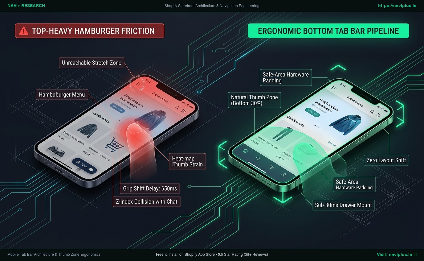
Bottom Navigation & Mobile Tab Bar Architecture: Engineering Native UX for Shopify
Technical guide to Shopify bottom navigation. Learn the biomechanics of the mobile thumb zone, safe-area hardware insets, sticky UI collision avoidance, and decoupled Tab Bar rendering.
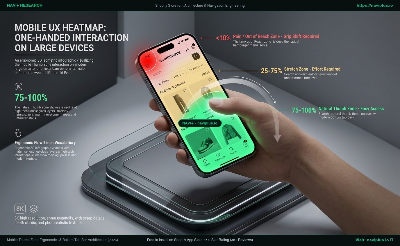
Shopify Mobile Navigation Beyond the Hamburger Menu: Ergonomics, Tab Bars, and Hybrid Architecture
Discover why default top-left hamburger menus fail on 6.7-inch mobile screens. Learn the biomechanics of the Thumb Zone, Liquid drawer limitations, and how bottom tab bars drive product discovery.
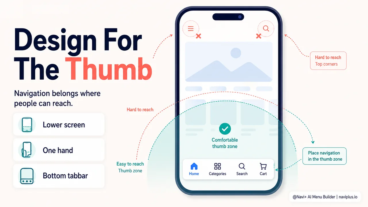
Building a mobile-first navigation strategy (not mobile-friendly)
Why mobile-first navigation is different from responsive design — thumb-reach zones, mobile-specific patterns, and building navigation around how people actually hold their phones.
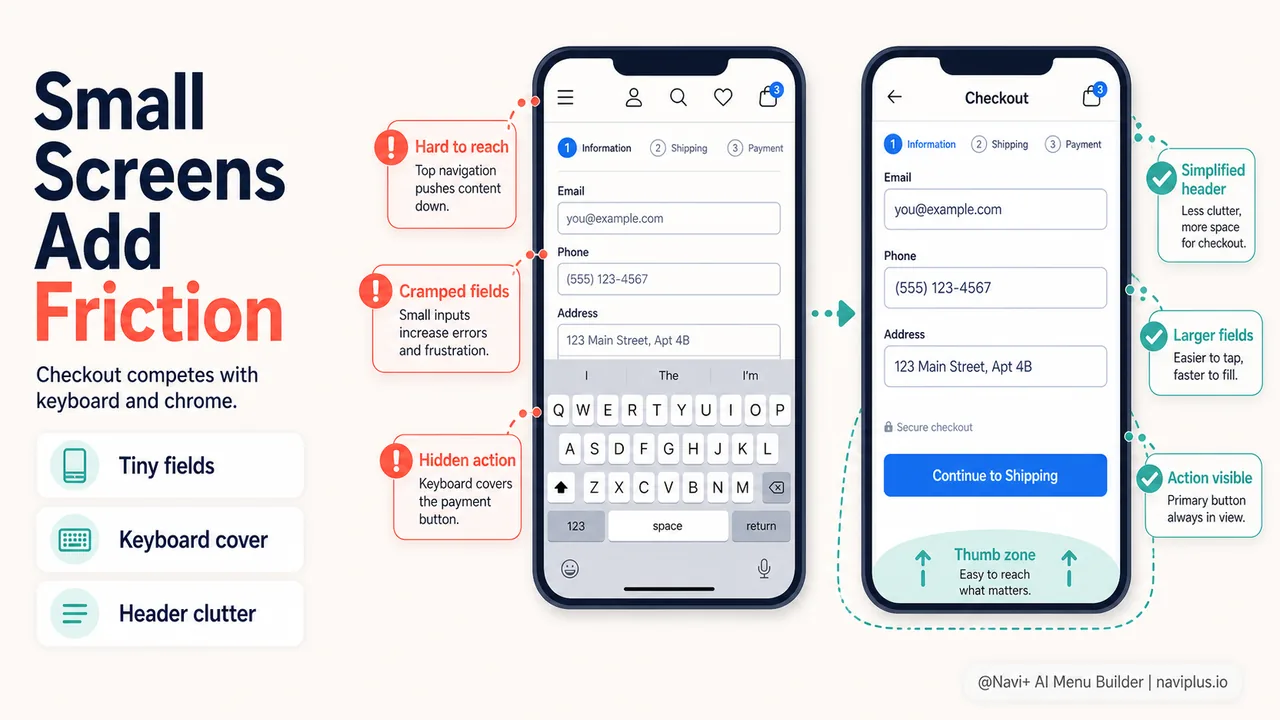
Mobile checkout: why navigation matters more on small screens
Mobile checkout barriers, single-thumb checkout flows, and how persistent cart access and simplified navigation reduce the 80% mobile cart abandonment rate.
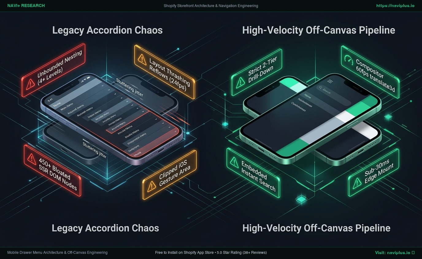
Mobile Drawer Menu Architecture: Engineering High-Velocity Off-Canvas Navigation for Shopify
Technical guide to mobile drawer menu design for Shopify. Master off-canvas drill-down hierarchies, 60fps compositor transitions, in-drawer search, and accessibility focus traps.
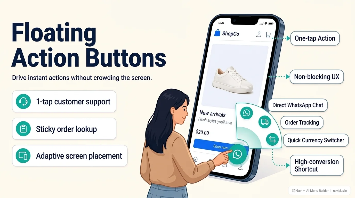
Floating action buttons for Shopify: when a FAB helps and when it just gets in the way
What a floating action button (FAB) is good for on an ecommerce store, the design rules that keep it useful instead of annoying, and how to avoid the most common FAB mistakes.