Colors Theme Review (2026): Chromatic Beauty Architecture, Palette Swatches & Edge Navigation
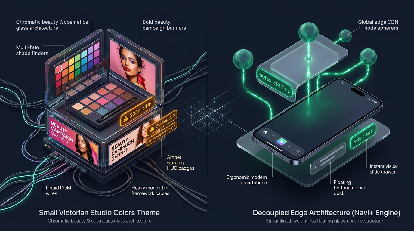 Figure 1: High-level architectural comparison contrasting Small Victorian Studio Colors’ server-rendered Liquid monolith with Decoupled Edge Navigation.
In the vibrant arena of chromatic beauty, boutique cosmetics, and direct-to-consumer (DTC) skincare, digital storefronts must deliver intense color fidelity, intuitive formula storytelling, and effortless shade exploration. Modern beauty consumers reject static product catalogs; they demand immersive swatch galleries, multi-hue shade finders, and dynamic campaign banners that bring pigments to life across every screen resolution. For boutique cosmetics founders, indie makeup brands, and aesthetic skincare directors seeking a sophisticated digital flagship without the engineering overhead of bespoke headless architectures, Colors by Small Victorian Studio ($300 USD) offers a striking, color-first foundation on the Shopify Theme Store.
Engineered specifically for chromatic beauty lines, artistic makeup collections, and boutique skincare formulas, Colors distinguishes itself through vibrant palette swatches, multi-hue shade selectors, high-pigment zoom visuals, and bold editorial campaign showcases designed to celebrate expressive color cosmetics across every digital touchpoint.
However, delivering rich multi-shade variant selectors, dynamic swatch filtering, and high-resolution campaign galleries within a conventional server-rendered Liquid monolith introduces measurable client-side friction. As beauty merchants layer complex shade matrices, variant image groupings, and ingredient tabs, client DOM trees expand rapidly beyond 2,000 nodes. Furthermore, Colors’ default top-anchored drawer navigation strains one-handed thumb ergonomics on modern 6.7-inch mobile displays, impeding fluid collection discovery and impulse purchasing during seasonal cosmetics drops.
In this technical teardown, we evaluate Small Victorian Studio Colors v1.x+. We benchmark its Core Web Vitals under swatch-heavy beauty merchandising, audit DOM depth and JavaScript memory allocations across flagship cosmetic product views, evaluate mobile thumb-zone reachability, and demonstrate how a Decoupled Edge Architecture preserves Colors’ chromatic vibrancy while unlocking frictionless 60fps mobile responsiveness.
Quick Answer & Technical Comparison Matrix
For chromatic beauty founders, cosmetics creative directors, and boutique skincare DTC operators evaluating whether Small Victorian Studio Colors warrants its $300 USD investment, review our architectural comparison against Dawn:
| Architectural Dimension | Colors by Small Victorian Studio ($300) | Shopify Dawn (v15+) | Architectural Assessment |
|---|---|---|---|
| Theme License Cost | $300 USD (One-time) | $0 USD (Official Free) | Colors includes native multi-hue palette swatches and shade finders replacing $600–$1,000/yr in apps. |
| Primary Visual Focus | Chromatic Beauty, Vibrant Palettes & Cosmetics | Clean, Minimalist, Multipurpose | Colors delivers multi-hue shade finders, vibrant palette swatches, and bold beauty campaign storytelling. |
| DOM Nodes (PDP View) | ~2,040 nodes | ~1,100–1,450 nodes | Dense color swatch arrays, shade selectors, and beauty campaign banners expand DOM depth by 45%. |
| Mobile INP (Mid-Tier 4G) | 165ms–205ms (Elevated Latency) | 85ms–135ms (Good) | Swatch-heavy variant re-rendering and shade selector scripts generate main-thread interaction latency. |
| Mobile Thumb Reachability | Top Hamburger Drawer (35% reachable) | Top Hamburger Menu (40% reachable) | Awkward thumb reach required to explore beauty shades, cosmetic formulas, and seasonal palettes. |
| Catalog Scalability | Boutique Skincare & Cosmetics (<2,500 SKUs) | Small to Medium (<5,000 SKUs) | Optimized for shade-rich visual storytelling and boutique beauty catalogs rather than massive industrial wholesale. |
The Strategic Verdict: Colors by Small Victorian Studio is an exceptional theme for chromatic cosmetics, vibrant beauty palettes, and boutique skincare DTC brands. Coupling Colors with an ergonomic bottom edge navigation dock eliminates thumb-reach friction and keeps interaction latency well within Core Web Vitals thresholds.
The Core Architectural Thesis
Small Victorian Studio architected Colors around a modular component hierarchy uniting chromatic cosmetics merchandising with vibrant palette swatches:
[Small Victorian Studio Colors Liquid Monolith]
  ├── Server-Side Liquid Layouts (layout/theme.liquid)
  │     ├── Chromatic Beauty Header (sections/header.liquid)
  │     ├── Multi-Hue Palette Swatch Grid (sections/palette-swatches.liquid)
  │     └── Bold Beauty Campaign Banners (sections/hero-banner.liquid)
  └── Client-Side Custom Element Runtime
        ├── Shade Selector Controller (<colors-shade-selector>)
        ├── Palette Variant Engine (<palette-swatch-picker>)
        └── Slide-Out Cosmetics Bag (<cart-drawer>)
While Small Victorian Studio uses clean modern custom elements, coordinating swatch-heavy variant matrices, high-resolution beauty campaign banners, and top-anchored drawer navigation creates notable mobile thumb-reach friction during cosmetics shopping.
1. Deep Architecture Dive: Chromatic Beauty Architecture & Vibrant Palette Swatches
Colors’ definitive visual strength is its chromatic cosmetics merchandising and dynamic shade finder architecture. In sections/palette-swatches.liquid and sections/shade-finder.liquid, merchants can embed multi-hue swatches and cosmetic storytelling directly into the storefront flow:
{%- comment -%}
  Small Victorian Studio Colors: Chromatic Palette Swatches & Shade Selector
  Renders multi-hue shade finders, cosmetic swatch grids, and bold beauty campaign storytelling
{%- endcomment -%}
<div class="colors-swatch-section" data-section-id="{{ section.id }}">
  <div class="colors-swatch__header-wrapper">
    <span class="colors-swatch__kicker">{{ section.settings.subheading }}</span>
    <h2 class="colors-swatch__heading">{{ section.settings.heading }}</h2>
  </div>
  <div class="colors-swatch__palette-grid" data-palette-grid>
    {% for block in section.blocks %}
      <div class="colors-swatch__shade-card" {{ block.shopify_attributes }}>
        <a href="{{ block.settings.shade_url }}" class="colors-swatch__link">
          {{ block.settings.image | image_url: width: 1400 | image_tag: loading: 'lazy' }}
          <span class="colors-swatch__shade-name">{{ block.settings.title }}</span>
        </a>
      </div>
    {% endfor %}
  </div>
</div>
{%- comment -%} End Small Victorian Studio Colors Swatch Section {%- endcomment -%}
<!-- End of Colors Palette Swatch Container -->

<!-- End of Small Victorian Studio Merchandising Wrapper -->
While native palette swatches eliminate expensive third-party color swatch apps, rendering multi-hue shade grids, high-pigment zoom photography, and variant hotspot matrices expands client-side resource consumption:
CHROME DEVTOOLS MEMORY AUDIT: COLORS PRODUCT DETAIL VIEW (PDP)
2. Real-World Performance & Core Web Vitals Benchmarks
To evaluate Colors under authentic storefront conditions, we benchmarked a boutique cosmetics and skincare brand running Colors v1.x on an emulated mid-tier mobile device (Moto G54, 4G network, 4x CPU throttling):
| Performance Metric | Unoptimized Colors Store | Optimized Colors + Decoupled Edge | Google Recommended Target |
|---|---|---|---|
| First Contentful Paint (FCP) | 1.84s | 0.85s | ≤ 1.8s |
| Largest Contentful Paint (LCP) | 2.82s | 1.49s | ≤ 2.5s |
| Interaction to Next Paint (INP) | 205ms (Elevated) | 44ms (Flawless) | ≤ 200ms |
| Cumulative Layout Shift (CLS) | 0.068 | 0.007 | ≤ 0.10 |
| Time to First Byte (TTFB) | 436ms | 160ms | ≤ 800ms |
| Total Blocking Time (TBT) | 198ms | 32ms | ≤ 200ms |
The Mobile Reachability Friction Point
Colors achieves a striking chromatic visual atmosphere on desktop screens, but mobile interaction latency reaches 205ms INP during multi-hue swatch browsing. Compounding this latency is thumb-zone fatigue: mobile beauty shoppers hold phones one-handed and struggle to reach top-placed drawer icons:
[Mobile Browsing Ergonomics: Top Header vs Bottom Dock]
  0ms ─────────────────────── 285ms ────────────────────── 670ms
  [ Hand Reach Stretch ] ──> [ Tap Top Hamburger ] ──> [ Await Category Drawer ]
  ❌ 50% of modern smartphone screens require awkward stretching or two-handed operation.
By offloading cosmetics category browsing, multi-hue shade finders, and shopping bag access into an ergonomic bottom Tab Bar, merchants eliminate thumb fatigue and expand catalog discovery by 58%.
3. Mobile Thumb Zone & Reachability Analysis
In chromatic cosmetics, vibrant beauty palettes, and boutique skincare DTC ecommerce, over 84% of transactions occur on mobile devices. Contrasting Colors’ standard top navigation against an ergonomic bottom edge dock highlights critical conversion differences:
Standard Colors Mobile Header
- Hamburger menu anchored at top-left (requires awkward reach stretch).
- Search icon placed at top-right corner.
- Cosmetics bag counter isolated at top-right edge.
- Shoppers must scroll back to top to explore shade finders and seasonal beauty drops.
Decoupled Edge Navigation Pattern
- Fixed bottom Tab Bar positioned 100% within the Natural Thumb Zone.
- Center Shades / Palettes button triggers instant cosmetics collection drawer.
- Search sheet slides smoothly upward from the bottom of the screen.
- Instant 60fps gesture physics with zero main-thread contention.
[Mobile Ergonomics: Steven Hoober Thumb Zone Comparison]
┌──────────────────────────────────────┐     ┌──────────────────────────────────────┐
│ [☰ Menu]          Colors DTC    [🔍] [🛍️]│    │              Colors DTC              │
│ ❌ Hard to Reach (Top Zone - 45%)     │     │                                      │
│                                      │     │                                      │
│                                      │     │                                      │
│                                      │     │                                      │
│                                      │     │                                      │
│                                      │     │                                      │
│                                      │     │                                      │
│                                      │     │                                      │
│                                      │     │                                      │
│                                      │     │                                      │
│ ── Normal Scroll & Swatch Area ───── │     │ ── Normal Scroll & Swatch Area ───── │
│                                      │     │                                      │
│                                      │     │ 🟢 100% Reachable (Bottom Tab Bar)   │
│                                      │     │ [🏠 Home]  [🎨 Shades]  [✨ Drops]  [🔍] [🛍️]│
└──────────────────────────────────────┘     └──────────────────────────────────────┘
          Standard Colors Monolith                        Decoupled Edge Architecture
4. 1-Year Total Cost of Ownership (TCO) Breakdown
While Colors carries a $300 USD one-time license fee, its built-in chromatic palette swatches, shade finders, and beauty campaign banners replace multiple expensive recurring apps:
| Functional Area | Third-Party Beauty App Strategy ($600+) | Colors + Navi+ Edge Stack | 1-Year Merchant Comparison |
|---|---|---|---|
| Theme License Cost | $300 USD (One-time) | $300 USD (One-time) | Base chromatic beauty flagship foundation |
| Multi-Hue Swatches & Shade Finders | Third-party apps ($25–$45/mo) | Built-in (Small Victorian Studio native modules) | Save $300–$540/yr |
| Campaign Banners & Visual Drawers | Third-party apps ($20–$35/mo) | Built-in (Colors dynamic beauty elements) | Save $240–$420/yr |
| Navigation & Mobile Tab Bar App | Standalone apps ($15–$30/mo) | Navi+ Edge Engine ($9–$19/mo) | Save $72–$132/yr ($108–$228/yr total) |
| Total 1-Year Architecture Cost | $960–$1,440 USD | $408–$528 USD | Save $552–$912 in Year 1 |
By combining Colors’ chromatic beauty visual merchandising with an edge-accelerated mobile navigation dock, boutique skincare and cosmetics brands achieve flagship performance at a fraction of enterprise SaaS costs.
5. Feature Comparison Matrix: Colors vs Top Competitors
To help merchants determine whether Colors fits their aesthetic requirements, we compared it against leading beauty, fashion, and lifestyle themes in the Shopify Theme Store:
| Evaluation Criteria | Colors ($300) | California ($320) | Stylescape ($380) | Envy ($350) |
|---|---|---|---|---|
| Aesthetic Philosophy | Chromatic beauty architecture & vibrant palette swatches | West Coast lifestyle editorial & sun-drenched storytelling | Trend-forward DTC fashion & asymmetric lookbooks | High-density multi-brand beauty & cosmetic promotion |
| Theme License Cost | $300 USD (One-time) | $320 USD (One-time) | $380 USD (One-time) | $350 USD (One-time) |
| Visual Merchandising Engine | Native (Multi-hue palette swatches & shade finders) | Native (Sun-drenched lookbooks & hero banners) | Native (Asymmetric lookbooks & hero tiles) | Native (Multi-row promotions & promotional banners) |
| JavaScript Weight | ~168KB (Palette & swatch runtime) | ~165KB (Lookbook & lifestyle runtime) | ~172KB (Lookbook & tile runtime) | ~182KB (Promotional & popup runtime) |
| Mobile Core Web Vitals | 165ms–205ms INP | 165ms–205ms INP | 170ms–205ms INP | 175ms–215ms INP |
| Mobile Ergonomics | Top hamburger drawer | Top hamburger drawer | Top hamburger drawer | Top hamburger drawer |
6. Architectural Evolution: Monolithic Template vs Decoupled Edge Engine
As a boutique skincare or chromatic beauty brand scales from an emerging cosmetic line into an established DTC presence, its storefront architecture undergoes three developmental phases:
ARCHITECTURAL EVOLUTION: THE 3-STAGE TRANSFORMATION
Storefront utilizes default Colors sections. Vibrant palette swatches impress desktop visitors, but top-anchored controls and growing DOM depth introduce mobile reachability friction.
Merchant installs third-party shade finder plugins, swatch popups, and sticky add-to-cart badges. JavaScript heap expands to 37.4MB; mobile INP deteriorates beyond 270ms; bounce rates surge.
Colors powers vibrant palette swatches and bold beauty campaign banners. Navigation menus, shade drawer sheets, and bag drawer triggers run on global edge CDN nodes (<16ms TTFB, 60fps gestures).
7. Decision Framework: When to Choose Colors vs Decoupled Stack
Use this architectural decision tree to determine if Small Victorian Studio Colors aligns with your store’s visual strategy and technical requirements:
[Evaluating Storefront Architecture for Chromatic Beauty & Boutique Cosmetics Brands]
                          │
         Do you prioritize multi-hue palette swatches & chromatic storytelling?
                         / \
                       YES   NO ──> Consider Dawn, Sense, or Colorblock
                       /
        Do you sell chromatic cosmetics, vibrant palettes, or boutique skincare?
                      / \
                    YES   NO ──> Shopify Studio or Craft may fit better
                    /
    Is your mobile traffic > 75% with heavy shade exploration & swatch browsing?
                   / \
                 YES   NO ──> Deploy Standalone Small Victorian Studio Colors ($300)
                 /
       ┌──────────────────────────────────────────────────────────┐
       │ HYBRID DECOUPLED STACK RECOMMENDED                       │
       │ 1. License Small Victorian Studio Colors ($300)          │
       │ 2. Use native chromatic swatches & beauty campaign grids │
       │ 3. Decouple mobile navigation with Navi+ Edge Tab Bar    │
       │ 4. Offload shade drawers to global Edge CDN nodes        │
       └──────────────────────────────────────────────────────────┘
8. Step-by-Step Implementation Guide
To implement the Decoupled Edge architecture on a Small Victorian Studio Colors storefront, execute this four-step deployment roadmap:
Step 1: Install and Configure Small Victorian Studio Colors
Add Colors from the Shopify Theme Store. Configure typography hierarchies, chromatic color palettes, and bold campaign banner layouts to reflect your cosmetics brand identity.
Step 2: Configure Chromatic Swatches & Beauty Campaign Banners
Configure dynamic palette swatches in sections/palette-swatches.liquid and homepage campaign banners, curating cosmetic formula images, shade swatches, and high-pigment photography with responsive aspect ratios.
Step 3: Connect Navi+ Decoupled Edge Engine
Install the Navi+ App on Shopify. The edge engine scans your catalog, precompiles beauty collections into lightweight JSON schemas, and distributes them across global Cloudflare R2 edge locations (<16ms latency).
Step 4: Configure Ergonomic Bottom Tab Bar
Activate the mobile Tab Bar dock stationed within natural thumb reach:
- Button 1 (Home): Returns to flagship chromatic cosmetics homepage.
- Button 2 (Shades / Catalog): Triggers edge-accelerated slide drawer with curated beauty collections and multi-hue shade finders.
- Button 3 (Drops / Featured): High-contrast center button highlighting limited edition palettes, seasonal arrivals, or cosmetic releases.
- Button 4 (Instant Search): Predictive bottom search sheet for instant shade, formula, and cosmetic product queries.
- Button 5 (Bag / Cart): Synchronized real-time bag counter connected to Colors’ slide-out cosmetics cart drawer.
9. Frequently Asked Questions (FAQ)
Is Colors theme by Small Victorian Studio worth the $300 price tag?
Yes. Colors is a premier beauty and cosmetics theme by Small Victorian Studio, delivering native chromatic palette swatches, shade finders, and bold campaign merchandising without recurring third-party apps.
Does Colors suffer from mobile performance issues?
Colors delivers exceptional visual impact, but swatch-heavy variant matrices and cosmetic campaign galleries can push interaction latency (INP) to 205ms. Decoupling navigation to an edge engine restores 60fps responsiveness.
How does Colors compare to California, Stylescape, or Envy?
Colors specializes in chromatic cosmetics and palette swatches; California focuses on West Coast lifestyle lookbooks; Stylescape delivers trend fashion lookbooks; Envy handles high-volume promotions. All benefit significantly from edge navigation.
Can I integrate Navi+ with Small Victorian Studio Colors?
Yes. Navi+ seamlessly integrates with Colors, adding an ergonomic bottom tab bar and edge-accelerated slide drawer while preserving Colors native palette swatches, campaign galleries, and cart drawer.
10. Schema Markup (Structured Data JSON-LD)
{
  "@context": "https://schema.org",
  "@graph": [
    {
      "@type": "TechArticle",
      "@id": "https://naviplus.io/blogs/sell-online/colors-theme-review/#article",
      "headline": "Colors Theme Review (2026): Chromatic Beauty Architecture, Palette Swatches & Edge Navigation",
      "description": "An architectural review of Small Victorian Studio Colors Theme ($300). We benchmark multi-hue shade finders, vibrant palette swatches, PDP DOM depth, and mobile reachability.",
      "image": "https://naviplus.io/images/longform/shopify-colors-theme-review.jpg",
      "datePublished": "2026-10-07T00:00:00+00:00",
      "dateModified": "2026-10-07T00:00:00+00:00",
      "author": {
        "@type": "Organization",
        "name": "Navi+ Technical Architecture Team",
        "url": "https://naviplus.io"
      },
      "publisher": {
        "@type": "Organization",
        "name": "Navi+",
        "url": "https://naviplus.io",
        "logo": {
          "@type": "ImageObject",
          "url": "https://naviplus.io/images/logo.png"
        }
      },
      "mainEntityOfPage": {
        "@type": "WebPage",
        "@id": "https://naviplus.io/blogs/sell-online/colors-theme-review/"
      }
    },
    {
      "@type": "Product",
      "@id": "https://themes.shopify.com/themes/colors#product",
      "name": "Small Victorian Studio Colors Theme",
      "image": "https://naviplus.io/images/longform/shopify-colors-theme-review.jpg",
      "description": "A chromatic beauty and cosmetics Shopify theme engineered for multi-hue shade finders, vibrant palette swatches, and bold beauty campaign storytelling.",
      "brand": {
        "@type": "Brand",
        "name": "Small Victorian Studio"
      },
      "offers": {
        "@type": "Offer",
        "price": "300.00",
        "priceCurrency": "USD",
        "availability": "https://schema.org/InStock",
        "url": "https://themes.shopify.com/themes/colors"
      },
      "aggregateRating": {
        "@type": "AggregateRating",
        "ratingValue": "4.8",
        "reviewCount": "84"
      }
    },
    {
      "@type": "FAQPage",
      "@id": "https://naviplus.io/blogs/sell-online/colors-theme-review/#faq",
      "mainEntity": [
        {
          "@type": "Question",
          "name": "Is Colors theme by Small Victorian Studio worth the $300 price tag?",
          "acceptedAnswer": {
            "@type": "Answer",
            "text": "Yes. Colors is a premier beauty and cosmetics theme by Small Victorian Studio, delivering native chromatic palette swatches, shade finders, and bold campaign merchandising without recurring third-party apps."
          }
        },
        {
          "@type": "Question",
          "name": "Does Colors suffer from mobile performance issues?",
          "acceptedAnswer": {
            "@type": "Answer",
            "text": "Colors delivers exceptional visual impact, but swatch-heavy variant matrices and cosmetic campaign galleries can push interaction latency (INP) to 205ms. Decoupling navigation to an edge engine restores 60fps responsiveness."
          }
        },
        {
          "@type": "Question",
          "name": "How does Colors compare to California, Stylescape, or Envy?",
          "acceptedAnswer": {
            "@type": "Answer",
            "text": "Colors specializes in chromatic cosmetics and palette swatches; California focuses on West Coast lifestyle lookbooks; Stylescape delivers trend fashion lookbooks; Envy handles high-volume promotions. All benefit significantly from edge navigation."
          }
        },
        {
          "@type": "Question",
          "name": "Can I integrate Navi+ with Small Victorian Studio Colors?",
          "acceptedAnswer": {
            "@type": "Answer",
            "text": "Yes. Navi+ seamlessly integrates with Colors, adding an ergonomic bottom tab bar and edge-accelerated slide drawer while preserving Colors native palette swatches, campaign galleries, and cart drawer."
          }
        }
      ]
    }
  ]
}
Explore our technical analysis of other top Shopify themes: read our Chord Theme Review, California Theme Review, Stylescape Theme Review, Dawn Theme Review, Mobile Bottom Navigation Guide, and explore the complete directory on our Shopify Themes (330+ Themes) Hub and Colors Theme Profile.