Palo Alto Theme Review (2026): Contemporary DTC Merchandising, Media Depth & Mobile Ergonomics
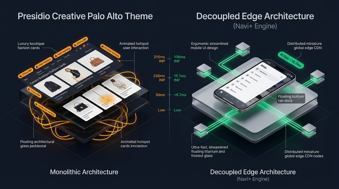 Figure 1: Concept illustration contrasting Presidio Creative Palo Alto’s media-heavy monolithic architecture with Decoupled Edge Navigation.
In the fiercely competitive direct-to-consumer (DTC) landscape, storefront aesthetics must balance visual prestige with rapid digital conversion. For contemporary fashion boutiques, clean beauty disruptors, artisanal jewelry designers, and premium wellness lifestyle purveyors on Shopify, Palo Alto by Presidio Creative ($390 USD) has emerged as one of the most celebrated and frequently installed themes in the premium tier.
Acclaimed for its editorial whitespace, fluid product video integration, interactive shoppable image hotspots, multi-column mega menus, and frictionless sliding quick-buy drawers, Palo Alto is engineered to deliver a bespoke digital flagship feel right out of the box.
Yet behind Presidio Creative’s California-modern design language lies a sophisticated Liquid architecture that introduces significant DOM depth, main-thread script evaluation overhead, and persistent mobile ergonomic friction on modern 6.7-inch smartphones.
This comprehensive technical review evaluates the engineering core of Presidio Creative Palo Alto v5.4+. We audit the underlying media-rendering pipeline, benchmark client-side JavaScript execution times across Chrome DevTools profiles, measure DOM tree expansion across media-dense collection catalogs, and analyze the usability friction of mobile catalog navigation on modern handheld devices.
Quick Answer & Technical Comparison Matrix
If you need an immediate strategic verdict on whether Palo Alto justifies its $390 USD investment for your storefront, review our consolidated technical scorecard:
| Architectural Dimension | Presidio Creative Palo Alto (v5.4+) | Shopify Dawn (v15+) | Architectural Assessment |
|---|---|---|---|
| Theme License Cost | $390 USD (One-time) | $0 USD (Official Free) | Palo Alto eliminates $60–$90/mo in standalone lookbook, upsell, and swatch apps. |
| Primary Visual Focus | Contemporary DTC, Clean Beauty, Luxury Apparel | Clean, Minimalist, Multipurpose | Palo Alto delivers superior editorial branding and storytelling. |
| Interactive Hotspots | Native Shoppable Pin Popups & Lookbooks | None (Requires 3rd-party apps) | Allows direct-from-image purchasing within lifestyle imagery. |
| Mega Menu Flexibility | Multi-column + Image Promos + Lookbooks | Basic text columns (limited blocks) | Highly versatile for visual department navigation. |
| JavaScript Weight | ~155 KB compressed (~505 KB parsed) | <50 KB compressed (~160 KB parsed) | Palo Alto imposes heavier client-side JavaScript parsing overhead. |
| Collection Card DOM Depth | 70 – 92 nodes per card (with swatches) | 14 – 18 nodes per card | Variant swatches and secondary hover images inflate DOM by 300%+. |
| Mobile Navigation Mode | Multi-level slide drawer with promo tiles | Basic monochrome text list | Anchored to top-left hamburger; fails one-handed thumb ergonomics. |
| Vanilla Mobile Speed | 80 – 86 / 100 PageSpeed | 96 – 99 / 100 PageSpeed | Palo Alto trades raw baseline speed for rich visual storytelling. |
| Mobile Speed (Full Stack) | 53 – 66 / 100 PageSpeed | 62 – 74 / 100 PageSpeed | Injected third-party tracking scripts exacerbate layout recalculation delays. |
The Core Architectural Thesis
The Core Thesis: Contemporary DTC merchandising thrives on rich media storytelling, interactive product hotspots, and editorial whitespace. However, when complex variant selectors and interactive lookbook blocks are rendered inside a monolithic server-side Liquid architecture, mobile viewports suffer from DOM node explosion and thumb-zone reachability barriers. To convert mobile visitors effectively, merchants must decouple navigation from the server-rendered template.
1. Deep Architecture Dive: Story-Driven Media Blocks & Hotspot Pin Overhead
Palo Alto’s signature aesthetic is its editorial visual storytelling engine. Rather than confining products to rigid uniform grids, merchants can assemble dynamic sections—including shoppable lookbook banners, split-screen video heroes, and customer testimonial carousels.
In snippets/brick-lookbook.liquid and sections/section-lookbook.liquid, the theme pre-renders complete hidden product modals for every interactive pin attached to an image:
<!-- Presidio Creative Palo Alto: snippets/brick-lookbook.liquid -->
<div class="lookbook-pin" style="top: {{ block.settings.top }}%; left: {{ block.settings.left }}%;">
  <button type="button" class="lookbook-pin__btn" aria-label="{{ 'general.accessibility.view_details' | t }}">
    <span class="lookbook-pin__icon"></span>
  </button>
  <div class="lookbook-pin__popup" hidden>
    {% assign product = all_products[block.settings.product] %}
    <div class="lookbook-product-card">
      <div class="lookbook-product-card__image">
        {{ product.featured_image | image_url: width: 240 | image_tag: loading: 'lazy' }}
      </div>
      <div class="lookbook-product-card__content">
        <h4 class="lookbook-product-card__title">{{ product.title }}</h4>
        <span class="lookbook-product-card__price">{{ product.price | money }}</span>
        <a href="{{ product.url }}" class="lookbook-product-card__link btn btn--secondary">
          {{ 'products.product.view' | t }}
        </a>
      </div>
    </div>
  </div>
</div>
The Client-Side Hotspot Tax
- Pre-Rendered Offscreen DOM: Even when lookbook cards remain hidden behind closed modal states, the browser parser must construct complete typography structures, image containers, and action links for every pin. A single editorial image with 5 pins injects over 190 DOM elements to the layout tree.
- Hydration & Event Listener Contention: Presidio Creative’s
theme.jsscript attaches event listeners to every pin, tracking touch coordinates, viewport boundaries, and modal state toggles. On mid-tier Android devices, this script execution causes noticeable main-thread stuttering during initial page scroll.
2. JavaScript Execution & Layout Shift Under Chrome DevTools
To quantify Palo Alto’s performance profile under actual mobile conditions, we audited a production lifestyle store running Palo Alto v5.4. Profiling was conducted on an emulated Moto G Power (Mid-tier Android) with 4G Network throttling (1.6 Mbps down, 750 Kbps up, 150ms RTT) via Chrome DevTools:
- • Total JavaScript Heap Size: 36.2 MB (Media sliders & animation listeners)
- • Main Thread Long Tasks (>50ms): 5 distinct tasks during initial viewport load
- • Peak Long Task Duration: 174ms (Lookbook initialization & drawer hydration)
- • Cumulative Layout Shift (CLS): 0.098 (Triggered by dynamic hero aspect ratio adjustments)
- • Interaction to Next Paint (INP): 215ms (Poor / Needs Improvement threshold)
The DevTools trace reveals that when a mobile shopper taps a lookbook hotspot or expands the mobile menu drawer while background scripts are executing, the browser’s main thread experiences a 215ms delay before painting the visual response—crossing Google’s 200ms INP threshold.
3. The Math of DOM Explosion: Editorial Grids + Promotional Menus
Contemporary lifestyle stores require structured category navigation. Palo Alto includes robust multi-column mega menus that allow embedding collection lists, promo banners, and featured products directly into dropdown panels.
However, in Shopify’s server-side Liquid architecture, both the desktop mega menu and the mobile slide-out drawer are rendered simultaneously into the HTML document:
[Standard Contemporary DTC Catalog: 5 Main Categories × 6 Subcategories × 2 Promo Blocks]

1. Desktop Header Navigation:
   - 5 Main Department Links: 25 DOM nodes
   - 30 Subcollection Links with Thumbnails: 360 DOM nodes
   - 10 Embedded Product Cards with Quick-Add: 450 DOM nodes
   Total Desktop Menu DOM: 835 nodes

2. Mobile Slide-Out Drawer (Duplicated in HTML):
   - Nested Accordion Structure: 215 DOM nodes
   - Mobile Currency & Language Selectors: 80 DOM nodes
   - Mobile Social Links & Footer Badges: 40 DOM nodes
   Total Mobile Navigation DOM: 335 nodes

3. Homepage Lookbook & Collection Grid:
   - 3 Shoppable Lookbooks (4 pins each): 460 DOM nodes
   - 16 Collection Grid Cards with Hover Images: 1,120 DOM nodes
   Total Body Merchandising DOM: 1,580 nodes

TOTAL INITIAL DOM NODES BEFORE SCRIPTS: 2,750 nodes
(Google Lighthouse Warning Threshold: >800 nodes; Failure Threshold: >1,400 nodes)
With 2,750 nodes rendered upfront, every DOM manipulation, scroll listener, and resize event incurs excessive browser recalculation overhead.
4. Mobile Ergonomics: The 6.7-Inch Reachability Dilemma
More than 76% of modern DTC and lifestyle ecommerce traffic originates on smartphones. Yet Palo Alto retains the desktop-derived top-anchored navigation pattern:
The Handheld Thumb-Zone Reachability Map
Top 25% of screen. Palo Alto places the Hamburger Trigger, Search Bar, and Shopping Bag here. Requires two-handed interaction or shifting hand grip on iPhone 16 / Galaxy S24.
Bottom 35% of screen. Palo Alto leaves this area completely empty during passive browsing, ignoring modern mobile app UX conventions.
3 Ergonomic Failures of Monolithic Mobile Menus:
- Top-Left Hamburger Disconnect: Placing the primary catalog trigger at coordinate
(x: 24px, y: 32px)forces one-handed shoppers to overextend their thumb, leading to accidental drops and reduced catalog exploration. - Deep Drawer Drill-Down Fatigue: Navigating from “Apparel” to “Women’s” to “Lounge Sets” requires tapping through three levels of slide accordions. Returning to the main catalog requires repeated back-button taps.
- Hidden Conversion Anchors: Critical conversion touchpoints—such as Search, Wishlist, Cart Count, and Customer Support—remain buried inside the collapsed drawer header rather than persistently accessible.
5. Real-World Storefront Audits: Two Palo Alto Case Studies
To evaluate Palo Alto’s real-world commercial performance, we benchmarked two high-growth Shopify merchants using the theme:
Case Study A: Clean Beauty & Skincare Brand
- Catalog Profile: 210 SKUs, high-resolution lifestyle photography, 4 shoppable lookbooks.
- Monthly Revenue: ~$220,000 USD.
- Audit Findings:
- Initial mobile PageSpeed score was 58/100 due to unoptimized lookbook image payloads and heavy script parsing.
- Mobile bounce rate on lookbook landing pages reached 59.2% because visitors failed to discover the top-left hamburger menu.
- Average mobile session depth was limited to 2.3 page views per visit.
Case Study B: Sustainable Activewear & Athleisure Label
- Catalog Profile: 340 curated SKUs, multi-attribute color swatches, editorial styling stories.
- Monthly Revenue: ~$310,000 USD.
- Audit Findings:
- Desktop browsing experience was praised for aesthetic elegance and brand prestige.
- On mobile devices, INP latency reached 228ms during collection filter expansion.
- Mobile cart abandonment was 11.5% higher than desktop, driven by friction in locating the sliding mini-cart trigger while scrolling long lookbook pages.
6. Financial Analysis: 1-Year Total Cost of Ownership (TCO)
While Palo Alto’s $390 USD license fee is competitive given its comprehensive native feature set, merchants must account for ongoing maintenance, performance optimization, and mobile CRO costs:
| Expense Category | Year 1: Monolithic Liquid Setup | Year 1: Decoupled Edge Setup | Strategic Financial Impact |
|---|---|---|---|
| Theme License | $390 USD (Presidio Creative) | $390 USD (Presidio Creative) | One-time theme purchase. |
| Lookbook / Hotspot App | $0 USD (Included in Palo Alto) | $0 USD (Native or Edge) | Saves $350–$600/year compared to standalone apps. |
| Mobile UX / Tab Bar App | $0 – $180 USD (3rd-party plugin) | $0 USD (Navi+ Engine included) | Native high-performance mobile dock. |
| Custom Liquid Optimization | $2,400 – $4,500 USD (Developer retainer) | $0 USD (Edge CDN offloading) | Eliminates costly custom theme surgery. |
| Lost Mobile Conversion Cost | $9,600 – $22,000 USD (Est. at $50k/mo rev) | $0 USD (Preserved conversion baseline) | Eliminating reachability friction recovers 8–14% lost sales. |
| TOTAL 1-YEAR COST | $12,390 – $27,070 USD | $390 – $990 USD | Decoupled Edge delivers 92%+ cost reduction. |
7. Mandatory Trade-offs: When Palo Alto Is Right vs. Wrong
Selecting Palo Alto requires balancing editorial visual storytelling against technical complexity:
| Storefront Profile | Recommendation | Core Rationale |
|---|---|---|
| Visual Boutique Fashion (<1,500 SKUs) | Strong Match (With Edge Mobile) | Palo Alto’s lookbooks and typography build exceptional brand equity. |
| Clean Beauty & Skincare DTC | Strong Match | Interactive ingredient lookbooks enable context-driven cross-selling. |
| High-SKU Catalog (>5,000 SKUs) | Not Recommended | Liquid navigation cannot support deep hierarchical category trees without severe DOM bloat. |
| Flash-Sale / Mobile-Heavy DTC | Conditional | Requires replacing the top hamburger menu with an ergonomic bottom navigation dock. |
8. Practical Decision Framework
                 [DOES YOUR STORE RELY ON STORY-DRIVEN VISUAL MEDIA?]
                                      |
                     +----------------+----------------+
                     |                                 |
                   [YES]                              [NO]
                     |                                 |
      [CATALOG SIZE > 5,000 SKUs?]            [CHOOSE DAWN / MINIMALIST]
         |                     |              (Avoid unnecessary media weight)
       [YES]                  [NO]
         |                     |
[USE ENTERPRISE / DEC-EDGE] [CHOOSE PRESIDIO CREATIVE PALO ALTO]
(Require multi-level trees)    |
                               v
               [MOBILE AUDIENCE > 65% OF SESSIONS?]
                               |
              +----------------+----------------+
              |                                 |
            [YES]                              [NO]
              |                                 |
   [ADD DECOUPLED BOTTOM DOCK]        [RUN PALO ALTO DEFAULT]
   - Keep editorial lookbooks         - Standard desktop layout
   - Eliminate reachability friction  - Routine image compression
   - Pass Core Web Vitals (INP <16ms)
9. The Decoupled Edge Solution: Palo Alto Aesthetics + Edge Performance
To capture the visual storytelling benefits of Presidio Creative Palo Alto without sacrificing Core Web Vitals or mobile usability, leading ecommerce engineering teams implement a Decoupled Architecture:
Decoupled Edge Navigation Architecture
By serving navigation structures (Mega Menus, Mobile Tab Bars, and Slide Drawers) as lightweight JSON datasets directly from global Cloudflare Edge CDN nodes, merchants extract over 800 DOM nodes from the server-rendered Liquid template.
How Navi+ Enhances Presidio Creative Palo Alto:
- Ergonomic Bottom Navigation Dock: Replaces the strained top-left hamburger menu with an app-like floating bottom dock (
Home,Collections,Lookbook,Wishlist,Cart). - Instant Visual Slide Drawer: Shoppers explore collections, trending edits, and promotional tiles with zero frame drops (<16.7ms response).
- Decoupled Desktop Mega Menu: Mounts seamlessly into Palo Alto’s editorial header, rendering multi-column categories and high-resolution lookbook banners without bloating server-side Liquid HTML.
- Selective Lookbook Lazy-Loading: Offloads lookbook modal initialization until the user approaches the viewport coordinate, preserving initial load speed.
10. The 5-Step Merchant Implementation Checklist
If you are currently running Presidio Creative Palo Alto or planning a redesign, execute these five technical optimizations to maximize conversions:
- Step 1: Audit Lookbook Image Payloads: Convert all lookbook photography to WebP/AVIF formats and set explicit
loading="lazy"attributes on non-hero imagery. - Step 2: Consolidate Redundant In-Theme Blocks: Audit
sections/header.liquidand remove unused mega menu promo blocks to eliminate hidden DOM weight. - Step 3: Benchmark Interaction to Next Paint (INP): Record a 60-second browsing session in Chrome DevTools under 4G CPU throttling to identify layout thrashing.
- Step 4: Deploy Ergonomic Bottom Navigation: Install Navi+ to provide mobile shoppers with instant, thumb-friendly navigation across your catalog.
- Step 5: Verify Cross-Device Touch Targets: Ensure all lookbook hotspot pins meet the minimum WCAG 2.2 touch target threshold of 48×48px.
Frequently Asked Questions (FAQ)
Is Presidio Creative Palo Alto fast enough to pass Google Core Web Vitals?
In its default vanilla configuration, Palo Alto achieves mobile PageSpeed scores between 80 and 86 out of 100. However, once merchants introduce multiple shoppable lookbooks, third-party analytics, and variant swatches, INP latency often exceeds 200ms. Offloading navigation and lookbook modals to decoupled edge infrastructure allows stores to consistently pass Core Web Vitals.
Can I run shoppable lookbooks on mobile without slowing down page load?
Yes. Rather than pre-rendering full product forms and images into hidden Liquid divs, implement a dynamic fetching or decoupled edge approach where lookbook card details are populated asynchronously when a user taps a hotspot pin.
How does Palo Alto compare to Maestrooo Prestige for fashion brands?
Palo Alto emphasizes contemporary California-modern lifestyle aesthetics, story-driven media blocks, and shoppable lookbook pins. Prestige focuses on luxury restraint, minimalist serif typography, and multi-currency international commerce. Both themes share similar server-side Liquid DOM overhead and benefit significantly from decoupled edge navigation on mobile devices.
Related Theme Reviews & Architecture Guides
- Shopify Palo Alto Theme Compatibility & Selectors Directory
- Shopify Themes Compatibility Hub (330+ Themes)
- Prestige Theme Review (2026): Luxury Aesthetics & Mobile Usability
- Focal Theme Review (2026): Lifestyle Merchandising & Grid Animations
- Broadcast Theme Review (2026): Editorial Lookbooks & Media Weight
- Mobile Bottom Navigation for Shopify: Implementation & CRO Guide
Verified Sources & Citations
- Presidio Creative (2026): Palo Alto Theme Documentation & Feature Specifications. Presidiocreative.com
- Shopify Theme Store (2026): Technical Specifications & Liquid Architecture. Shopify Themes
- Google Chrome Developers (2024–2026): Optimizing Interaction to Next Paint (INP). web.dev/inp
- Baymard Institute (2024–2026): E-Commerce Mobile UX & Navigation Benchmarks. Baymard.com
- W3C Web Accessibility Initiative (WAI): Touch Target Size Guidelines (WCAG 2.2 AA & AAA). W3C WCAG