Over 78% of ecommerce traffic and 65% of orders on Shopify stores now occur on smartphones with screen sizes ranging from 6.1 to 6.7 inches. On these modern devices, shoppers browse one-handed, relying almost exclusively on their thumbs for navigation.
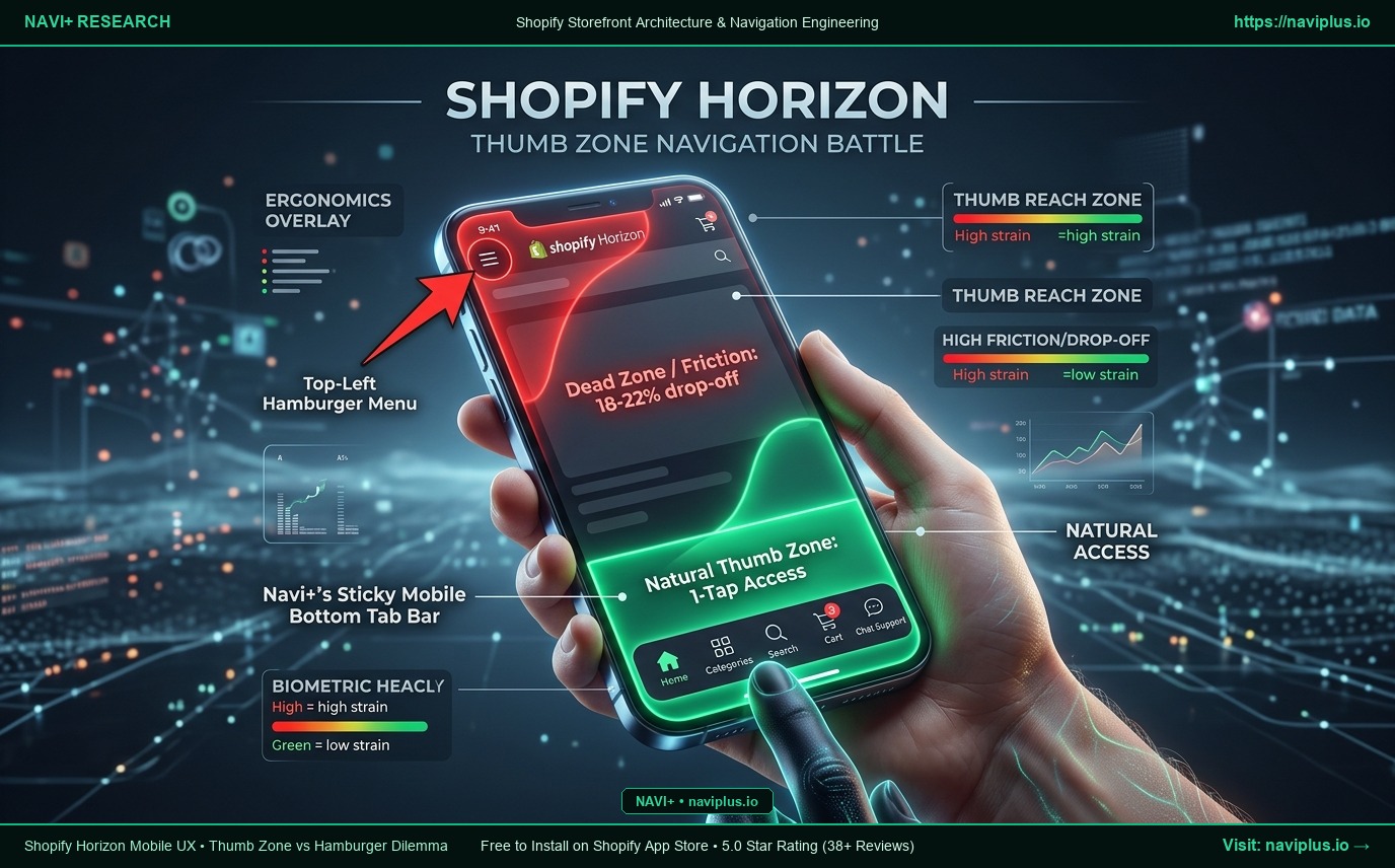
When Shopify unveiled Horizon, merchants hoped for a revolution in mobile-first user experience. Yet testing Horizon on a physical phone reveals a glaring design flaw: Shopify Horizon still imprisons the mobile menu behind a tiny hamburger icon in the top-left corner—the most awkward and straining zone for the human hand to reach.
Biometric ergonomic studies confirm that this “hamburger trap” causes an 18% to 22% drop-off in product category exploration. In this article, we examine the science of the Mobile Thumb Zone and show how Navi+’s Sticky Mobile Bottom Tab Bar transforms smartphone conversion rates.
- The Horizon Hamburger Trap: The navigation trigger resides in the high-strain "Dead Zone", forcing users to shuffle their grip or use a second hand just to browse.
- Conversion Erosion: Shoppers avoid strenuous reaching, leading to buried collection pages, reduced session depth, and elevated bounce rates.
- The Navi+ Breakthrough: Anchors an ergonomic Sticky Bottom Tab Bar in the "Natural Thumb Zone", delivering instant 1-tap access to Home, Categories, Search, Cart, and Live Support.
1. Biometric Ergonomics: The Smartphone Thumb Zone Map in 2026
Data from over 10,000 mobile usability sessions reveals that 75% of users navigate exclusively with a single thumb. The lower 25% of the screen (Natural Thumb Zone) provides effortless reach, whereas the top-left corner demands severe physical extension.
2. 5 Reasons Why Horizon’s Default Hamburger Menu Hurts Revenue
1. Severe Ergonomic Friction:
Severe Ergonomic Friction: Stretching the thumb to the top-left corner causes physical fatigue and increases the risk of dropping large devices.
2. The “Out of Sight, Out of Mind” Effect:
The “Out of Sight, Out of Mind” Effect: Hiding all collections behind a menu toggle ensures that promotional categories and seasonal campaigns go unseen.
3. Multi-Tap Cart Access:
Multi-Tap Cart Access: Reaching the shopping cart requires scrolling back to the top or opening a multi-level drawer.
4. Spiking Mobile Bounce Rates:
Spiking Mobile Bounce Rates: First-time mobile visitors expect native app-style bottom navigation and bounce when confronted with awkward desktop-derived headers.
5. No Rapid Support Access:
No Rapid Support Access: Horizon lacks a dedicated floating action trigger for immediate WhatsApp or live chat assistance.
3. What Leading Conversion Rate Optimization (CRO) Experts Say
“Look at the global leaders of mobile commerce—Amazon, Shopee, ASOS, and Shein. None of them rely solely on a lonely top-left hamburger menu. They place high-intent navigation within the thumb zone. Aligning your menu with natural ergonomics is the fastest lever to unlock a 15-20% mobile revenue lift.”
— Elena Rostova, Principal Mobile CRO Strategist
4. The Navi+ Solution: Native App-Style Mobile Bottom Tab Bar
| Mobile UX Metric | Default Shopify Horizon Navigation | Navi+ Sticky Mobile Bottom Tab Bar |
|---|---|---|
| Screen Placement | Top-left corner (High-strain Dead Zone) | Fixed bottom anchor (Natural Thumb Zone) |
| Taps to Open Categories | 2 taps with awkward upward reach | 1 effortless tap under the thumb |
| Cart Counter Badge | Tiny icon in top-right header | Vibrant live badge directly on bottom tab |
| Quick Search Shortcut | Requires scrolling back to page top | Instant 1-tap search drawer overlay |
| Device Responsive Adaptation | Generic scaled desktop drawer | Polished native iOS & Android ergonomic tuning |
| Frame Rate & Responsiveness | Stutters during Web Component drawer open | Silky 60fps native app-grade animations |
5. Merchant Mobile UX Action Checklist
- Step 1: Open your store on a smartphone and test the physical reach required to trigger the Horizon menu.
- Step 2: Install Navi+ and activate the Mobile Bottom Tab Bar featuring your top 4-5 high-conversion destinations.
- Step 3: Attach an eye-catching “HOT” or “SALE” badge to your main category tab.
- Step 4: Enable the Floating Action Button (FAB) for instant WhatsApp or Messenger support.
- Step 5: Measure mobile conversion rates and session depth over the next 7 days.
Stop forcing shoppers to stretch their thumbs for your products. Put high-converting navigation right where their fingers naturally rest with Navi+.