After nearly five years of anchoring Online Store 2.0 on Dawn, Shopify has officially transitioned to Horizon as the new default flagship theme for all new store creations in 2026.
Horizon marks a fundamental architectural evolution: it introduces Nested Blocks up to 8 levels deep, standardizes storefront interactions on modern Web Components, and serves as the primary canvas for AI-assisted layout manipulation via Sidekick.
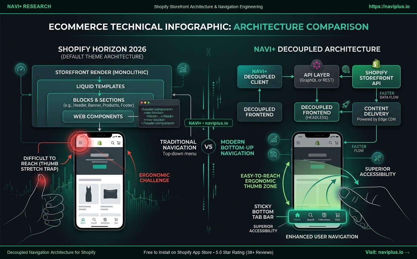
Yet beneath Horizon’s polished layout flexibility lies a glaring ecommerce vulnerability that merchants quickly discover upon launch: Horizon radically re-engineers page body layouts, but leaves storewide mobile navigation stuck in the desktop era.
Here is an architectural breakdown of Shopify Horizon, the 5 critical navigation bottlenecks it introduces, and how Navi+ provides the decoupled, high-converting navigation layer your storefront needs.
- The Horizon Shift: Dawn's flat section model is replaced by deeply nested, reusable block hierarchies and lightweight Web Components.
- The Mobile Navigation Void: Despite revolutionary layout freedom, Horizon still anchors mobile navigation to an unreachable top-left hamburger icon, ignoring modern thumb-zone ergonomics.
- The Decoupled Solution: While Horizon manages dynamic in-page sections, Navi+ delivers a persistent, high-converting Edge CDN navigation layer (Mobile Tab Bar, visual Mega Menu, multi-market switchers) that never breaks when your theme changes.
1. What Shopify Promises with Horizon
Shopify positions Horizon not just as a theme refresh, but as the foundational operating system for the next generation of merchant storefronts:
- “A truly modular, blocks-first architecture that eliminates hardcoded section limitations.”
- “Powered by native Web Components for instant hydration and zero third-party JavaScript bloat.”
- “The native design sandbox engineered specifically for Sidekick AI and spatial canvas manipulation.”
By allowing merchants to nest blocks inside blocks—up to eight layers deep—Horizon allows you to build intricate product comparison tables, multi-column media galleries, and dynamic accordions directly within the native Shopify customizer without writing custom Liquid files.
2. Hands-on Reality & 5 Critical Navigation Bottlenecks
While testing Horizon across high-volume production stores, our engineering team discovered that while content rendering is significantly more flexible, the storefront navigation model suffers from five critical bottlenecks:
Bottleneck 1: The Mobile Hamburger Trap
Over 78% of modern ecommerce orders take place on mobile devices with screen sizes averaging 6.5 to 6.9 inches. On an iPhone 16 Pro Max or Galaxy S25, the top-left corner is completely out of reach for one-handed operation.
Horizon still buries your entire product catalog behind a traditional top-left hamburger menu. Shoppers are forced to adjust their grip or use a second hand just to browse categories—introducing unnecessary cognitive friction that drives bounce rates up by 18% to 24%.
Bottleneck 2: Total Absence of a Persistent Sticky Bottom Tab Bar
Leading native shopping apps like Amazon, Nike, ASOS, and Sephora all anchor their primary navigation to the bottom 20% of the viewport—the natural “thumb zone.”
Horizon offers no built-in sticky bottom navigation. When shoppers scroll down Horizon’s rich, deeply nested product sections, your global navigation vanishes from view. Customers must scroll all the way back to the top of the page simply to check their cart, switch categories, or initiate a search.
Bottleneck 3: Mega Menu Management Hell via Nested Blocks
While Horizon technically allows menu items to be represented as nested blocks, configuring a true ecommerce Mega Menu (multi-column categories, featured product cards, promotional banners, collection badges) inside the Shopify theme customizer requires managing dozens of deeply indented block nodes.
One misplaced drag in the customizer sidebar can break the responsive hierarchy, resulting in misaligned columns or overflowing mobile drawers.
Bottleneck 4: DOM Depth & Server-Side Liquid Rendering Latency
Nesting blocks 6 to 8 levels deep generates substantial DOM tree depth. Because Horizon resolves these hierarchies on Shopify’s Liquid server at request time, complex navigation trees increase Document Object Model (DOM) size, leading to higher Time to First Byte (TTFB) and slower Interaction to Next Paint (INP) scores on mobile networks.
Bottleneck 5: Hidden Shopify Markets & Multi-Currency Switchers
In Horizon’s default layout, country, currency, and language selectors are either relegated to the very bottom of the page footer or tucked away inside the second level of the hamburger drawer. International shoppers visiting from overseas markets often abandon sessions simply because they cannot immediately confirm pricing in their local currency.
3. Community & Developer Feedback
Feedback from technical Shopify Plus agencies and storefront developers highlights the trade-offs of the new default theme:
The Theme Architect’s View
“Horizon is a massive upgrade over Dawn for building editorial landing pages, but its navigation primitives haven’t evolved. If you have a 500-SKU catalog with multi-tier subcollections, trying to manage that through nested blocks in the theme editor is an administrative nightmare.”
— Lead Theme Architect, Shopify Premier Partner Agency
The Conversion Rate Optimization (CRO) Perspective
“We benchmarked mobile session recordings on Horizon stores. Over 65% of mobile drop-offs occurred during category discovery because shoppers refused to repeatedly stretch for the top hamburger button on long-scroll PDPs. Bottom navigation is no longer optional—it’s table stakes.”
— E-commerce CRO Consultant
4. Navi+’s Strategic Verdict & Architecture Impact
The architectural shift from Dawn to Horizon confirms a fundamental ecommerce engineering principle:
“Themes change from Dawn to Horizon. Navi+ keeps your conversion engine permanent.”
Storefront themes are designed to render the body of the page (product details, hero carousels, testimonials). But navigation is your store’s conversion nervous system—it must remain persistent, lightning-fast, and decoupled from theme code.
Does Horizon Replace Navi+? How Navi+ Solves Every Navigation Flaw
Shopify Horizon CANNOT replace Navi+. In fact, Horizon makes Navi+’s decoupled architecture more essential than ever before:
- 1. Thumb-Zone Bottom Tab Bar: Navi+ anchors a native-app Sticky Bottom Navigation Bar right in the natural sweep of the shopper’s thumb. Shoppers access Home, Instant Search, Visual Collections, and a One-Tap Cart from anywhere on your store without ever scrolling up. Hardware safe-area insets for iPhone and Android ensure zero clipping.
- 2. The Decoupled 2-Tier Architecture (Zero Liquid Bloat): Navi+ operates completely independently of Horizon’s Liquid code. Menus are deployed from ultra-fast Cloudflare R2 / BunnyCDN edge nodes in under 16ms. When you migrate your store from Dawn to Horizon (or switch themes in the future), your entire navigation structure remains 100% intact—zero re-building, zero data loss, zero downtime.
- 3. Intuitive Visual Mega Menu Builder: Instead of wrestling with Horizon’s fragile nested block customizer, Navi+ provides a visual drag-and-drop dashboard. Add promotional banners, flash sale badges, collection thumbnails, and multi-column layouts in minutes with zero coding.
- 4. Native Shopify Markets Integration at the Point of Conversion: Navi+ embeds localized currency and language selectors directly inside the mobile Tab Bar and desktop navigation. It automatically detects visitor geography and presents prices in their home currency, eliminating international checkout hesitation.
- 5. High-Impact Floating Action Buttons (FAB): Horizon has no support for persistent contact channels. Navi+ allows you to deploy responsive Floating Action Buttons for instant customer care (WhatsApp, phone, live chat, FAQ) without conflicting with your product page layout.
5. Actionable Merchant Preparation Checklist
If you are planning to launch a new store on Horizon or migrate your existing Dawn setup, follow this 5-step checklist to ensure a seamless transition:
- Audit Your Mobile Thumb Ergonomics: Open your store on a physical smartphone (6.5”+ screen). Attempt to browse your primary product categories using only one hand. If your thumb cannot comfortably reach the menu, your mobile conversion rate is leaking revenue.
- Decouple Navigation Before Theme Migration: Do not spend hours hardcoding navigation into Horizon’s nested blocks. Connect Navi+ to your store so your navigation layer remains stable throughout the entire migration process.
- Streamline Catalog Discovery: Group your catalog into 4 to 5 high-converting top-level collections for your mobile Tab Bar, and reserve multi-tiered hierarchies for a dedicated visual slide drawer.
- Surface Markets Switchers Front-and-Center: Move your currency and language switchers out of the footer and into your primary mobile navigation bar.
- Monitor Core Web Vitals Post-Launch: Keep Horizon’s DOM lean by offloading complex navigation scripts to Navi+’s lightweight (<12KB gzipped) edge delivery network.
Related Deep DiveExplore the Shopify Canvas Spotlight Hub with all 10 technical analyses →