Quick Answer
For fashion stores with over 1,000 SKUs, treating on-site search as the primary discovery mechanism often increases session abandonment. Apparel shoppers rarely begin with exact keywords; they browse with ambiguous intent (e.g., “vacation linen shirts” or “workout gear”).
High-performing stores resolve this by pairing activity-based categorization with visual sub-navigation and mobile bottom access. However, this approach introduces distinct trade-offs: smaller catalogs (<100 SKUs) and stores selling technical replacement parts should avoid complex visual hierarchies in favor of direct search and streamlined lists.
The Core Thesis
Fashion ecommerce is primarily a visual browsing and recognition problem before it ever becomes a text query problem.
1. Why Large Catalog Navigation Breaks on Standard Themes
Standard navigation structures with simple dropdowns typically perform well when a catalog is small and tightly curated. In those scenarios, top-level navigation requires minimal cognitive effort to scan.
When inventory scales past 500 or 1,000 SKUs across varied sizing, materials, and seasonal drops, standard theme navigation encounters two common structural failure modes:
- The Overloaded Flat List: Grouping 40+ collection links into a single vertical dropdown menu, which induces decision paralysis.
- The Deeply Buried Sub-Hierarchy: Hiding seasonal lines three or four taps deep behind generic labels like “Catalog” or “Collections,” causing shoppers to lose context.
On mobile viewports, where screen space is constrained, these structures force repeated expanding, collapsing, and scrolling. If a shopper cannot quickly verify whether a store carries their intended style, they typically exit rather than attempt alternative queries.
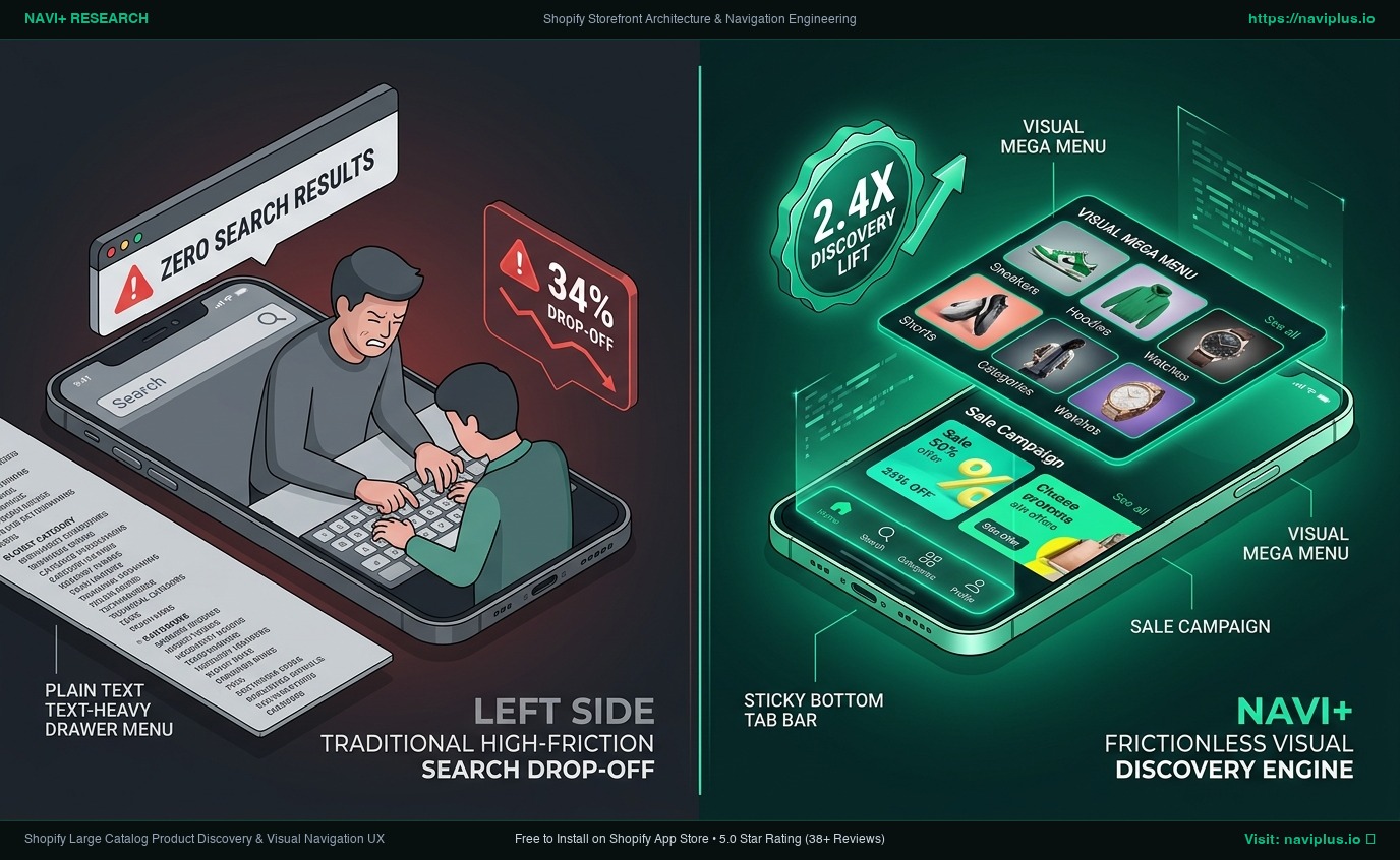 Figure 1: Concept illustration of a three-tier information architecture designed for high-SKU catalog browsing.
2. What Usability Research Reveals About Browsing vs. Search
The Recognition vs. Recall Disconnect
Human-computer interaction research published by the Nielsen Norman Group highlights that recognition is cognitively easier than recall. In fashion shopping, customers readily recognize what they want when scanning thumbnails or category chips, but struggle to formulate exact keyword phrases into a search input.
Navigation Depth and Mobile Abandonment
Usability benchmarks from the Baymard Institute show that nested sub-category paths that require excessive tapping without visual reassurance consistently lead to orientation loss. When mobile users are forced to backtrack repeatedly through nested accordion drawers to explore adjacent departments, navigation fatigue sets in.
The Role of Search
While site search typically converts at a higher rate per user session, analytics across ecommerce platforms consistently indicate that the vast majority of visitors begin their session by browsing category pathways. Search is an accelerator for high-intent buyers, but navigation carries the burden of initial exploration.
3. Real Store Observations: How High-Growth Brands Structure Discovery
To evaluate how large-catalog fashion merchants handle this balance, we reviewed the live mobile and desktop storefronts of several prominent direct-to-consumer (D2C) brands:
Gymshark (Shopify Plus)
- Primary Observation: On mobile and desktop, Gymshark categorizes navigation primarily by user activity (“Lifting”, “Running”, “Rest Day”) rather than strictly by garment type (e.g., T-Shirts, Shorts).
- Mobile Interaction Pattern: Within category pages, they employ horizontal scrolling chips near the top of the viewport for rapid sub-filtering, paired with a sliding bottom-sheet filter menu that maintains page context.
- Why It Matters: Shoppers shopping for specific athletic pursuits can isolate relevant styles in a single tap without navigating multi-tiered generic dropdowns.
Allbirds (Shopify Plus)
- Primary Observation: Allbirds structures its desktop Mega Menu around proprietary sustainable materials (Tree, Wool, Sugar) alongside visual product thumbnails.
- Mobile Interaction Pattern: On mobile screens, department categories are exposed through clean, persistent segment controls.
- Why It Matters: It leverages the brand’s core selling proposition directly within the navigation hierarchy rather than relegating it to promotional banners.
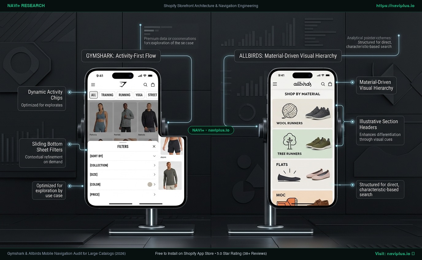 Figure 2: Real-world storefront observation comparing activity-first filtering (Gymshark) and material-led categorization (Allbirds).
4. Where These Patterns Agree and Where They Diverge
Across the stores reviewed, several consistent design patterns emerge:
- Visual anchors: High-SKU stores routinely supplement text links with category chips, badges, or miniature imagery.
- Context preservation: Mobile filters increasingly slide up from the bottom rather than navigating away to full-page filter screens.
However, their organizational approaches diverge based on brand positioning:
- Gymshark organizes by User Intent / Activity.
- Allbirds organizes by Material & Product Silhouette.
- Fast-fashion retailers (such as ASOS) organize primarily by Trend, Gender, and Garment Taxonomy.
There is no universal taxonomy; navigation hierarchy must reflect how your specific customer segment mentally categorizes your products.
5. Trade-Offs: When This Advice Works (And When It Does Not)
Implementing deep visual navigation and multi-column mega menus is not a universal best practice. Merchants must evaluate specific trade-offs:
When Visual Mega Menus & Multi-Tier Navigation Work Best:
- Broad catalogs (>500 SKUs): Multiple departments, seasonal lines, and varied lifestyle collections.
- Apparel, beauty, and lifestyle categories: Where visual presentation, styling, and aesthetic browsing drive decision-making.
- Stores with significant mobile traffic: Where reducing tap depth and preserving browsing context directly improves engagement.
When You Should NOT Use This Approach:
- Small or focused catalogs (<100 SKUs): Introducing multi-column mega menus or sticky category pills on a focused boutique store adds visual clutter and cognitive overhead without providing discovery benefit.
- Technical, B2B, or Replacement Part Stores: In industries where shoppers purchase by exact model number, part code, or technical specifications, visual lookbooks are counterproductive. In these stores, robust faceted search and autocomplete query bars must take priority.
- Single-Product or Funnel Stores: Direct landing pages designed around a single hero offer require minimal navigation to avoid funnel leakage.
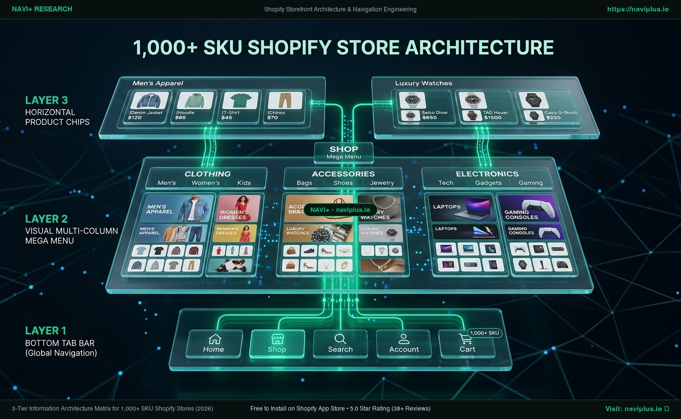 Figure 3: Concept illustration outlining the three structural layers of a scalable catalog hierarchy.
6. Practical Decision Framework for Shopify Merchants
To determine the appropriate navigation architecture for your store, consider this decision matrix:
| Catalog Size & Type | Recommended Navigation Model | Search Strategy | Mobile Priority |
|---|---|---|---|
| < 100 SKUs (Boutique) | Clean single-tier menu (max 5-7 links) | Standard header search | Standard responsive header |
| 100 – 500 SKUs (Growing) | 2-level dropdown with horizontal collection pills | Autocomplete keyword search | Sticky category pills on PLP |
| 500 – 2,000+ SKUs (Fashion/D2C) | Multi-column Visual Mega Menu + Lifestyle taxonomy | Faceted search + visual suggested results | Sticky Bottom Tab Bar + Bottom-sheet filters |
| Technical / B2B Catalog | Strict functional taxonomy (Brand > Model) | Part number / SKU search bar (prominent) | Compact drawer + Faceted filter drawers |
7. Where Navi+ Fits (And Its Limitations)
Navi+ was developed to address a specific technical constraint within Shopify’s default architecture: standard Shopify Admin navigation limits menus to 3 levels of nesting and standard theme rendering ties menu performance directly to server-side Liquid execution.
Where Navi+ Helps:
- Decoupled Edge Delivery: Navi+ distributes navigation data as static JSON via Cloudflare Edge CDN, allowing high-SKU stores to render rich visual mega menus and mobile bottom tab bars without increasing server load.
- Theme Independence: Menu structures remain fully preserved when switching or updating Shopify themes.
Limitations to Consider:
- Navi+ is designed for browsing navigation and category exploration. It does not replace an enterprise search engine (such as Algolia or Shopify Search & Discovery) for full-text keyword indexing.
- For stores with fewer than 50 products, default theme navigation is often entirely sufficient and does not warrant adding a third-party navigation app.
8. Action Checklist for Optimizing Large Catalog Stores
- Step 1: Review your Google Analytics 4 (GA4) search metrics to identify what percentage of revenue originates from direct search vs. collection browsing.
- Step 2: Audit your internal taxonomy; eliminate duplicate collection tags, reduce unnecessary nesting depth, and ensure every category level provides strong information scent.
- Step 3: Evaluate whether an activity-based, material-based, or garment-based taxonomy best aligns with how your customers search.
- Step 4: On mobile, verify whether filters and sub-categories are accessible without requiring customers to scroll all the way back to the top header.
- Step 5: If your store exceeds 500 SKUs, test introducing visual category thumbnails and bottom-anchored mobile navigation.
Sources & Evidence Citations
- Nielsen Norman Group: Recognition vs. Recall in UX — Analysis of cognitive load in interface navigation (
nngroup.com). - Baymard Institute: Mobile Ecommerce Navigation Benchmarks — Usability research on nested category drill-downs and backtracking friction (
baymard.com). - Shopify Help Center: Menus and Links Documentation — Specifications on Shopify Admin nesting hierarchy limits (
help.shopify.com). - Live Store Audits: Storefront observations conducted on mobile and desktop viewports for Gymshark (
gymshark.com) and Allbirds (allbirds.com), inspected October 2026.