

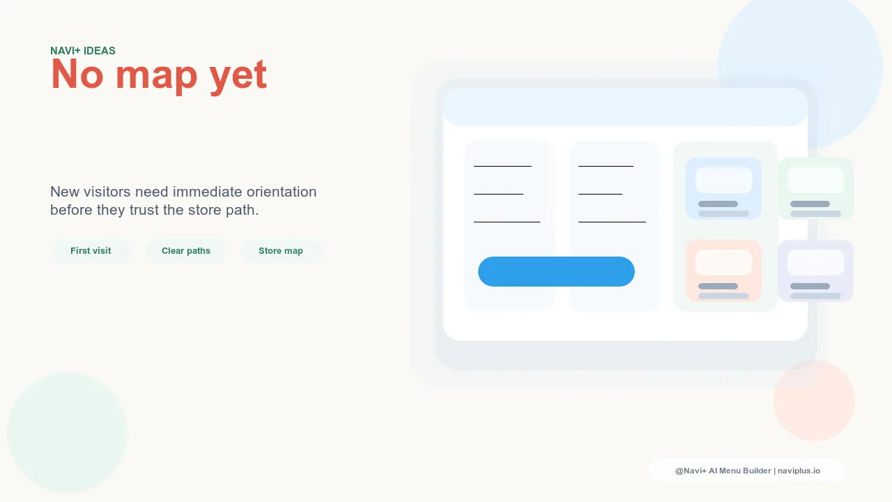
The New Visitor's Orientation Problem
Every first-time visitor to your store arrives with the same fundamental disadvantage: no knowledge of your catalog structure, your product naming conventions, or how you've organized what you sell. They don't know if you use industry terminology or customer-friendly language in your categories. They don't know how deep your catalog goes or whether the product type they're looking for falls under one category label or another.
Experienced users of any system navigate by memory — they know where things are because they've been there before. New users navigate by inference — they read labels, make guesses, click, and adjust based on what they find. The quality of their experience depends entirely on how well the navigation labels match their mental model and how quickly they can build a workable map of the store's structure.
Most e-commerce navigation is designed by people who know the catalog deeply — store owners, product managers, developers. This creates a systematic blind spot: the labels that make sense to people who know the catalog are not always the labels that make sense to people who don't. When an expert designs navigation for an expert, new visitors pay the price in confusion and abandonment.
"We realized our category names made perfect sense to us and almost none to new visitors when we ran user testing. 'Basics,' 'Essentials,' and 'Foundation' were three separate sections with overlapping products — internally they made sense as tiers, but new visitors couldn't tell them apart. We merged and renamed them based on customer language from our support emails. New visitor engagement with navigation increased noticeably within a week."
— A Navi+ customer, skincare brand
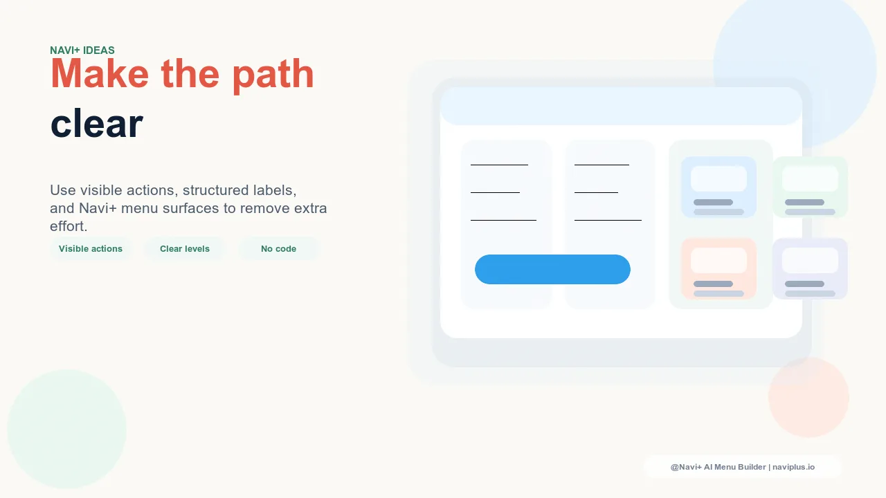
What New Visitor-Friendly Navigation Looks Like
Navigation that serves new visitors well has several characteristics that differ from navigation optimized for returning customers:
Unambiguous category labels. New visitor navigation prioritizes descriptive clarity over brevity. "Men's Outerwear" is better for a new visitor than "Outerwear" (which gender?). "Skincare for Dry Skin" is better than "Hydration Collection" (what is it?). The extra words cost nothing in space on a modern mobile menu and save the new visitor a navigation dead end.
A clear starting point. New visitors often don't know which category to start with. Navigation that includes an orientation path — "Start Here," "Bestsellers," "New to the brand?" — gives indecisive visitors a low-friction entry point rather than forcing a category choice they're not ready to make. This is especially valuable for stores with complex or deeply segmented catalogs.
Visual breadcrumbs and context cues. New visitors benefit more from navigational context than returning visitors. Breadcrumb navigation — showing the path taken to reach the current page — helps new visitors understand where they are in the catalog and how to navigate back to explore other sections. Stores that suppress breadcrumbs to reduce visual clutter remove the one wayfinding aid most useful to the visitors most likely to get lost.
Quick access to the most common entry categories. Analytics will show you which categories first-time visitors most commonly enter through organic search, social, and paid traffic. These are the categories your new visitors are looking for — and they should be the most prominent categories in your navigation, not buried under internal taxonomy logic.
Testing Navigation for New Visitors
The most direct way to test whether your navigation works for new visitors is to watch someone who has never seen your store try to find a specific product using only the navigation. Don't give them any instructions other than the product they're looking for. Watch where they hesitate, where they backtrack, and where they give up. The hesitations and backtracks are your navigation's failure points.
Short of live user testing, your analytics provide a reasonable proxy. Bounce rate by entry page is the most useful metric — a high bounce rate on pages where navigation is the primary wayfinding tool suggests the navigation isn't giving new visitors a clear enough path forward. High exit rates from navigation-heavy pages (category pages, the homepage) similarly indicate orientation failure.
| Navigation Feature | For New Visitors | For Returning Visitors |
|---|---|---|
| Descriptive category labels | Critical — reduces guessing | Less necessary — already know locations |
| "Start Here" or bestseller entry point | High value — reduces decision paralysis | Low value — know where to go already |
| Breadcrumb navigation | High value — builds mental map | Moderate value — confirms location |
| Deep catalog access in Slide Menu (Navi+) | Lower value initially | High value — exploring full range |
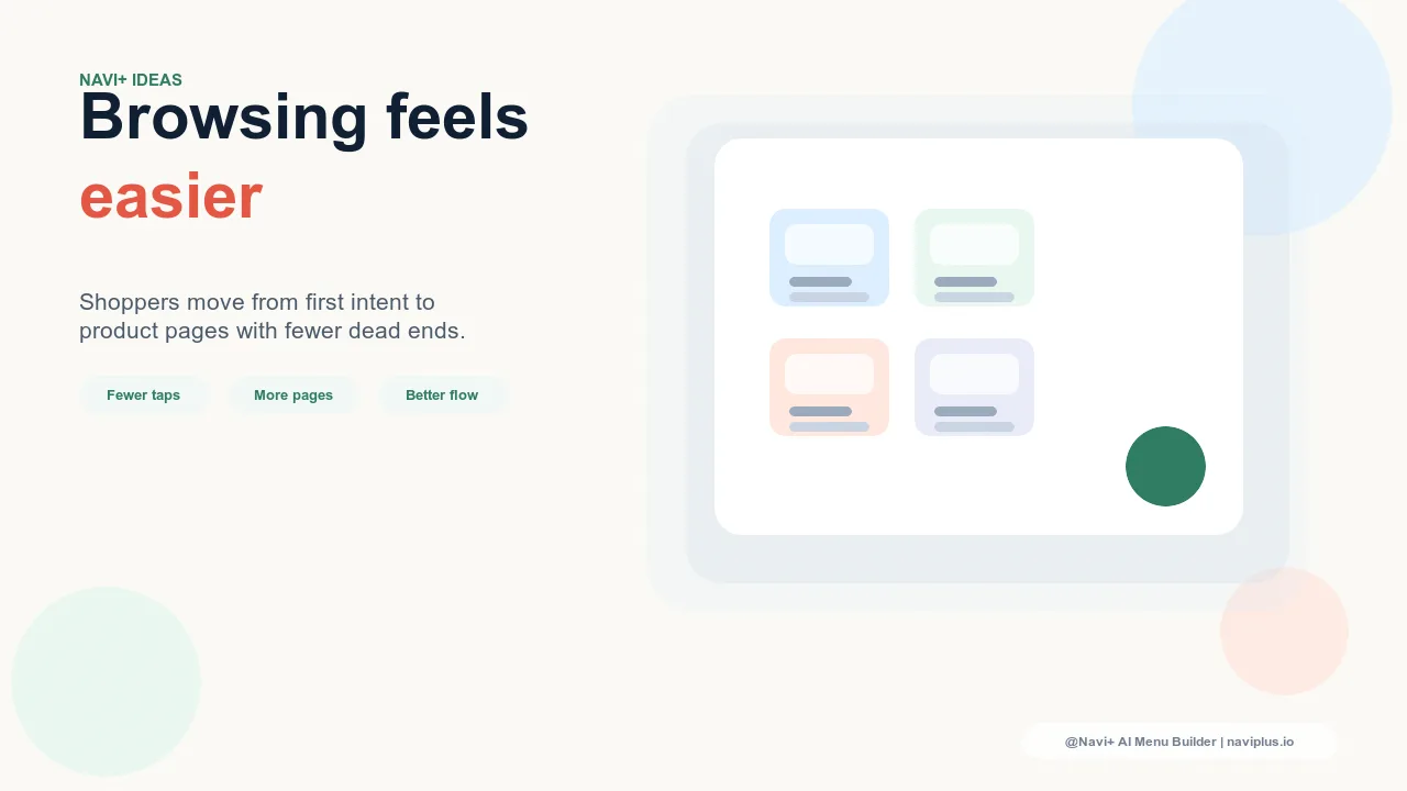
Balancing New and Returning Visitor Needs
The most effective navigation serves both new and returning visitors well without sacrificing one for the other. The Tab Bar handles this elegantly: its five slots can include both orientation-friendly destinations (Bestsellers, New Arrivals, Search) and deep-catalog access (Shop All categories, Slide Menu trigger). New visitors use the high-level slots; returning visitors who know what they want use search or navigate directly.
Navi+ allows the Tab Bar, Mega Menu, and Slide Menu to be configured independently — giving you precise control over what's immediately prominent (new visitor friendly) versus what's available but not foregrounded (returning visitor utility). The result is navigation that converts both segments rather than optimizing for one at the expense of the other.
Try it free — no code, no developer needed
Install in minutes on Shopify, WordPress, or any website.