Between 2016 and 2026, the average smartphone screen size expanded from 4.7 inches to over 6.7 inches, adopting elongated aspect ratios (19.5:9 and 20:9). Yet, the vast majority of ecommerce themes remain tethered to a desktop-era artifact: the top-left hamburger menu.
Every time a mobile shopper wants to browse categories, check active sales, or switch departments, they must physically shift their grip or use their second hand to reach the top-left corner. In digital commerce, physical effort equals conversion friction.
In this deep dive into mobile ergonomics, we synthesize foundational touch interaction research from Steven Hoober, Apple Human Interface Guidelines, and Nielsen Norman Group to examine why moving core navigation to a persistent Bottom Tab Bar is essential for high-converting Shopify stores.
- The One-Handed Reality: Landmark usability observations by Steven Hoober reveal that 75% of smartphone interactions are driven entirely by the thumb, with nearly 49% of shoppers operating devices with a single hand while in motion.
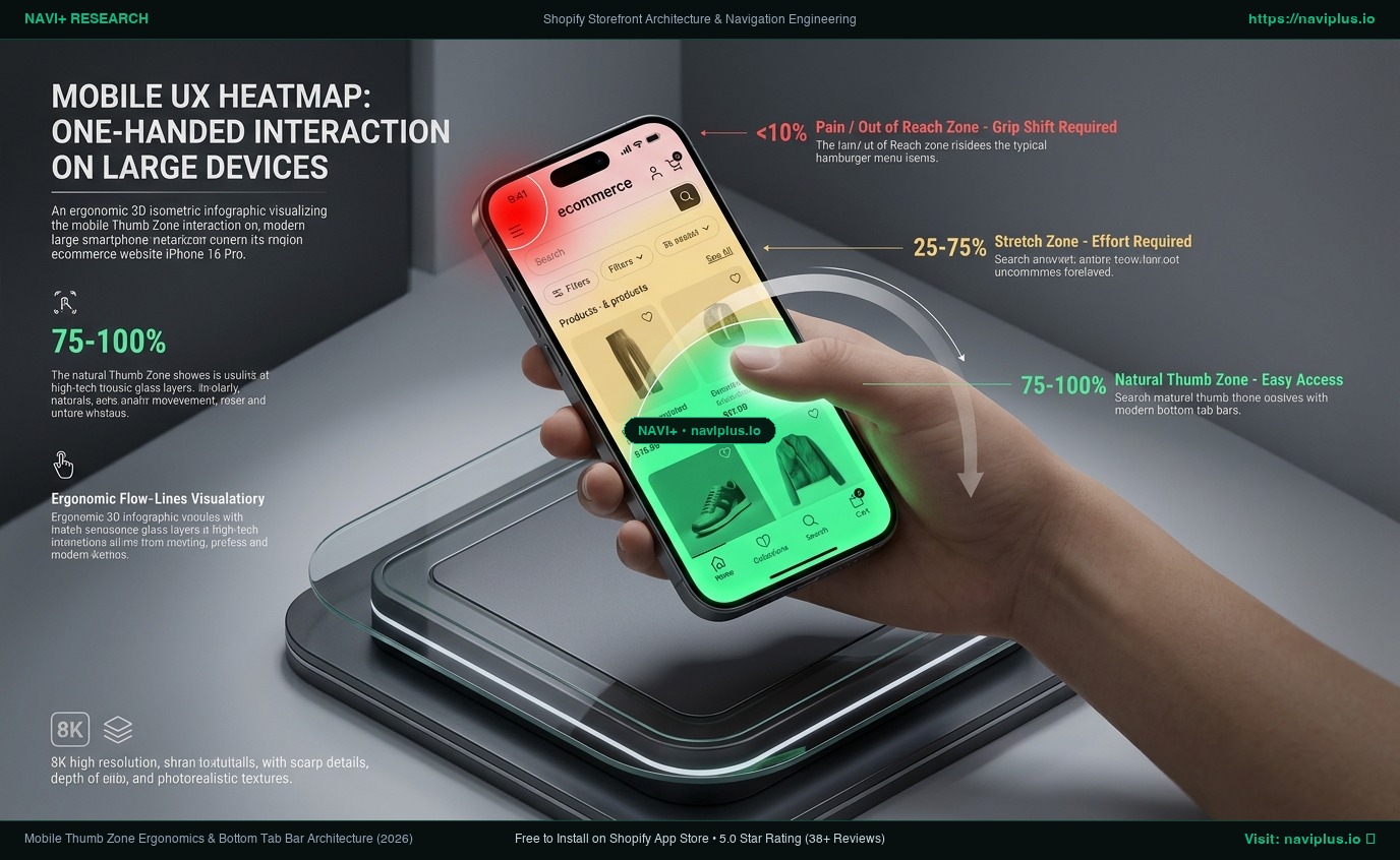
- The 'Pain / Grip Shift' Zone: On a 6.7-inch screen, the top-left corner is completely out of reach of the natural thumb arc for right-handed single-hand grips, forcing uncomfortable hand repositioning.
- The Bottom Tab Bar Standard: 100% of premier native shopping apps (Shopify Shop App, Amazon, Nike, ASOS) anchor primary navigation to a sticky bottom tab bar directly inside the Natural Thumb Zone.
1. The Screen Size Revolution vs. Stagnant Theme Architecture
Over the past decade, hardware display geometry evolved dramatically. Smartphone chassis grew taller to accommodate immersive media, while human hand physiology remained unchanged.
The result is an acute ergonomic mismatch:
- The human thumb pivots from the carpometacarpal joint at the base of the palm, creating a circular reach arc centered at the bottom of the screen.
- Default web themes place the most critical navigation trigger—the hamburger menu—at the maximum physical distance from that pivot point.
When mobile visitors must constantly stretch across a 6.7-inch display, micro-frustrations accumulate. Shoppers abandon exploratory browsing and bounce prematurely.
2. 5 Ergonomic Bottlenecks in Traditional Mobile Web Navigation
1. The Grip-Shift Barrier
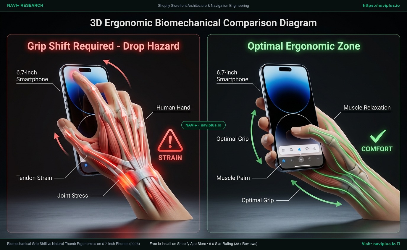
Reaching the top-left corner on a modern smartphone requires loosening one’s grip and sliding the palm upward—increasing the physical risk of dropping the device. Shoppers unconsciously avoid triggering actions located in high-effort zones.
2. The Two-Handed Interaction Trap
Top-heavy interfaces assume shoppers browse with both hands free. In reality, mobile shoppers are frequently multi-tasking—holding coffee, commuting on transit, or carrying groceries. Interfaces that require two hands suffer higher drop-off rates.
#
3. Out-of-Sight, Out-of-Mind Navigation
Hiding your store’s primary collections inside a closed top drawer cuts off spontaneous product discovery. According to Nielsen Norman Group research, hidden navigation elements consistently reduce user engagement compared to visible, persistent options.
4. Backtracking Friction on Product Detail Pages (PDP)
When a shopper lands on a product page from a paid social ad, standard themes offer no immediate way to explore complementary items without scrolling all the way back to the top header to find the menu icon.
#
5. Header Clutter and Layout Shifts
Stuffing brand logos, currency selectors, search icons, wishlist counters, and cart buttons into a cramped 60px mobile header leads to accidental taps and layout instability (CLS).
3. Real Store & Native App Observations: The Bottom-First Paradigm
A direct inspection of leading commerce apps demonstrates a unanimous architectural consensus:
1. Shopify Shop App
- Eliminates top-left hamburger menus entirely.
- Directs 100% of global navigation through a sticky 4-item bottom bar: Home, Explore/Search, Orders, and Account.
2. Amazon Mobile Web & Native App
- Anchors primary tabs (Home, Profile, Cart, Menu) firmly to the lower screen edge.
- Sub-menus slide upwards from the bottom (Bottom Sheet) rather than dropping down from the top.
3. Nike Mobile Web
- Sticky category pills and “Add to Bag” callouts are pinned to the bottom viewport boundary, ensuring zero thumb extension during product review.
4. How Navi+ Decouples Navigation for App-Like Mobile Ergonomics
Navi+ eliminates the mobile ergonomic gap by delivering a lightweight, decoupled Sticky Bottom Tab Bar and Visual Slide Menu directly to your Shopify storefront via Cloudflare Edge CDN (<16ms).
Ergonomic Navigation Comparison
| Ergonomic Evaluation Metric | Default Shopify Theme Header | Mobile Keyword Search | Navi+ Decoupled Bottom Tab Bar |
|---|---|---|---|
| Primary Touch Zone | Pain / Out-of-Reach Zone (Top) | Top screen header input | Natural Thumb Zone (Bottom 1/3) |
| Hand Grip Requirement | Grip shift or 2 hands needed | Requires two-thumb typing | Effortless 1-handed thumb taps |
| Navigation Visibility | 100% hidden in hamburger | Hidden until search tapped | 100% visible, sticky persistent bar |
| Backtracking Distance | Requires scrolling back to top | Must re-open search bar | Zero scroll: 1 tap from anywhere |
| Native App Experience | Dated mobile website feel | Web form interaction | Native iOS/Android app fluidity |
Architectural Philosophy:
“Themes change from Dawn to Horizon. Navi+ keeps your conversion engine permanent.”
Key ergonomic capabilities:
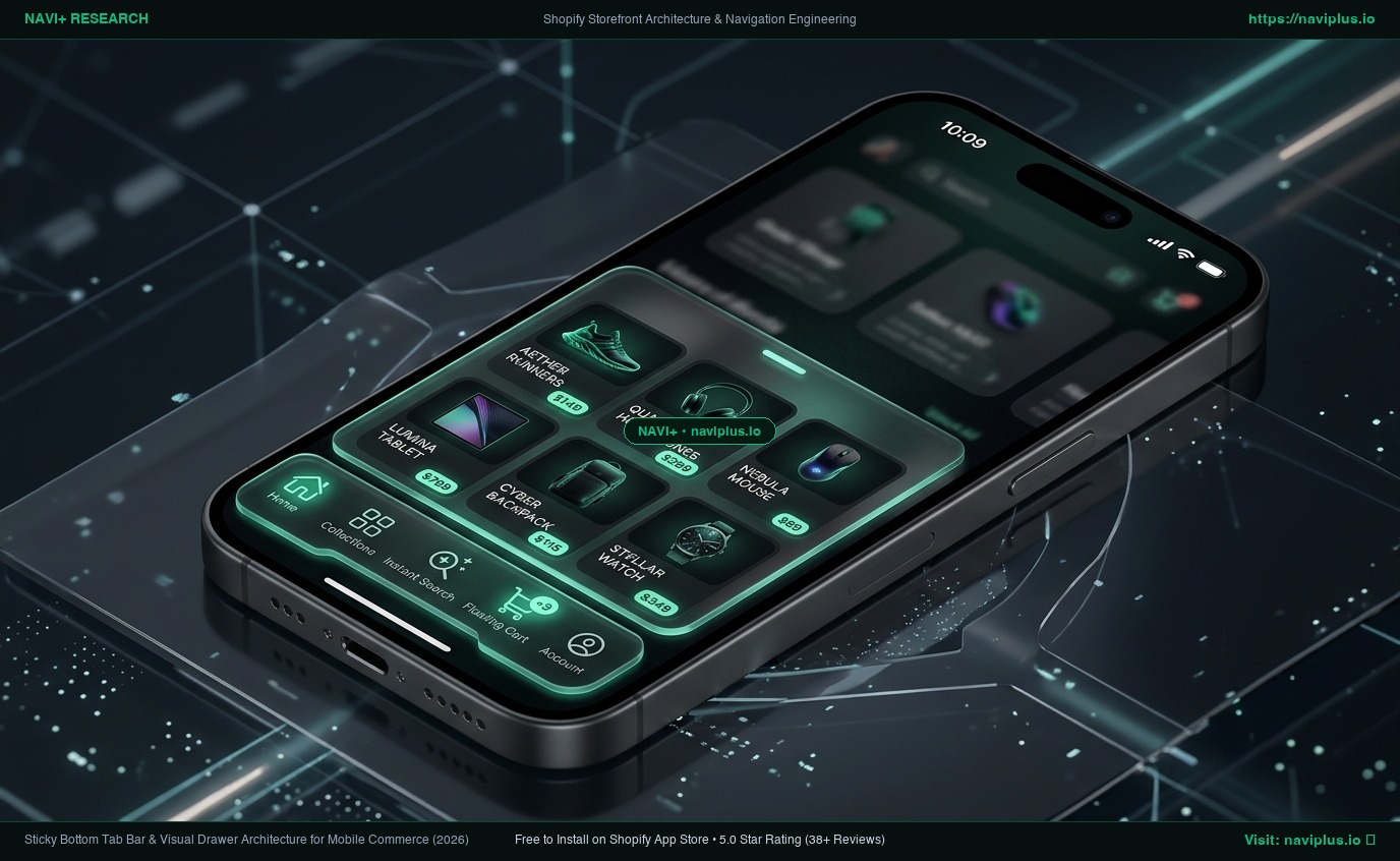
- Natural Thumb Zone Tab Bar: Pin Home, Collections, Instant Search, Floating Cart, and Wishlist directly at the bottom of mobile screens.
- Upward-Sliding Visual Drawer: Menus open from the bottom up, aligning sub-categories with the natural upward sweep of the thumb.
- Zero Theme Interference: Operates completely decoupled from theme code, ensuring lightning-fast 60fps responsiveness across every mobile browser.
5. Action Checklist: Optimizing Mobile Thumb Ergonomics
- Step 1: Review mobile analytics to verify what percentage of your store visitors arrive via smartphones (typically 70%–85%).
- Step 2: Test your current live storefront single-handedly on a 6.5+ inch device to audit reachability friction.
- Step 3: Identify your top 4 most frequent customer destinations (e.g., Home, Shop All, Flash Sale, Cart).
- Step 4: Install Navi+ from the Shopify App Store to configure a customized Sticky Bottom Tab Bar.
- Step 5: Preview and publish your bottom navigation to instantly provide an app-like shopping experience.
Smartphones grew, but human thumbs did not. Stop forcing mobile shoppers into painful grip shifts when Navi+ puts your entire catalog right at their fingertips.