Flat vs Deep Navigation on Shopify: How Many Menu Levels Your Store Needs
Shopify store owners regularly face an architectural dilemma: should your store adopt a broad, flat menu exposing every collection at once, or a deep hierarchy guiding shoppers through nested layers?
Neither extreme works well in practice. Packing dozens of collections into your main header overwhelms visitors, while burying items under many nested sub-menus makes products harder to find. Instead, build a balanced pyramid structure within Shopify’s three-level limit, measuring click depth rather than counting menu rows.
Quick answer
Flat navigation puts most pages a few clicks from the homepage; deep navigation stacks more levels. Neither wins outright: deep hierarchies are harder to use, but very flat menus overwhelm shoppers. For most Shopify stores, aim for a pyramid inside Shopify’s three-level menu limit. Measure click depth, not menu levels.
What flat vs deep navigation means on Shopify
Flat navigation uses broad categories and shallow branching so visitors reach most pages in few steps. Deep navigation uses a taller structure with narrower initial groupings that branch into nested sub-levels. An agency convention often describes flat navigation as having few layers, usually 1 to 3 tiers (Fresh Consulting). On Shopify, applying this requires separating menu configuration from actual shopper travel paths.
Click depth is not the same as menu levels
Store owners frequently confuse menu levels with click depth. Menu levels describe how linklists are nested inside theme settings. Click depth measures the actual count of clicks or taps required to travel from the homepage to a target page.
For example, a clothing store might set up a two-level menu where “Women” drops down to “Dresses.” If a shopper clicks “Women,” views an intermediary collection page, clicks “Summer Dresses,” and selects a product, the click depth is already several clicks. Conversely, a desktop mega menu can display three tiers across organized columns, letting a buyer reach a specific sub-collection in a single click from the homepage. Click depth measures customer friction; menu levels describe theme structure.
Shopify’s three-level menu limit
In the Shopify admin under Content > Menus, drop-down menus have a platform ceiling. The top-level item can have up to two levels of nested drop-down menus (Shopify Help), creating a maximum of 3 levels in Liquid linklist objects (Shopify Dev Docs).
Most themes support up to two levels of nested drop-down menus (Shopify Help), but visual implementations vary. Check your theme settings to verify how multi-level menus render across desktop and mobile screens.
| Concept | What it measures | Where configured | Impact |
|---|---|---|---|
| Menu levels | Structural tier of nested links | Shopify Admin | Dictates header layout and drawer grouping |
| Click depth | Clicks or taps from homepage to target | Overall link tree | Determines browsing friction and crawl path |
Why deep menus lose shoppers and crawlers
Stretching navigation across excessive vertical layers creates friction for shoppers and search bots alike. When buyers must click through several consecutive layers of sub-menus before seeing products, mental effort multiplies. Usability research from the Nielsen Norman Group confirms that “all other things being equal, deep hierarchies are more difficult to use” (NN/g). Every additional dropdown tier forces customers to make another choice, giving shoppers another chance to take a wrong turn.
For search engines, deeply nested structures make crawling harder. Google’s John Mueller pointed out that “if you make it too deep, then that makes it harder for us to crawl” (Search Engine Journal).
Google Search Central guidelines state that every page you care about should have a link from at least one other page on your site using crawlable HTML <a> tags with valid href attributes. Store owners must make sure Google can crawl your menu properly. In addition, deeper sites require breadcrumbs, which show a link for each level of the site from the homepage to the current page, ensuring shoppers maintain their orientation (NN/g).
The risk of going too flat
Recognizing the drawbacks of deep menus, some merchants swing to the opposite extreme: flattening their entire catalog into a single tier. They place dozens of collection links directly on the homepage or pack a long row of category links across the top header.
However, stripping away structural depth introduces severe user experience flaws. As NN/g warns, “users can also become overwhelmed with long, cluttered menus” (NN/g). When an online store displays a long row of unordered category links, shoppers can struggle to locate specific departments.
Over-flattening an e-commerce catalog also hurts organic search. John Mueller cautioned that “if it’s very flat, then we think, oh all of these are equally important” (Search Engine Journal). Search engines rely on internal links to understand topical hierarchy. When a store links to every sub-collection directly from the main header with identical prominence, it becomes harder to signal which collections are primary offerings and which are secondary.
In the Search Engine Journal article, a site owner asked Mueller about a site with a mega menu that had over 1,000 links (Search Engine Journal). The article does not report what happened to that site, so treat it only as an example of the question merchants ask. A menu that lists every collection with the same weight gives no sense of which pages belong together, and simply cramming every collection into your main menu is not healthy flat architecture.
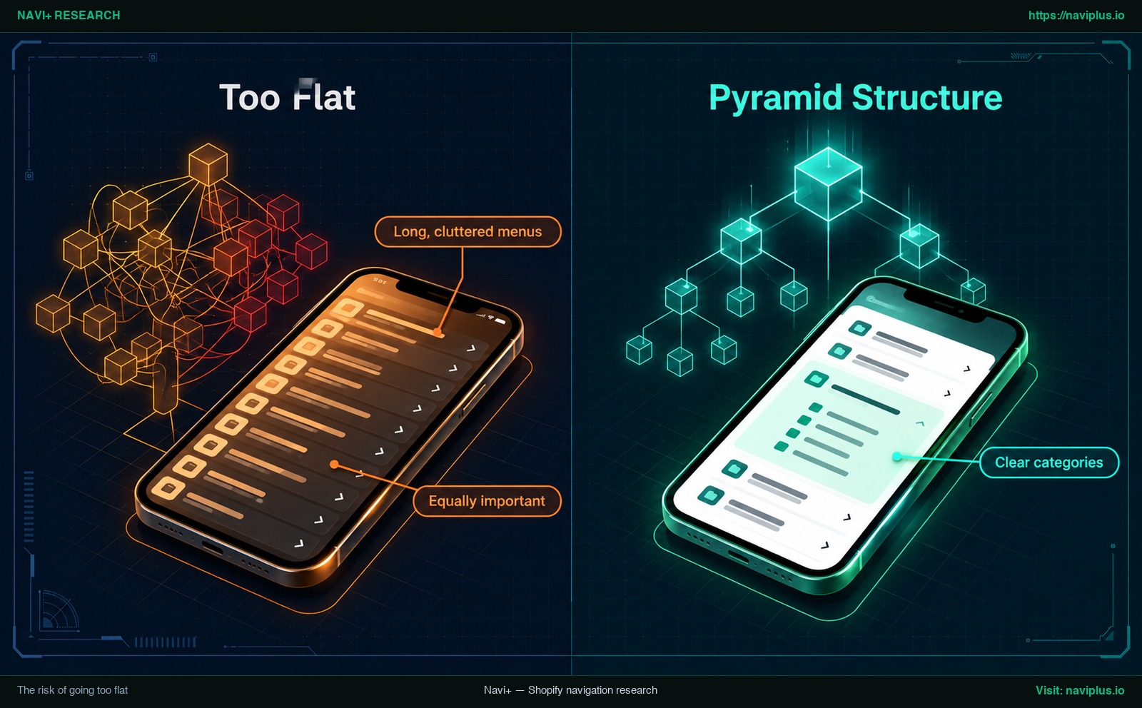
Figure 1: Concept illustration of a too-flat menu next to a pyramid structure.
The pyramid structure: a balance for most stores
Rather than choosing between two dysfunctional extremes, store owners benefit from establishing a structured middle ground. John Mueller explicitly recommended this approach: “I would try to aim for more of a pyramid structure” (Search Engine Journal). A pyramid structure helps search engines understand the context of individual pages within the site much more effectively (Search Engine Journal).
In an e-commerce pyramid hierarchy, the homepage sits at the apex. Below the homepage rests a concise row of clear categories representing primary product departments (such as “Men”, “Women”, or “Living Room”). Each primary category then branches down into focused subcategories (such as “Outerwear”, “Footwear”, or “Lighting”), which ultimately lead to individual product pages.
The visual contrast highlights the core trade-off:
- An architecture that is Too flat creates long, cluttered menus where all items appear Equally important, overwhelming customers and obscuring semantic hierarchy.
- A balanced Pyramid structure groups products into Clear categories, minimizing unnecessary Click depth while providing intuitive logical stepping stones for buyers and search crawlers.
As Nielsen Norman Group concluded, there is no single right answer (NN/g), and both extremes carry costs. Mailchimp’s architecture guide similarly observed that a flatter architecture generally works better for most websites (Mailchimp DE). The goal is finding a structure that is flatter than a labyrinthine directory without collapsing into an unstructured catalogue.
| Navigation model | Shape | Strengths | Weaknesses | Source |
|---|---|---|---|---|
| Flat | Broad and shallow | Fewer clicks to reach pages | Long, cluttered menus can overwhelm shoppers; pages can look equally important to Google | NN/g; John Mueller (SEJ) |
| Deep | Narrow and tall | Granular categorization | Harder to use; harder for search engines to crawl | NN/g; John Mueller (SEJ) |
| Pyramid | A few clear top categories, then subcategories | Gives Google context for each page; keeps menus scannable | Requires category planning inside menu limits | John Mueller (SEJ); NN/g |
Choosing depth by catalog size
The ideal navigation depth for your store depends on the scale and complexity of your merchandise catalog. Because every product mix presents distinct taxonomy demands, merchants should treat the guidance below as rules of thumb, not fixed thresholds.
- Small catalogs (a few dozen products): A 1-level or 2-level structure is generally sufficient. A boutique carrying handcrafted accessories or a single clothing collection can showcase its primary lines directly across the main header without nested sub-menus. Shoppers can scan available items quickly, and click depth remains low.
- Mid-sized catalogs (a few hundred products): A 2-level hierarchy often works well. Top-level categories segment major product divisions, while second-level links point to curated sub-collections, providing clear thematic filtering without disorienting buyers.
- Large catalogs (thousands of products): Expanding inventory requires making full use of Shopify’s 3-level menu limit, combined with on-page collection filters and dedicated category landing pages. Detailed architectural planning is essential when scaling; review our in-depth guides on organizing a catalog of 1,000+ products and how navigation changes as your catalog grows for structured taxonomy frameworks.
Deep navigation on mobile: drawers, tab bars and collapsed levels
Maintaining an intuitive hierarchy is particularly vital on mobile screens, where screen real estate is restricted. On smartphones, multi-tier navigation typically relies on slide-out drawers utilizing accordion toggles or progressive drill-down panels (for pattern breakdowns, see our reviews on Shopify multi-level menu patterns and mobile drawer menu design).
A critical usability hurdle in mobile drill-down menus involves allowing shoppers to explore a parent category as a whole. When a buyer taps “Men’s Apparel” and advances into subcategories like “Shirts” and “Jackets”, they frequently wish to view all men’s apparel at once. E-commerce usability benchmarks from Baymard Institute reveal that only 24% of sites implement this well (Baymard) by providing a distinct “View All” link at the head of each nested menu level.
When faced with mobile space constraints, some stores attempt to simplify their mobile headers by eliminating lower-level subcategories entirely. Baymard warns against this compromise, emphasizing that removing lower levels on mobile is a poor implementation of the mobile UX (Baymard). Stripping subcategories deprives smartphone shoppers of granular navigation paths, forcing them to sift through overwhelming collection grids. Additionally, Shopify Help documentation notes that some themes might require CSS adjustments to improve mobile usability (Shopify Help).
To reduce mobile click depth without flattening your category tree, a bottom tab bar can act as a shortcut. A persistent bar gives one-tap access to a main collection or a deeply nested one, while the category tree underneath stays unchanged.
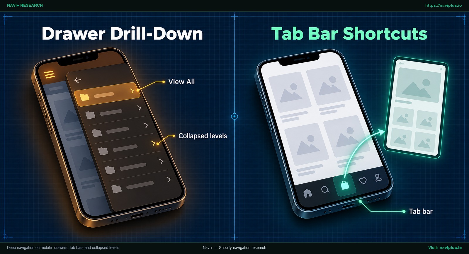
Figure 2: Concept illustration of a drawer drill-down with a View All item and a tab bar shortcut.
Using a mega menu to flatten without clutter
For desktop shoppers, a well-engineered mega menu offers a practical way to reduce click depth while preserving strong hierarchical organization. Rather than forcing users through nested flyout menus one level at a time, a mega menu displays second and third-level links simultaneously across an expansive two-dimensional panel.
The effectiveness of a mega menu lies in structured visual grouping. Instead of presenting an uncurated list of links that risks overwhelming visitors (NN/g) or a mega menu with over 1,000 links like the one in the Search Engine Journal question (Search Engine Journal), a clean mega menu organizes links into balanced columns under distinct, non-clickable or clickable category headers. This enables shoppers to scan the entire breadth of a department in a single interaction while maintaining a logical pyramid structure.
On mobile, the same content usually has to be presented as a drill-down drawer or collapsible accordion rather than a wide panel. For layout and column-grouping ideas, explore our guide on mega menu best practices.
How to measure click depth and test a change
Changing your store’s navigation structure changes how shoppers and search crawlers find your pages. To optimize your hierarchy safely without disrupting existing performance, follow this structured five-step evaluation framework:
- Audit your top-selling products: Identify your top 10 best-selling items in Shopify analytics. Navigate to each product from the homepage as a first-time visitor, counting the exact number of clicks or taps required. If your best sellers sit many clicks away, consider adding direct sub-collection links or shortcuts.
- Verify crawlable HTML links: Ensure that every important page has a link from at least one other page on your site (Google Search Central). Verify that navigation links are rendered as crawlable HTML
<a>tags containing validhrefdestinations (Google Search Central), rather than JavaScript click events that search engines may fail to trace. - Conduct lightweight tree testing: Before overhauling your live theme, run a brief tree test with a small group of colleagues or customers. As usability research indicates, tree testing helps validate site structure by allowing users to attempt to find information in the proposed hierarchy (NN/g).
- Pilot on a single collection first: Rather than restructuring your entire catalog overnight, adjust one primary collection department. Maintain existing collection handles and product URLs unchanged—updating navigation links does not alter canonical page URLs. Monitor impressions, click-through rates, and index coverage in Google Search Console over several weeks to evaluate impact before rolling out updates across your store.
- Treat the three-click rule as informal guidance: Remember that the widely cited “three-click rule” is merely a practical rule of thumb, not a strict search ranking criterion or scientific usability law. Google’s John Mueller noted that search engines look for a reasonable number of clicks (Search Engine Journal), focusing on logical connectivity rather than rigid click limits.
Trade-offs: when a deeper menu is the right call
Although flatter navigation structures benefit the majority of direct-to-consumer stores, there are clear retail scenarios where a deeper hierarchy is the superior, more practical solution.
Stores handling highly technical or heavily categorized inventories, such as automotive replacement parts organized by make, model, year, and engine type, may need deeper hierarchical pathways. Attempting to force a complex catalog into a flat 1-level or 2-level menu produces unmanageable lists that frustrate buyers looking for specific compatibility.
A deeper navigation architecture succeeds when supported by clear breadcrumbs displaying links for each level from the homepage to the current page (NN/g). Conversely, aggressively flattening a deeply technical catalog strips away crucial semantic relationships, diluting the contextual understanding that search engines rely upon (Search Engine Journal).
Because Shopify enforces a hard ceiling of 3 levels within Liquid linklists (Shopify Dev Docs), merchants managing complex product lines should utilize faceted collection filters and sub-collection grid cards to handle further depth. Ultimately, as NN/g research affirms, there is no single right answer for all websites (NN/g), and the optimal hierarchy must reflect the specific search habits of your audience.
Where Navi+ fits
If your current Shopify theme limits your ability to execute a clean pyramid navigation structure, Navi+ lets you build separate navigation components on top of it. Navi+ menus are limited to three levels, the same ceiling as Shopify menus.
Navi+ focuses on practical storefront navigation components:
- Mobile Menu: A mobile drawer with up to three levels. You can add a “View All” item at the top of each level like any other menu item.
- Tab Bar: A bottom bar that gives one-tap shortcuts to your most important or deepest collections, lowering click depth without changing your category tree.
- Desktop & Mobile Mega Menu: Multi-column panels that group links under headings instead of one long list. A Mobile Menu can embed the tree of a Desktop Mega Menu, so desktop and mobile share one structure.
- Icon Menu: Image-based tiles that work as visual entry points into your main categories.
If your theme’s menu can’t show the structure you planned, Navi+ lets you build a Mobile Menu, Tab Bar or Mega Menu on top of it, within the same three levels — try it on one collection first.
Action checklist
- Measure the click depth from your homepage to your 10 top-selling products.
- Inspect your active theme settings to confirm how many nested menu levels it supports (most support up to 2 nested levels).
- Structure your top navigation into a balanced pyramid hierarchy with distinct parent categories.
- Ensure mobile drawer menus include a visible “View All” link at the top of each nested tier.
- Implement direct shortcuts (such as a sticky bottom tab bar or breadcrumbs) for deeply nested collections.
- Test structural changes on a single collection first, keeping existing URLs unchanged.
- Monitor Search Console impressions and indexing for several weeks to see the effect.
FAQ
How many levels should a Shopify menu have?
Shopify menus allow at most 3 levels in Liquid linklists, and most themes support up to two levels of nested drop-downs below top items. Most stores do well staying within this 3-level structure.
Should every product be within three clicks?
The three-click idea is a rule of thumb, not a proven law. Google only asks for a reasonable number of clicks and that every important page is linked from at least one other page on the site.
Is a flat site structure better for SEO?
Not automatically. John Mueller pointed out that a very flat site makes every page look equally important to search engines and recommends aiming for a balanced pyramid structure.
Can a big mega menu hurt SEO?
It can blur hierarchy if implemented poorly. The case discussed on Search Engine Journal examined a mega menu with over 1,000 links; grouping links into logical columns and keeping menus to real category paths helps keep the hierarchy clear.
How should deep menus work on mobile?
Keep necessary category tiers using drill-down drawers or accordions, but add a visible “View All” item at each level. Usability research from Baymard shows that removing lower levels on mobile is a poor UX implementation.
Sources
- Nielsen Norman Group (Kathryn Whitenton, 2013): Flat vs. Deep Website Hierarchies
- Search Engine Journal (Roger Montti, quoting John Mueller, 2021): John Mueller Recommends Pyramid Site Structure
- Shopify Help Center: Drop-down menus in Shopify
- Shopify Developer Documentation: Liquid linklist object
- Google Search Central: Creating crawlable links
- Baymard Institute: Mobile navigation ‘View All’ usability research
- Fresh Consulting: UI/UX Principle #23: Flatter Navigation is Better Than Deeper Navigation
- Mailchimp (DE): Website-Architektur optimieren
Explore the topics
This guide links out to focused articles — dive deeper on each.