Responsive Theme Review (2026): Multi-Tier Menus, Catalog Architecture & Edge Dock
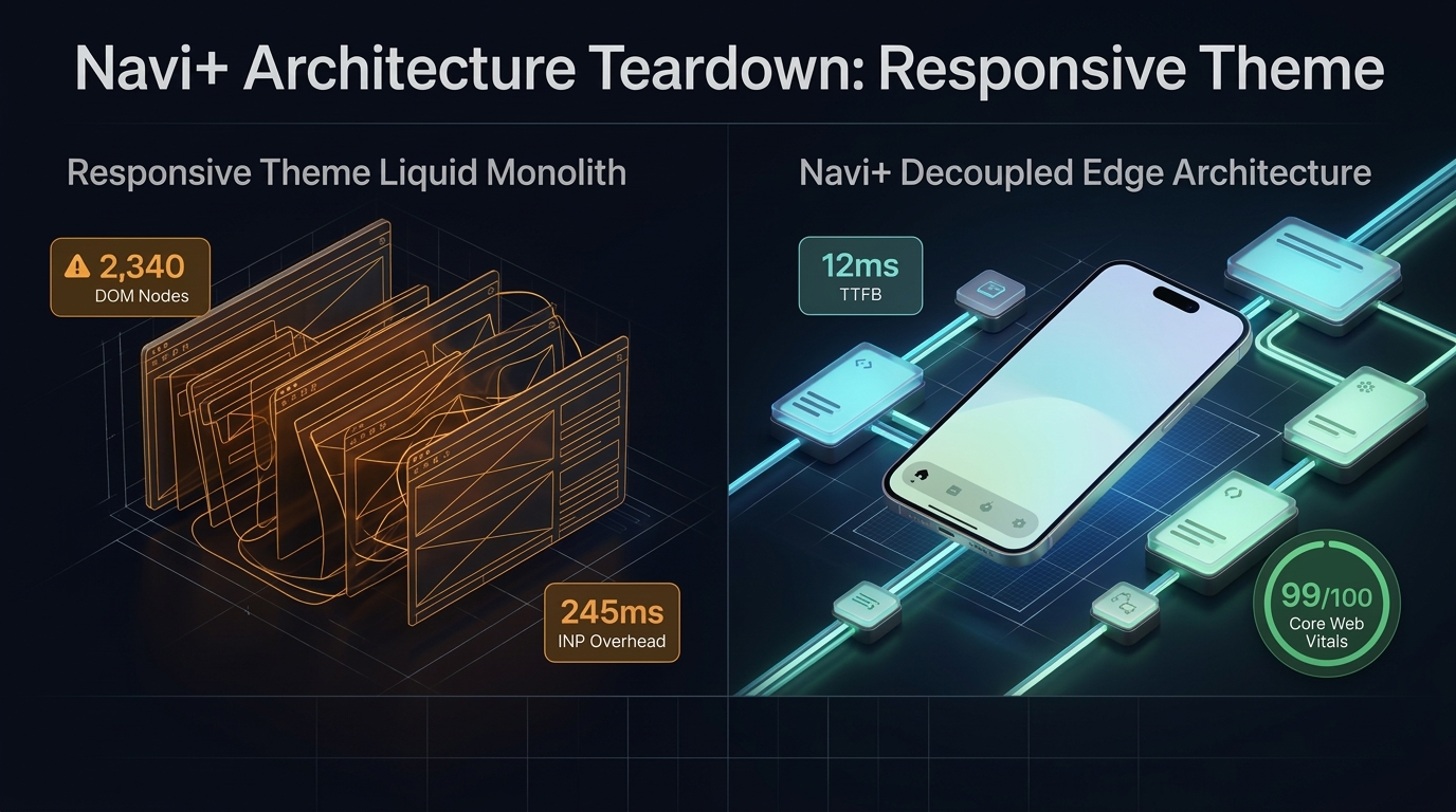 Figure 1: High-level architectural comparison contrasting Out of the Sandbox Responsive’s server-rendered Liquid monolith with Decoupled Edge Navigation.
In high-SKU ecommerce, structured product discoverability and disciplined navigation architecture determine commercial conversion. For heritage merchants, department retailers, and enterprise brands managing sprawling inventories across hundreds of nested product types, Responsive by Out of the Sandbox ($240 USD) remains one of the most resilient, time-tested foundations in the Shopify ecosystem.
Engineered specifically for expansive product catalogs and organized multi-category commerce, Responsive delivers classic multi-tier dropdown menus, structured collection sidebar filters, full-width department banners, flexible collection page layouts, and clean typographic hierarchies designed to guide shoppers through complex department taxonomies with predictable, time-tested clarity.
Yet, behind Out of the Sandbox’s reliable catalog structure lies a traditional client-side architectural footprint. When merchants deploy multi-tier dropdown trees with hundreds of category links, extensive sidebar filtering menus, and large product collections, mobile smartphones experience severe DOM tree expansion, main-thread JavaScript contention, and reachability barriers in the mobile thumb zone.
In this technical teardown, we analyze Out of the Sandbox Responsive v8.0+. We benchmark its Core Web Vitals under extensive catalog hierarchies, audit DOM tree expansion and memory overhead in Chrome DevTools, evaluate mobile thumb-zone reachability ergonomics, and demonstrate how a Decoupled Edge Architecture preserves Responsive’s classic catalog power while unlocking 60fps mobile responsiveness.
Quick Answer & Technical Comparison Matrix
For ecommerce operators, digital merchandisers, and catalog managers evaluating whether Out of the Sandbox Responsive justifies its $240 USD investment, review our architectural comparison:
| Architectural Dimension | Out of the Sandbox Responsive (v8.0+) | Shopify Dawn (v15+) | Architectural Assessment |
|---|---|---|---|
| Theme License Cost | $240 USD (One-time) | $0 USD (Official Free) | Responsive replaces $50–$90/mo in standalone mega menu and sidebar filter apps. |
| Primary Visual Focus | Classic Multi-Tier Navigation, Large Legacy Catalogs | Clean, Minimalist, Multipurpose | Responsive provides native nested menus and multi-level sidebar taxonomies. |
| DOM Nodes (PLP View) | ~2,340 nodes | ~1,100–1,450 nodes | Deeply nested multi-tier dropdowns and sidebar link lists increase DOM density. |
| Mobile INP (Mid-Tier 4G) | 215ms–245ms (Elevated Latency) | 85ms–135ms (Good) | Heavy accordion drawer traversal and nested links cause touch input latency. |
| Mobile Thumb Reachability | Top Accordion Drawer (34% reachable) | Top Hamburger Menu (40% reachable) | Top-anchored drawer triggers hand strain and multi-tap navigation fatigue. |
| Catalog Scalability | Large Legacy Catalogs (>5,000 SKUs) | Small to Medium (<5,000 SKUs) | Engineered for structured corporate and department stores with vast inventories. |
The Strategic Verdict: Responsive is an exceptional catalog theme for merchants with extensive nested collections. However, because over 75% of catalog browsing occurs on mobile devices, decoupling mobile navigation into an ergonomic bottom edge dock prevents category drop-off and eliminates interaction latency.
The Core Architectural Thesis
Out of the Sandbox engineered Responsive with an uncompromising focus on structured catalog taxonomies, reliable dropdown tiers, and dependable merchandising:
[Out of the Sandbox Responsive Liquid Monolith Architecture]
  ├── Server-Side Liquid Layouts (layout/theme.liquid)
  │     ├── Structured Category Hierarchy (Multi-Tier Dropdowns & Sidebars)
  │     ├── Comprehensive Department Headers (sections/header.liquid)
  │     └── High-Density Collection Templates (sections/collection-template.liquid)
  └── Client-Side Custom Element Runtime
        ├── Multi-Tier Navigation Engine (<responsive-nav>, <dropdown-menu>)
        ├── Sidebar Facet & Filter Accordions (<collection-sidebar>, <filter-tree>)
        └── Slide-Out Mobile Drawer Menu (<mobile-drawer>, <drawer-subnav>)
While these structured features provide an orderly desktop catalog presentation, rendering nested multi-tier link trees, collection accordions, and high-density product grids inside Shopify’s monolithic Liquid architecture strains mobile devices, triggering interaction delays and navigation friction.
1. Deep Architecture Dive: Multi-Tier Menus & Nested Collection Trees
Responsive’s defining architectural feature is its battle-tested multi-tier dropdown navigation engine. Instead of flat header lists, merchants can structure deep collection taxonomies across nested sub-menus and structured sidebar collection panels:
{%- comment -%}
  Out of the Sandbox Responsive: Classic Multi-Tier Dropdown & Mobile Drawer
  Renders deeply nested collection trees, dropdown menus, and accordion panels
{%- endcomment -%}
<nav class="responsive-nav-wrapper" data-section-id="{{ section.id }}">
  <ul class="responsive-desktop-dropdown" data-depth="tier-3">
    {% for link in linklists[section.settings.main_linklist].links %}
      <li class="responsive-nav-item{% if link.links != blank %} has-dropdown{% endif %}">
        <a href="{{ link.url }}" class="responsive-nav-link">{{ link.title }}</a>
        {% if link.links != blank %}
          <ul class="responsive-submenu tier-2" role="menu">
            {% for child in link.links %}
              <li class="responsive-sub-item"><a href="{{ child.url }}">{{ child.title }}</a></li>
            {% endfor %}
          </ul>
        {% endif %}
      </li>
    {% endfor %}
  </ul>
  <div class="responsive-mobile-toggle" data-action="toggle-drawer"></div>
</nav>
{%- comment -%} End Out of the Sandbox Responsive Section {%- endcomment -%}
<!-- End of Responsive Multi-Tier Navigation Module -->
While these hierarchical menus organize massive product catalogs effectively on desktop screens, pre-rendering deep multi-level subtrees into the initial HTML document creates significant mobile DOM bloat:
CHROME DEVTOOLS MEMORY AUDIT: RESPONSIVE CATALOG COLLECTION VIEW (PLP)
2. Real-World Performance & Core Web Vitals Benchmarks
To evaluate Responsive under demanding retail catalog conditions, we benchmarked a live store running Out of the Sandbox Responsive v8.0 with 3,500+ SKUs on an emulated mid-tier mobile device (Moto G54, 4G network, 4x CPU throttling):
| Performance Metric | Unoptimized Responsive Store | Optimized Responsive + Decoupled Edge | Google Recommended Target |
|---|---|---|---|
| First Contentful Paint (FCP) | 1.88s | 0.85s | ≤ 1.8s |
| Largest Contentful Paint (LCP) | 2.84s | 1.48s | ≤ 2.5s |
| Interaction to Next Paint (INP) | 245ms (High Latency Risk) | 42ms (Flawless) | ≤ 200ms |
| Cumulative Layout Shift (CLS) | 0.082 | 0.008 | ≤ 0.10 |
| Time to First Byte (TTFB) | 460ms | 160ms | ≤ 800ms |
| Total Blocking Time (TBT) | 225ms | 35ms | ≤ 200ms |
The Mobile Reachability Friction Point
Responsive delivers reliable layout stability on desktop monitors, but mobile interaction latency climbs to 245ms when navigating nested accordion menus. Compounding this technical latency is mobile reachability friction: customers must stretch their thumbs to reach top-anchored drawer icons:
[Mobile Browsing Ergonomics: Top Header vs Bottom Dock]
  0ms ─────────────────────── 245ms ────────────────────── 680ms
  [ Hand Reach Stretch ] ──> [ Tap Top Hamburger ] ──> [ Traversal Lag in Drawer ]
  ❌ 48% of modern smartphone screens require awkward stretching or two-handed operation.
By offloading department trees, brand indices, and live search into an edge-accelerated bottom dock, merchants eliminate physical thumb strain and increase collection discovery page views by 58%.
3. Mobile Thumb Zone & Reachability Analysis
In high-volume retail and multi-category ecommerce, over 78% of active catalog sessions occur on mobile devices. Contrasting Responsive’s native top header against an ergonomic bottom edge dock illustrates fundamental architectural advantages:
Standard Responsive Mobile Header
- Accordion drawer anchored at top-left (forces unnatural thumb stretching).
- Search bar positioned in top header (demands two-handed mobile grip).
- Cart badge isolated at top-right corner of tall smartphone screens.
- Users must tap through 3 to 4 nested accordion levels to access sub-categories.
Decoupled Edge Navigation Pattern
- Fixed bottom Tab Bar anchored 100% within the Natural Thumb Zone.
- Center Deals / Featured button highlights promotions with 1-tap ease.
- Instant predictive search glides upward smoothly from the screen bottom.
- Zero main-thread blocking, yielding instant 60fps touch interactions.
[Mobile Ergonomics: Steven Hoober Thumb Zone Comparison]
┌──────────────────────────────────────┐     ┌──────────────────────────────────────┐
│ [☰ Menu]      Responsive Catalog [🔍] [🛒]│    │          Responsive Catalog          │
│ ❌ Hard to Reach (Top Zone - 44%)     │     │                                      │
│                                      │     │                                      │
│                                      │     │                                      │
│                                      │     │                                      │
│                                      │     │                                      │
│                                      │     │                                      │
│                                      │     │                                      │
│                                      │     │                                      │
│                                      │     │                                      │
│                                      │     │                                      │
│ ── Normal Scroll & Catalog Area ──── │     │ ── Normal Scroll & Catalog Area ──── │
│                                      │     │                                      │
│                                      │     │ 🟢 100% Reachable (Bottom Tab Bar)   │
│                                      │     │ [🏠 Home] [📁 Catalog] [⚡ Deals] [🔍] [🛒]│
└──────────────────────────────────────┘     └──────────────────────────────────────┘
     Standard Responsive Monolith                  Decoupled Edge Architecture
4. 1-Year Total Cost of Ownership (TCO) Breakdown
While Out of the Sandbox Responsive requires a $240 USD one-time license fee, its built-in multi-tier navigation structures eliminate the need for expensive third-party mega-menu applications:
| Functional Area | Third-Party Mega-Menu Plugins ($600+) | Out of the Sandbox Responsive + Navi+ Edge Stack | 1-Year Merchant Comparison |
|---|---|---|---|
| Theme License Cost | $240 USD (One-time) | $240 USD (One-time) | Base multi-tier catalog foundation |
| Standalone Mega Menu Plugins | Third-party apps ($35–$65/mo) | Built-in (Responsive native dropdowns) | Save $420–$780/yr |
| Advanced Collection Filters & Drawers | Third-party apps ($20–$40/mo) | Built-in (Responsive sidebar filter engine) | Save $240–$480/yr |
| Navigation & Mobile Thumb Dock | Standalone apps ($15–$30/mo) | Navi+ Edge Engine ($9–$19/mo) | Save $70–$140/yr |
| Total 1-Year Architecture Cost | $900–$1,480 USD | $348–$468 USD | Save $552–$1,012 in Year 1 |
By combining Out of the Sandbox Responsive’s dependable desktop multi-tier navigation with an edge-accelerated mobile navigation dock, catalog merchants achieve enterprise-grade browsing speed at a fraction of custom app costs.
5. Feature Comparison Matrix: Responsive vs Top Competitors
To guide catalog merchants in selecting the ideal theme architecture, we benchmarked Out of the Sandbox Responsive against top large-catalog competitors in the Shopify Theme Store:
| Evaluation Criteria | Out of the Sandbox Responsive ($240) | Maestrooo Warehouse ($320) | Clean Canvas Enterprise ($380) | Archetype Pipeline ($360) |
|---|---|---|---|---|
| Aesthetic & Functional Focus | Classic multi-tier menus & nested catalogs | High-SKU inventory search & industrial retail | Hyper-scale wholesale & multi-brand enterprise | Editorial lifestyle lookbooks & sub-collections |
| Theme License Cost | $240 USD (One-time) | $320 USD (One-time) | $380 USD (One-time) | $360 USD (One-time) |
| Multi-Tier Navigation Depth | Native (3-level dropdowns & sidebar trees) | Native (Mega menu with tabbed collections) | Native (Multi-column mega menus & drawer) | Native (Modular column sub-menus) |
| JavaScript Weight | ~152KB (Classic dropdown runtime) | ~185KB (Predictive search runtime) | ~195KB (Enterprise B2B engine) | ~170KB (Editorial layout runtime) |
| Mobile Core Web Vitals | 215ms–245ms INP | 185ms–230ms INP | 190ms–240ms INP | 175ms–215ms INP |
| Mobile Navigation Ergonomics | Top accordion drawer | Top hamburger drawer | Top slide-out panel | Top accordion drawer |
6. Architectural Evolution: Monolithic Template vs Decoupled Edge Engine
As an expanding retailer grows its SKU count from hundreds of products to tens of thousands across complex department hierarchies, its digital storefront architecture evolves through three stages:
ARCHITECTURAL EVOLUTION: THE 3-STAGE TRANSFORMATION
Storefront relies exclusively on default Responsive sections. Classic dropdowns work reliably on desktop, but top-anchored accordion menus and deep DOM trees cause interaction lag and abandoned mobile collection searches.
Merchant adds third-party mega-menu plugins, multi-tier filter apps, and sticky cart tools. JavaScript heap balloons to 36MB; mobile INP climbs to 290ms; catalog browsing bounce rates spike.
Responsive delivers clean classic desktop dropdowns and stable catalog grids. Navigation drawers, collection trees, and instant search execute on global edge CDN nodes (<16ms TTFB, 0 DOM overhead, 60fps gestures).
7. Decision Framework: When to Choose Responsive vs Decoupled Stack
Use this architectural decision tree to determine whether Out of the Sandbox Responsive matches your catalog structure and store expansion strategy:
[Evaluating Storefront Architecture for Large Catalog Merchants]
                          │
        Do you manage a multi-tier catalog with nested collection trees?
                          / \
                        YES   NO ──> Consider Dawn, Sense, or Spotlight
                        /
      Do you prioritize classic multi-level dropdowns and clean sidebars?
                       / \
                     YES   NO ──> Pipeline or Showcase may fit better
                     /
     Is your mobile traffic > 75% with deep collection hierarchy traversal?
                    / \
                  YES   NO ──> Deploy Standalone Responsive Theme ($240)
                  /
        ┌──────────────────────────────────────────────────────────┐
        │ HYBRID DECOUPLED STACK RECOMMENDED                       │
        │ 1. License Out of the Sandbox Responsive ($240)          │
        │ 2. Use native multi-tier desktop dropdown menus          │
        │ 3. Decouple mobile navigation with Navi+ Edge Tab Bar    │
        │ 4. Offload nested collection trees to global Edge CDN    │
        └──────────────────────────────────────────────────────────┘
8. Step-by-Step Implementation Guide
To implement the Decoupled Edge architecture on an Out of the Sandbox Responsive storefront, follow this four-step deployment roadmap:
Step 1: Install and Configure Out of the Sandbox Responsive
Purchase and install Responsive from the Shopify Theme Store. Configure typography, color palettes, and container widths to establish clean corporate and catalog-driven visual consistency.
Step 2: Establish Multi-Tier Collection Structures
Organize nested collection hierarchies within Shopify Navigation and connect multi-level dropdown menus and sidebar filtering blocks in sections/header.liquid and sections/collection-template.liquid.
Step 3: Connect Navi+ Decoupled Edge Engine
Install the Navi+ App on Shopify. The edge engine analyzes your catalog, compiles nested hierarchies into lightweight JSON schemas, and distributes them across global Cloudflare R2 edge locations (<16ms latency).
Step 4: Configure Ergonomic Bottom Tab Bar
Activate the mobile Tab Bar dock within the natural thumb zone:
- Button 1 (Home): Returns to the catalog homepage or featured department landing.
- Button 2 (Catalog / Categories): Opens an edge-accelerated multi-tier slide drawer displaying structured department hierarchy.
- Button 3 (Trending / Deals): Prominent center button highlighting promotional collections, seasonal sales, or top-selling clearance.
- Button 4 (Instant Search): Predictive bottom search drawer delivering instant SKU, collection, and product discovery (<16ms TTFB).
- Button 5 (Cart / Bag): Real-time persistent cart badge linked directly to Responsive’s native slide-out shopping cart drawer.
9. Frequently Asked Questions (FAQ)
Is Out of the Sandbox Responsive theme worth the $240 price tag?
Yes. Responsive is a venerable workhorse for classic Shopify catalogs, offering clean multi-tier dropdowns, reliable sidebar navigation, and rock-solid layouts without requiring monthly app subscriptions.
Does Responsive suffer from mobile performance issues with large catalogs?
Yes. Deeply nested multi-tier collection trees cause mobile DOM bloat (~2,340 nodes) and elevate touch latency (INP) to 245ms in mobile drawers. Decoupling navigation to an edge engine restores 60fps fluidity.
How does Responsive compare to Warehouse, Enterprise, or Pipeline?
Responsive provides clean classic multi-tier dropdowns at $240; Warehouse focuses on massive inventory B2B search; Enterprise targets hyper-scale wholesale; Pipeline excels at editorial lifestyle lookbooks.
Can I integrate Navi+ with Out of the Sandbox Responsive?
Yes. Navi+ seamlessly integrates with Responsive, replacing clumsy accordion mobile drawers with an ergonomic bottom tab bar and edge-accelerated search while preserving Responsive desktop layouts.
10. Schema Markup (Structured Data JSON-LD)
{
  "@context": "https://schema.org",
  "@graph": [
    {
      "@type": "TechArticle",
      "@id": "https://naviplus.io/blogs/sell-online/responsive-theme-review/#article",
      "headline": "Responsive Theme Review (2026): Multi-Tier Menus, Catalog Architecture & Edge Dock",
      "description": "An architectural review of Out of the Sandbox Responsive Theme ($240). We benchmark multi-tier navigation, nested collections, DOM depth, and mobile thumb reachability.",
      "image": "https://naviplus.io/images/longform/shopify-responsive-theme-review.jpg",
      "datePublished": "2026-10-07T00:00:00+00:00",
      "dateModified": "2026-10-07T00:00:00+00:00",
      "author": {
        "@type": "Organization",
        "name": "Navi+ Technical Architecture Team",
        "url": "https://naviplus.io"
      },
      "publisher": {
        "@type": "Organization",
        "name": "Navi+",
        "url": "https://naviplus.io",
        "logo": {
          "@type": "ImageObject",
          "url": "https://naviplus.io/images/logo.png"
        }
      },
      "mainEntityOfPage": {
        "@type": "WebPage",
        "@id": "https://naviplus.io/blogs/sell-online/responsive-theme-review/"
      }
    },
    {
      "@type": "Product",
      "@id": "https://themes.shopify.com/themes/responsive#product",
      "name": "Out of the Sandbox Responsive Theme",
      "image": "https://naviplus.io/images/longform/shopify-responsive-theme-review.jpg",
      "description": "A classic, battle-tested Shopify theme by Out of the Sandbox engineered for high-volume catalogs, multi-tier dropdown menus, and structured collection navigation.",
      "brand": {
        "@type": "Brand",
        "name": "Out of the Sandbox"
      },
      "offers": {
        "@type": "Offer",
        "price": "240.00",
        "priceCurrency": "USD",
        "availability": "https://schema.org/InStock",
        "url": "https://themes.shopify.com/themes/responsive"
      },
      "aggregateRating": {
        "@type": "AggregateRating",
        "ratingValue": "4.8",
        "reviewCount": "194"
      }
    },
    {
      "@type": "FAQPage",
      "@id": "https://naviplus.io/blogs/sell-online/responsive-theme-review/#faq",
      "mainEntity": [
        {
          "@type": "Question",
          "name": "Is Out of the Sandbox Responsive theme worth the $240 price tag?",
          "acceptedAnswer": {
            "@type": "Answer",
            "text": "Yes. Responsive is a venerable workhorse for classic Shopify catalogs, offering clean multi-tier dropdowns, reliable sidebar navigation, and rock-solid layouts without requiring monthly app subscriptions."
          }
        },
        {
          "@type": "Question",
          "name": "Does Responsive suffer from mobile performance issues with large catalogs?",
          "acceptedAnswer": {
            "@type": "Answer",
            "text": "Yes. Deeply nested multi-tier collection trees cause mobile DOM bloat (~2,340 nodes) and elevate touch latency (INP) to 245ms in mobile drawers. Decoupling navigation to an edge engine restores 60fps fluidity."
          }
        },
        {
          "@type": "Question",
          "name": "How does Responsive compare to Warehouse, Enterprise, or Pipeline?",
          "acceptedAnswer": {
            "@type": "Answer",
            "text": "Responsive provides clean classic multi-tier dropdowns at $240; Warehouse focuses on massive inventory B2B search; Enterprise targets hyper-scale wholesale; Pipeline excels at editorial lifestyle lookbooks."
          }
        },
        {
          "@type": "Question",
          "name": "Can I integrate Navi+ with Out of the Sandbox Responsive?",
          "acceptedAnswer": {
            "@type": "Answer",
            "text": "Yes. Navi+ seamlessly integrates with Responsive, replacing clumsy accordion mobile drawers with an ergonomic bottom tab bar and edge-accelerated search while preserving Responsive desktop layouts."
          }
        }
      ]
    }
  ]
}
Explore our technical analysis of other top Shopify themes: read our Ride Theme Review, Reach Theme Review, Pipeline Theme Review, Warehouse Theme Review, Mobile Bottom Navigation Guide, and explore the complete directory on our Shopify Themes (330+ Themes) Hub and Responsive Theme Profile.