Quick Answer: How to Customize the Header Menu Layout in Shopify
Open Online Store > Themes > Customize and select the Header section. There you can change the logo position, pick which menu appears, and (in themes like Dawn) choose a menu type: Dropdown, Mega menu, or Drawer. Build the menu itself in Content > Menus.
To configure your header menu layout step by step:
- Open your theme settings: In your Shopify admin, navigate to Online Store > Themes > Customize and click the Header section in the left sidebar.
- Set your logo and layout position: Adjust the Logo position setting to choose whether your logo sits to the left of your links or centered above them. (Labels differ by theme).
- Connect and nest your menu: Go to Content > Menus to build your link structure with up to two nested levels, then assign that navigation list under Header > Menu.
- Select your menu type and audit mobile: Under Menu type, select Dropdown, Mega menu, or Drawer, then verify your mobile presentation using Mobile logo position.
What “Header Menu Layout” Means in Shopify
When merchants speak about customizing their header menu layout, they are rarely adjusting a single isolated setting. In Shopify, the header layout is an ecosystem formed by four distinct layers working together:
- Branding and alignment (Logo position): Controls where your store identity appears relative to the navigation links, search bar, and cart icon.
- Assigned navigation list (Which menu appears): The specific menu asset linked to your header section from your store admin.
- Structural hierarchy and menu type (Menu depth & presentation): How nested category tiers render on desktop viewports, whether as vertical cascading lists, expansive multi-column panels, or hidden drawers.
- Mobile presentation rules (Mobile layout & drawer behavior): How the banner adapts to compact touchscreens, positioning icons, branding, and slide-out navigation drawers.
According to official Shopify documentation, you change the default main menu for most themes by editing the settings in the theme’s Header section. However, the actual links, labels, and hierarchical parent-child relationships live outside the theme customizer inside Content > Menus. In that admin interface, top-level navigation items support up to two levels of nested drop-down menus, giving your catalog a maximum depth of three tiers.
Because every theme architecture handles layout parameters differently, this guide uses Shopify’s reference theme, Dawn, to illustrate concrete settings and menus. In Dawn, these controls are modular schema settings, but labels and available toggles differ across other Shopify themes. To explore broader desktop models, laptop viewport scaling, and flex wrapping breakpoints across different architectures, review our analysis of header layout models and breakpoints.
Step 1: Change the Logo and Menu Position in the Theme Editor
The first physical layer of your header layout is the alignment between your store branding and your navigation links. To adjust this in Shopify:
- Log in to your Shopify admin panel.
- Go to Online Store > Themes.
- On your active or staging theme, click Customize.
- In the left template sidebar, click Header.
In Dawn, you will see a setting labeled Logo position. This dropdown provides four primary arrangement options:
- Middle left: Places your logo on the left side of the header on the same horizontal row as your main menu items. This compact inline format preserves vertical screen space and suits standard catalogs.
- Top left: Positions your logo in the top-left corner, stacking the navigation menu on a dedicated line directly underneath.
- Top center: Centers your logo prominently at the top of the header and centers your navigation menu directly beneath it. If you want a centered logo with the menu neatly aligned below, this is the exact native setting to choose.
- Middle center: Centers the logo, with the menu on the left and the header icons on the right.
Remember that while these four options exist in Dawn, labels and layout choices differ in other themes. Some third-party themes combine logo alignment and menu alignment into separate controls, while others provide fixed layouts. If your current theme lacks the specific arrangement you require, refer to the decision framework in the section on what to do when your theme runs out of options.
Step 2: Choose the Header Menu and Build Nested Links
Changing where the menu sits will not help if the header is connected to the wrong link list or if subcategories fail to drop down. Navigation menus in Shopify are created in your store backend and then referenced inside your theme settings.
To build and assign your header menu:
- In your Shopify admin, go to Content > Menus (as outlined in Shopify Help).
- Click Main menu (or click Create menu if building a custom navigation asset from scratch).
- Add your primary categories as top-level menu items.
- To create submenus, drag child items slightly to the right underneath their parent item until an indentation marker appears, then release your cursor.
- Click Save menu.
Per Shopify’s navigation specifications, the top-level item can have up to two levels of nested drop-down menus (amounting to three total tiers). All Shopify themes are built to display nested items as drop-down menus branching from the main menu bar.
Once your menu structure is saved in Content > Menus, return to Online Store > Themes > Customize, click the Header section, locate the Menu setting card, click Change, select your newly structured menu, and hit Save. For a detailed step-by-step walkthrough on organizing multi-level categories without dragging errors, read our complete guide to add a submenu to your navigation menu.
Step 3: Pick Dropdown, Mega Menu, or Drawer
Once your nested links are assigned to the header section, you must determine how those subcategories unfold when desktop shoppers hover or click. In the Dawn theme editor under the Header section, look for the Menu type setting. Dawn provides three desktop display models (labels differ by theme):
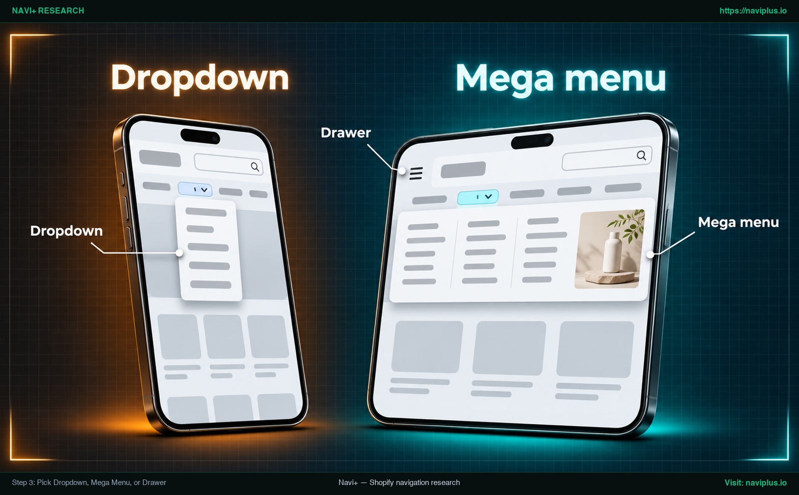
Figure 1: Concept illustration — Step 3: Pick Dropdown, Mega Menu, or Drawer
| Menu type (in Dawn) | Visual presentation on desktop | Best suited for | Key usability considerations |
|---|---|---|---|
| Dropdown | Narrow vertical flyout lists appearing directly below the hovered top-level link. | Small to medium catalogs with straightforward, single-tier subcategories. | Clean and space-efficient; becomes tedious if shoppers must hunt through deep nested flyouts. |
| Mega menu | Expansive full-width panel displaying multiple organized link columns simultaneously. | Large catalogs, multi-department apparel, lifestyle brands, or extensive collections. | Enables shoppers to scan the entire collection at a glance without memorizing submenus. |
| Drawer | Replaces horizontal desktop links with a compact menu icon (hamburger) that opens an off-canvas panel. | Minimalist editorial stores, portfolio brands, or storytelling-focused experiences. | Hides desktop navigation behind an extra interaction, which significantly reduces link discoverability. |
According to research from the Nielsen Norman Group, mega menus are “an excellent design choice for accommodating a large number of options”. NN/g emphasizes that mega menus show everything at a single glance, allowing users to visually discover categories rather than struggling to remember what each generic heading contains.
Conversely, selecting Drawer in Dawn (governed by the section.settings.menu_type_desktop == 'drawer' check in Dawn’s header.liquid) hides your horizontal links behind a menu button on desktop screens. While visually clean, this approach has a real trade-off: NN/g’s 2016 research found that discoverability is cut almost in half by hiding a website’s main navigation. If your store has a broad catalog, reserve the drawer for mobile screens and use an open menu structure on desktop. To design balanced link columns, headers, and visual tiles, consult our guide on mega menu best practices.
Show Menu Links Directly in the Header Instead of a Dropdown
A common question, including in a Shopify Community thread about the Sense theme, is how to show the top-level links directly across the header with no drop-down.
In Shopify’s architecture, dropdowns are not triggered by a theme toggle; they are triggered by hierarchy. As Shopify Help documentation clarifies, all themes will display nested items as drop-down menus from the main menu. If a menu item has child links indented beneath it in Content > Menus, your theme will automatically render a dropdown container.
To display links flat across your header banner:
- Open your Shopify admin and navigate to Content > Menus.
- Select your active header navigation menu.
- Inspect your link list. If any item is nested underneath another, click and drag that child item to the left until it aligns flush with the top-level tier.
- Ensure every single link is positioned at root level.
- Click Save menu.
When you preview your storefront, your theme will render those links side by side across the horizontal navigation strip without any dropdown triggers.
Keep viewport limits in mind. NN/g advises that if your site has 4 or fewer top-level navigation links, you should display them as visible links. With many top-level links, the row can wrap onto two lines or crowd the logo on narrower laptop screens, so preview several widths. If your catalog needs many destinations, group them under parent headings, for example with a mega menu, rather than crowding the primary bar.
Mobile Header Menu Layout: Hamburger, Drawer, and Bottom Tab Bar
A header menu layout that looks balanced on a desktop monitor can easily break on a phone. Because mobile screen space is limited, themes handle mobile navigation with dedicated responsive layouts.
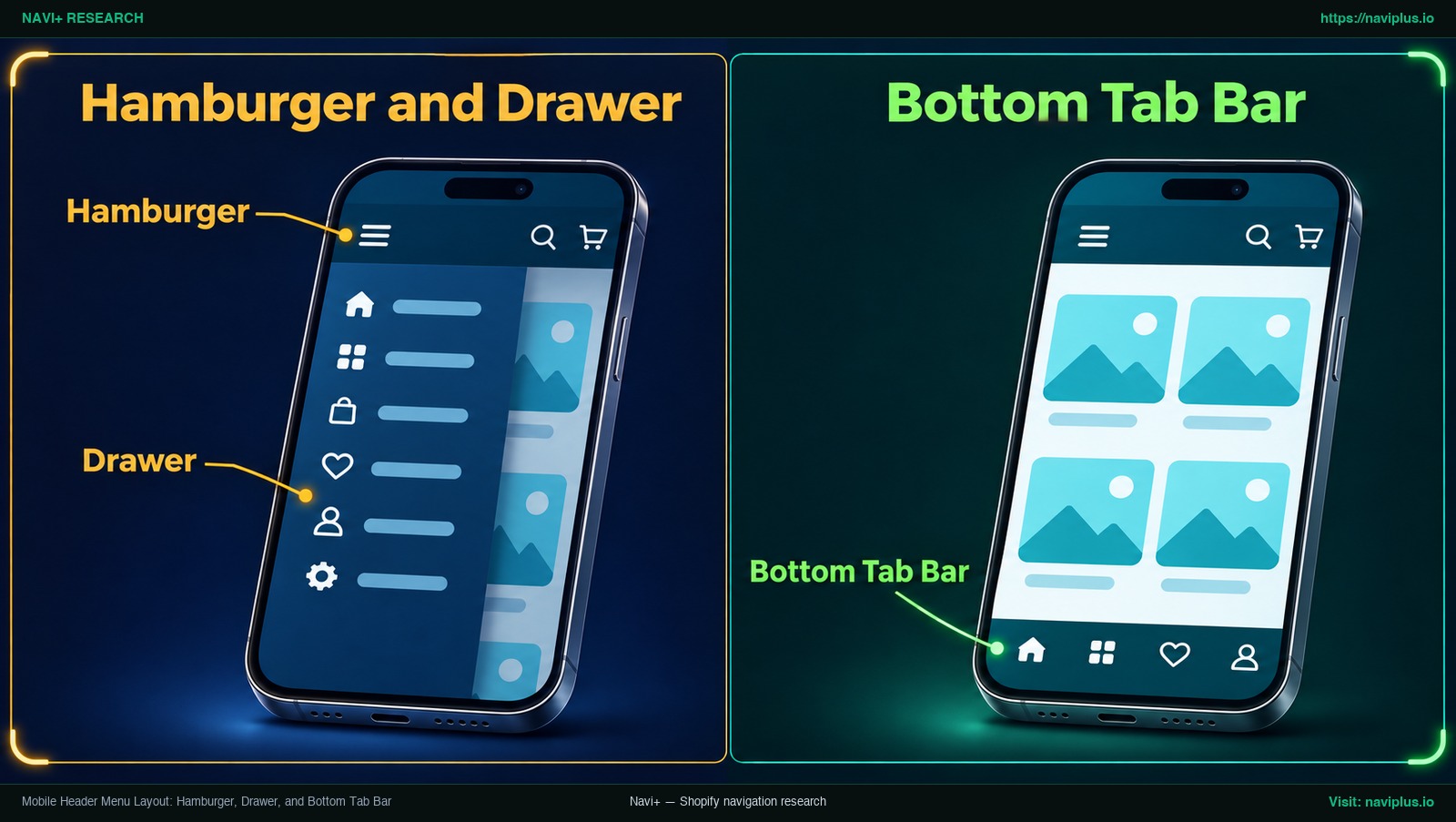
Figure 2: Concept illustration — Mobile Header Menu Layout: Hamburger, Drawer, and Bottom Tab Bar
In Dawn’s Header settings, merchants have access to a distinct setting named Mobile logo position, offering two choices:
- Center: Centers the logo in the mobile header bar.
- Left: Aligns the logo to the left side of the mobile header bar.
Labels differ by theme. For example, in third-party themes such as Stiletto, the mobile menu uses settings in the Header section. In many themes, mobile navigation links collapse into an off-canvas slide-out drawer opened by tapping the hamburger icon.
However, relying entirely on a hidden hamburger drawer has a cost. Nielsen Norman Group’s 2016 research found that discoverability is cut almost in half by hiding a website’s main navigation.
Hidden drawers are still useful for large catalogs, but you can also keep a few key pages visible with a persistent bottom tab bar (for example Home, Shop, Search and Cart) within thumb reach, and leave deeper categories to the slide-in drawer. To configure independent link structures across viewports, explore our tutorial on how to set up separate desktop and mobile menus.
When Your Theme Runs Out of Options: Code Edits vs a Menu App
Every Shopify merchant eventually hits a wall where the native theme customizer runs out of settings. You might want five columns instead of four in your mega menu, a unique split-menu layout where links sit on both sides of a centered logo, or custom promotional banners inside the mobile drawer. When you reach this boundary, you face a strategic choice between editing theme Liquid files or installing a specialized navigation app.
Before you edit code: duplicate the theme
If you decide to modify code directly in your theme files (such as sections/header.liquid or related CSS stylesheets), never alter your active production theme directly. As Shopify’s official documentation emphasizes, it is always a good idea to make a backup copy so that you can discard your changes and start again if you make an error or break your layout.
To duplicate your theme safely:
- In your Shopify admin, go to Online Store > Themes.
- Locate your current theme, open its actions menu, and select Duplicate.
- Rename the copy to indicate you are testing custom code modifications.
- Perform and test all code edits exclusively within this duplicate copy before publishing.
The hidden cost of custom theme edits
Direct code modification carries ongoing maintenance work. Shopify’s documentation warns that when you update a theme, your code changes can be removed in the updated copy. If you rewrite header.liquid to change alignment, CSS media queries, or drawer animations, plan to check and re-apply those edits after every theme update.
If your layout needs go beyond the native settings, you can consider a theme built for more complex navigation, or an app that works alongside your theme.
Common Header Menu Problems and Fixes
When adjusting header layouts, small configuration mismatches can cause links to vanish or menus to distort. Use this diagnosis table to resolve common issues:
| Problem | Likely cause | Recommended fix |
|---|---|---|
| Menu does not appear in the header | The Header section is not pointing to an active menu handle. | Open Online Store > Themes > Customize > Header. Check the Menu setting. If blank or pointing to an obsolete list, click Change, select your active menu, and save. |
| Submenu dropdowns do not drop down | Links in the admin menu are positioned flat at root level rather than nested. | Go to Content > Menus, select your menu, and drag child items horizontally to the right under their parent items until indented. Save changes. |
| Theme lacks expected logo alignment options | You are running a third-party theme or older framework that uses different schema keys than Dawn. | Check your theme’s manual. Look for separate “Desktop layout” or “Header layout” dropdowns, or consult the theme developer documentation. (Labels differ by theme). |
| Mobile logo appears clipped or misaligned | The mobile logo alignment collides with icon spacing or source padding. | In Customize > Header, inspect the Mobile logo position setting (Center vs Left). Ensure the logo image file is cropped tightly to eliminate excess whitespace. |
| Header covers page content during scrolling | Sticky header settings are conflicting with custom styling or banner blocks. | Review your theme’s sticky navigation toggles, or follow our complete guide to make your header sticky across desktop and mobile devices. |
Trade-offs: When Not to Change Your Header Layout
Redesigning your header layout is not always the right business decision. Before rearranging menus or introducing multi-column panels, consider the functional trade-offs:
- Modest catalogs do not need mega menus: If your store has only a few simple categories, a wide mega menu panel may leave more empty space than it needs. A single-column dropdown or a flat row of links is often enough.
- Desktop drawers reduce navigation visibility: Selecting Drawer on desktop gives a clean look, but NN/g’s 2016 research found that hiding main navigation cuts discoverability almost in half. Reserve it for stores where discovery relies on on-page storytelling.
- Custom Liquid edits create upgrade work: Editing
header.liquidor adding custom CSS can be lost when you update the theme, according to Shopify’s documentation. Unless someone can maintain the edits across versions, prefer standard theme settings or an app. - Every additional app adds administrative overhead: Installing navigation tools introduces an additional dashboard to manage. Only extend your stack when your theme’s native layout settings genuinely fail to serve your catalog structure.
Where Navi+ Fits
When your theme’s built-in header options reach their limits, Navi+ is one way to add navigation features alongside your theme.
You build the menu in the Navi+ app and enable it as an app embed in the theme editor. The menu is drawn in the browser next to your theme’s own header, so you do not need to edit header.liquid:
- Desktop Mega Menu: Displays a rich dropdown with columns, images, and featured links.
- Mobile Menu: A slide-in mobile menu that reveals your full navigation without leaving the page.
- Tab Bar: A sticky bottom tab bar for mobile that keeps a few key destinations within thumb reach.
Navi+ menus also go up to three levels. To decide which menu type fits your catalog, explore our framework to choose the right menu type.
If your theme’s Header section stops at a basic dropdown, Navi+ lets you add a Desktop Mega Menu, a Mobile Menu, or a bottom Tab Bar alongside your theme — try it on a duplicate theme first and keep what works.
Action Checklist
Follow this operational checklist to plan, configure, and audit your Shopify header menu layout:
- Duplicate your theme: Create a backup copy under Online Store > Themes before adjusting critical layout or template configurations.
- Configure logo alignment: In Customize > Header, select your preferred Logo position (e.g., Top center or Middle left in Dawn; labels differ by theme).
- Structure your menu hierarchy: In Content > Menus, build your navigation list using clean parent-child drag nesting (keeping within two nested tiers beneath top-level items).
- Assign the menu handle: Verify under Header > Menu that the theme section is linked to your intended navigation asset.
- Select your desktop menu type: Choose Dropdown, Mega menu, or Drawer based on catalog width and department complexity.
- Audit mobile alignment: Test your header on real mobile viewports and configure Mobile logo position (Center or Left).
- Verify touch ergonomics: Audit your mobile drawer on a smartphone, and evaluate whether adding a sticky bottom tab bar improves thumb accessibility.
- Preview across viewport breakpoints: Test desktop, laptop, and tablet widths to confirm that menu items do not awkwardly wrap or overlap branding.
FAQ
How many levels can a Shopify header menu have?
A top-level item in a Shopify menu can have up to two levels of nested drop-down menus below it, creating a maximum structure of three hierarchical tiers.
How do I make a dropdown in the Shopify header?
In your Shopify admin, navigate to Content > Menus, select your menu, drag child menu items horizontally to the right underneath a parent item to indent them, and click save.
How do I put the logo in the center with the menu below?
In the Dawn theme customizer, click the Header section and set Logo position to Top center. This centers your logo and places your menu directly beneath it. (Labels differ in other themes).
Can I show menu links in the header instead of a dropdown?
Yes. Shopify themes automatically render any menu item with nested child links as a dropdown. To display links flat across your header bar, move all items to the root top level in Content > Menus.
Can I change the menu layout only on mobile?
Yes. Dawn provides a dedicated Mobile logo position setting (Center or Left) in the Header section. Mobile links typically share the desktop menu asset within an off-canvas drawer, though some themes include separate mobile controls in Header settings.
Should I edit header.liquid?
You should only edit header.liquid after creating a duplicate backup copy of your theme. Keep in mind that your code changes can be removed when you update to a newer theme version.
Sources
- Shopify Help Center: Drop-down menus — Guidelines on menu nesting depth, theme header assignment, and Content > Menus admin workflows.
- Shopify Help Center: Duplicating themes — Documentation recommending staging backups before applying custom storefront modifications.
- Shopify Help Center: Editing theme code — Policy outlining how code modifications are removed during theme version upgrades.
- Shopify Dawn GitHub Repository: en.default.schema.json — Core theme schema defining native settings including Logo position, Menu type, and Mobile logo position.
- Shopify Dawn GitHub Repository: sections/header.liquid — Source template implementing desktop menu types and off-canvas drawer conditionals.
- Nielsen Norman Group: Mega Menus Work Well Anywhere Navigation Needs to Go — Usability research on multi-column menu panels and user browsing memory.
- Nielsen Norman Group: Hamburger Menus and Hidden Navigation Hurt Metrics (2016) — Research establishing that hiding navigation behind drawer icons reduces discoverability almost in half.
- Fluorescent Theme Documentation: Stiletto Header — Reference illustrating how third-party themes manage desktop and mobile header menu parameters.
- Shopify Community: How to change header-menu layout Sense theme — Merchant discussion addressing horizontal unnested link placement on modern storefronts.
Explore the topics
This guide links out to focused articles — dive deeper on each.