Desktop Mega Menu Slide Menu Tab Bar

Baby Studio — a baby & nursery catalog made easier to browse on Shopify with Mega Menu, Slide Menu, and Tab Bar

How Baby Studio reorganized its navigation to make a baby & nursery catalog easier to explore on both desktop and mobile.

BS
Baby Studio
babystudio.com.au
Baby & nursery retail Shopify Mobile navigation
At a glance
Industry
Baby & nursery retail
Platform
Shopify
Challenge
A catalog with many product groups, but flat navigation
Navi+ menus
Desktop Mega Menu · Slide Menu · Tab Bar
Focus
Catalog discovery on desktop, fast actions on mobile

The customer's problem

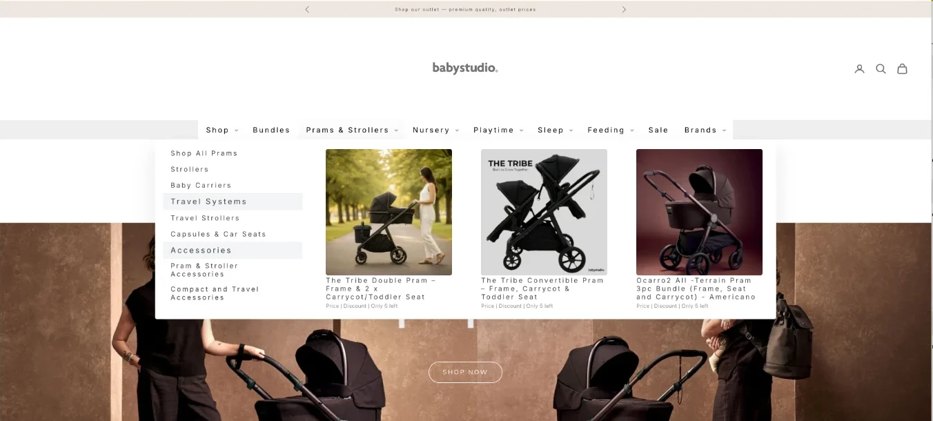
Baby Studio serves a very specific group of shoppers: parents, young families, and people buying gifts for little ones. For this group, the need is usually clear, but the path to the product branches in many directions: strollers, car seats, nursery, feeding, baby care, toys, accessories, and product groups organized by age or use case.

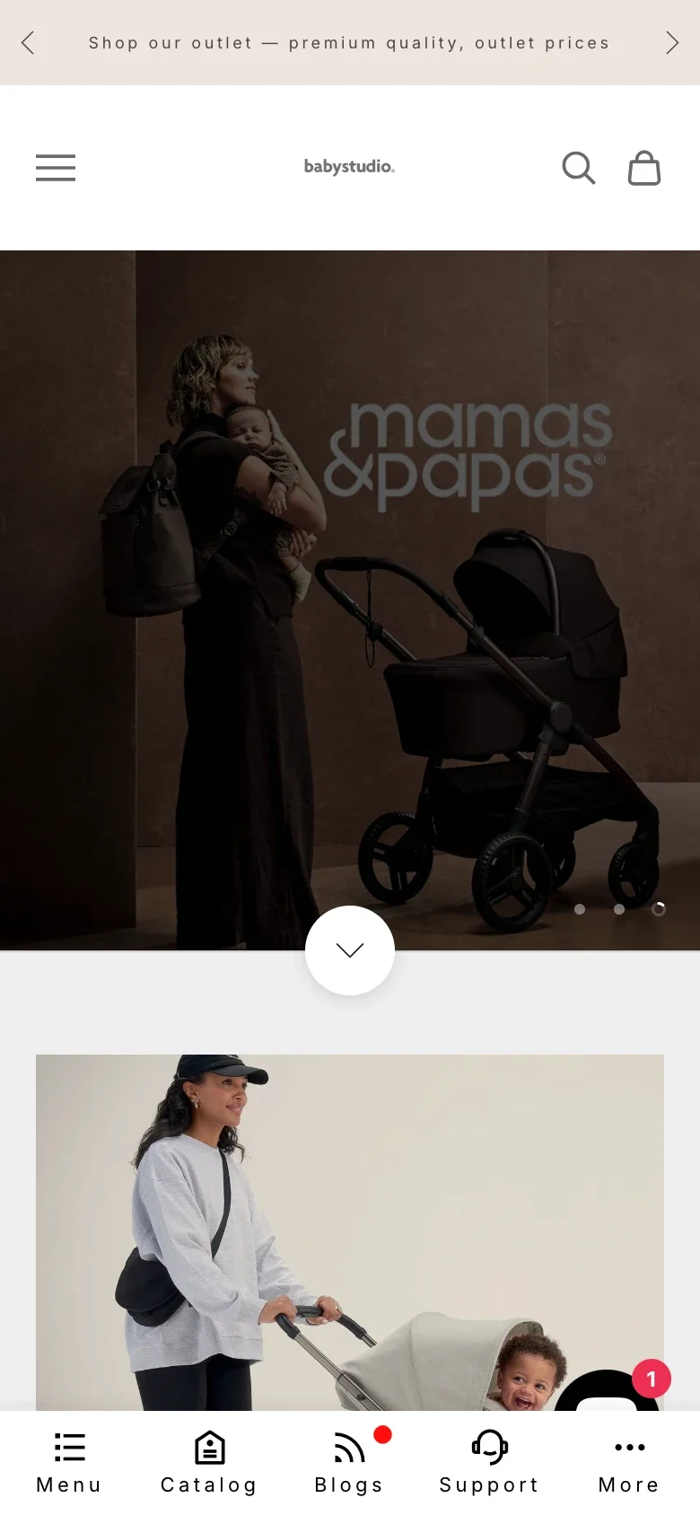
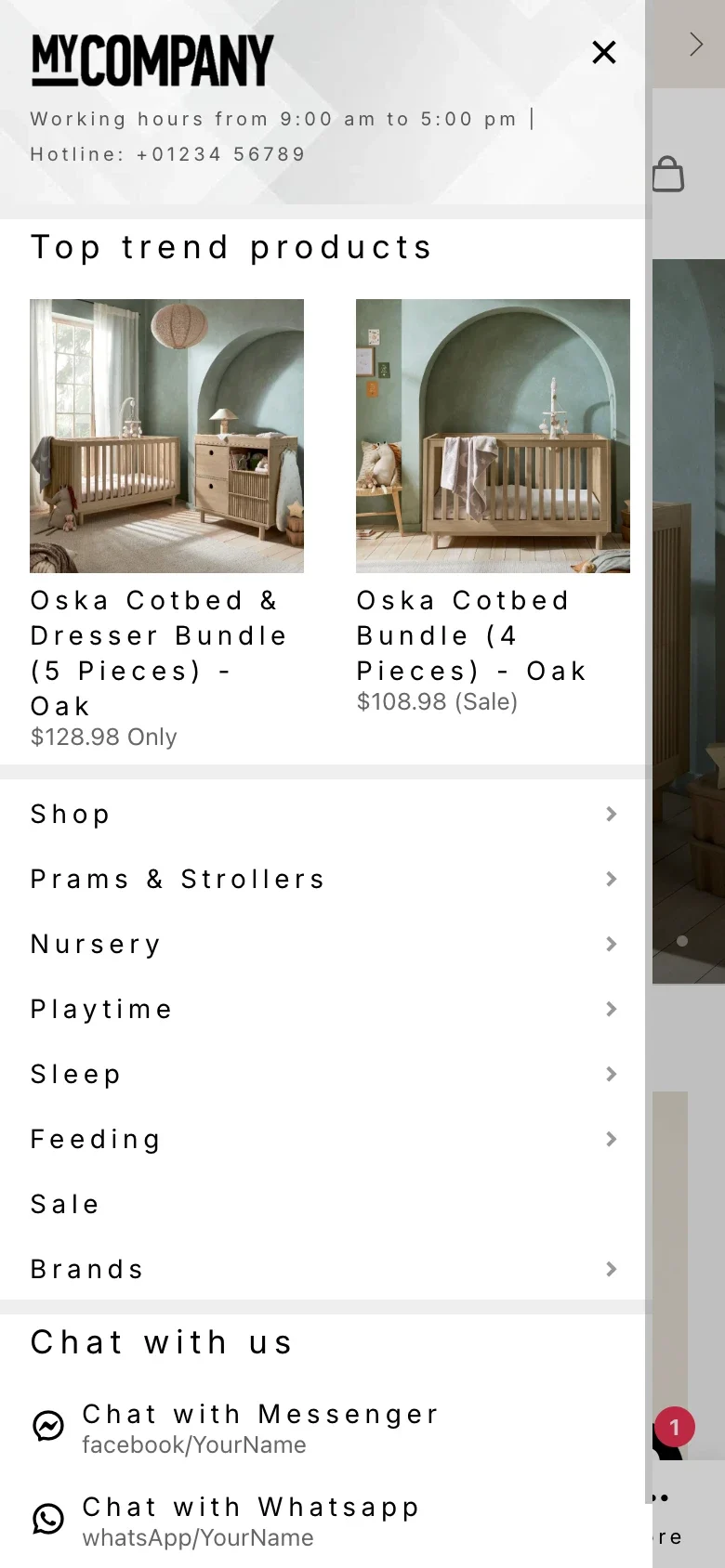
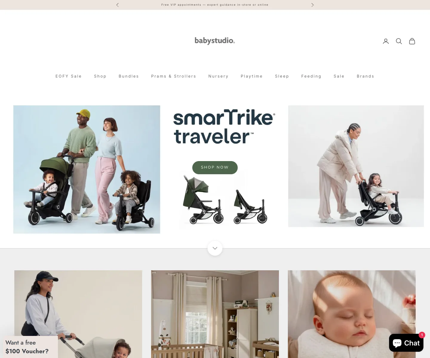
When a catalog has this many groups, the theme's default menu starts to run out of room. On desktop, a flat menu bar can't convey the full breadth of the store. On mobile, if everything is hidden behind a hamburger menu, customers have to open each level themselves and guess which group holds the product they need.

Baby Studio desktop storefront before Navi+ — flat category navigation without a mega menu
Baby Studio on desktop: many product groups, but the header is still a flat menu bar — the catalog isn't yet opened up into a mega menu.

The problem isn't a lack of products. The problem is that the products are good, but the navigation structure doesn't help customers see what the store sells, so they spend extra steps finding the right area. On mobile, a few extra steps are enough for a customer to skip an important product group.

Baby Studio mobile menu before Navi+ — first navigation level
The current mobile menu: the main groups live inside a drawer, so customers have to open the menu before they can even see the catalog.

What Navi+ solves

The right approach was to keep the theme and avoid rebuilding the entire store. Navi+ was used as an extra navigation layer, with a clear role for each context: desktop needs breadth, mobile needs quick actions, and a customer who's shopping needs shortcuts to the points that matter.

Desktop Mega Menu — showing customers what the store has right from the start

The Mega Menu can split the main product groups into clear columns, for example: prams & strollers, car seats, nursery, feeding, toys, baby care, sale, or featured collections. Each group gets an easy-to-read label and a representative image, so new visitors don't have to click around too much.

Slide Menu — drilling deep into the catalog without weighing mobile down

The Slide Menu fits a catalog with many sub-groups. Customers can move from a broad group into narrower ones screen by screen, more like an app experience than one long list of links. This is especially helpful when customers need to choose by need, age, product type, or matching accessories.

Tab Bar — bringing menu, search, and cart down to thumb's reach

On mobile, the Tab Bar keeps the key actions always at the bottom of the screen: Home, Shop/Menu, Search, Cart, Account, or Sale. Customers don't have to scroll up to the header to search, open the menu, or check the cart. For shoppers browsing through lots of baby products, cutting these repeated actions makes for a lighter experience.

Results after Navi+

After reorganizing the navigation with Navi+, Baby Studio can present its catalog in a way that's closer to how people actually shop: desktop shows more product groups, mobile has a clearer path, and the primary actions sit where customers can easily tap them.

Baby Studio updated desktop mega menu showing Prams and Strollers navigation with product images
The desktop update: the Prams & Strollers category opens up into a mega menu, with sub-groups and sample products.
Baby Studio updated mobile storefront with Navi+ bottom Tab Bar
The mobile update: the Tab Bar places Menu, Catalog, Blogs, Support, and More at the bottom of the screen, right within thumb's reach.
Baby Studio updated mobile slide menu with product highlights and category links
The Slide Menu after the update: a sliding panel overlays the storefront, keeping the page context behind it while bringing categories, featured products, and a contact shortcut into the same flow.

The goal isn't simply a "prettier" menu. The result is that new customers quickly understand what the store has, mobile customers find the right area in fewer loops, and the header can slim down without losing key functions like search, cart, and menu.

  • Desktop conveys the breadth of the catalog better with the Mega Menu.
  • Mobile has a clearer path with the Slide Menu.
  • Search, cart, and menu sit closer to the thumb with the Tab Bar.
  • New customers understand what the store has faster.
  • A catalog with many product groups becomes easier to browse without switching themes.

Key principles

These apply to most stores with a multi-branch catalog — not just Baby Studio.

  • Desktop is for discovery: a mega menu opens up the breadth of the catalog right from the header, so new visitors can see what the store sells without clicking around.
  • Mobile is for going deep: a slide menu lets customers move through each level like an app, a good fit for catalogs grouped by need or age.
  • Primary actions belong within thumb's reach: bring menu, search, and cart down into the Tab Bar, taking the load off the header.
  • Add a layer, don't replace the foundation: improve navigation without switching themes or dropping the apps you already run.

Have a similar store and want to try Navi+? Check out the menu types or read the documentation.

K
Khoi — Founder, Navi+
Builds Navi+ and personally advises Shopify stores with large catalogs on their navigation.

Get started with Navi+ AI Menu Builder

Pick your platform — free to install, live in minutes.