Quick answer
To fix image sizes inside a menu, give every menu image the same shape with CSS aspect-ratio, then choose object-fit: cover to fill the box (edges may be clipped) or contain to show the whole image. Upload sources at least as large as they display, and test the mobile drawer separately.
- Standardize your source images: Pick one uniform aspect ratio for the whole menu row.
- Force one shape with CSS: Apply
aspect-ratioandobject-fitto your theme image selector. - Stop cropping in Dawn: Switch background-rendered mega menu images to contain mode.
- Fix blurry visuals: Serve assets sized for high-density screens and verify file paths.
- Check the mobile drawer: Audit drawer selectors and nested tiers on mobile viewports.
Why menu images end up uneven, cropped or blurry
Before editing code, confirm whether your navigation is generated by your Shopify theme or by an installed navigation app. Themes and apps structure HTML differently, so adding CSS to the wrong class will produce no visible change.
Menu images typically misbehave for three distinct reasons:
| Symptom | Likely cause | Fix in this guide |
|---|---|---|
| Uneven image heights | Source images have mixed aspect ratios and containers use automatic height. | Step 1 & Step 2 |
| Cropped product photos | Container aspect ratio mismatches the image, paired with cover or background fill rules. |
Step 2 & Step 3 |
| Blurry or pixelated images | Source image is smaller than the display box, or the menu still references an older asset. | Step 4 |
When an image container lacks an explicit proportion, browsers render each photo at its native height. A portrait image placed next to a square graphic forces the navigation row to step downward irregularly. Conversely, themes that enforce fixed rectangular slots clip photo edges when you upload square pictures. Identifying your exact symptom ensures you apply the correct rule.
This video shows how images are added to a dropdown mega menu; use it for context on where the sizing problem begins.
Step 1: Standardize your source images
The cleanest fix is standardizing source aspect ratios before uploading graphics to Shopify. As noted in Shopify’s theme images documentation, “you need to use the correct image aspect ratio” so graphics align across layouts.
Select one uniform proportion for every image sharing a visual row in your menu:
- Square (1:1): Best for collection cards, product thumbnails, and symmetrical grids.
- Landscape (such as 3:2 or 16:9): Well suited for horizontal promotional cards and banners.
Export all images in that row at that exact ratio. Upload files that are at least as large as the physical pixel area where they display on desktop. For high-density screens (such as Retina displays), prepare files at double the container dimensions.
Avoid arbitrary fixed pixel numbers from forums. Menu column widths differ across themes, so no single pixel size fits all stores. Furthermore, according to Shopify’s Liquid image filter documentation, “an image can never be resized to be larger than its original dimensions.” Uploading undersized assets guarantees blurriness when scaled.
Step 2: Force one shape with aspect-ratio and object-fit
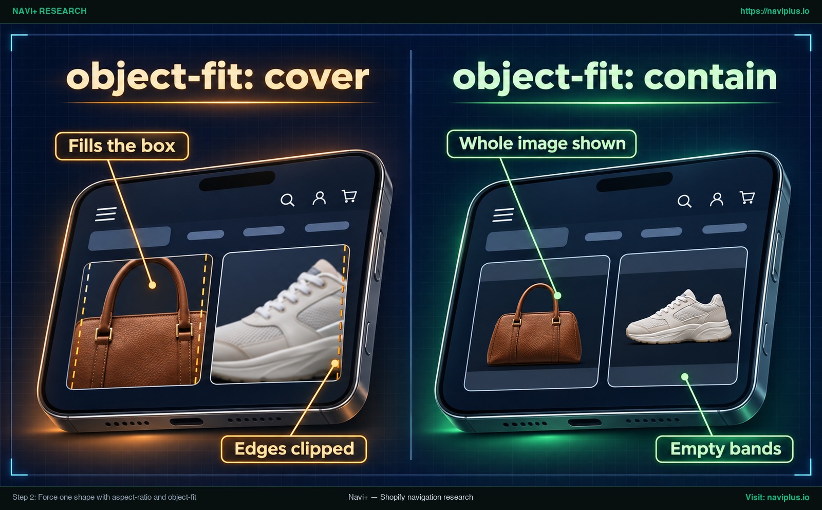
Concept illustration: the same menu images with object-fit cover and contain.
When your store already uses existing images with mismatched proportions, use CSS to enforce uniform dimensions. The modern CSS property aspect-ratio, documented by MDN Web Docs, “allows you to define the desired width-to-height ratio of an element’s box.”
Add this rule to your theme’s Custom CSS setting or main stylesheet:
/* Replace .your-menu-selector img with your theme's exact selector */
.your-menu-selector img {
  width: 100%;
  aspect-ratio: 1 / 1;
  object-fit: cover;
}
Note: Replace .your-menu-selector img with the specific class used in your active theme.
In this snippet, width: 100% spans the container width, aspect-ratio: 1 / 1 locks the box into a square, and object-fit: cover fills the frame. The behavior of object-fit governs how images adapt when their proportions differ from the container, as defined by MDN Web Docs:
| Property value | MDN specification behavior | Visual outcome | Best use case |
|---|---|---|---|
object-fit: cover |
“If the object’s aspect ratio does not match the aspect ratio of its box, then the object will be clipped to fit.” | Fills the container completely; outer edges are trimmed. | Best for even mega menu rows where aligned outer edges are essential. |
object-fit: contain |
“the object will be ‘letterboxed’ or ‘pillarboxed’ if its aspect ratio does not match the aspect ratio of the box” | Shows the whole photo without cropping; adds blank side or top bands. | Best when full product silhouettes or logos must not be clipped. |
object-fit: fill |
“This is the initial value. The entire object will completely fill the box.” | Stretches or squashes image geometry to fit the box. | Avoid in navigation menus because it distorts photo proportions. |
How to find the right selector in your theme
Because CSS selectors differ across Shopify themes, locate the exact class used by your header:
- Open your online store in your desktop browser.
- Hover over your navigation menu to reveal the mega menu panel.
- Right-click the uneven menu image and select Inspect.
- In DevTools, locate the
<img>element or its parent wrapper and read its class name. The name differs from theme to theme. - In your Shopify admin, open Online Store > Themes, click Actions > Duplicate to save a backup, then click Customize.
- Paste your CSS into your theme’s Custom CSS setting if it has one, or add it to the bottom of your theme’s main stylesheet (for example
base.cssin Dawn).
Step 3: Stop cropping in the Dawn mega menu
Shopify’s Dawn theme can confuse merchants because, in the community thread below, the mega menu images are drawn as CSS background images rather than <img> tags. In that case the object-fit rule from Step 2 does not apply to them.
In a Shopify Community discussion on Dawn mega menu sizing, the suggested fix is to switch the background to background-size: contain so the whole picture shows instead of being cropped. This is a community example, not official Shopify guidance, and the thread does not confirm that it solved the problem.
To try the same approach in Dawn’s desktop mega menu, the thread suggests adding this code at the bottom of your base.css file:
/* Adapted from a community thread: verify the panel ID and selector in your own theme */
@media screen and (min-width: 767px) {
  #MegaMenu-Content-2 li:before {
    /* contain shows the whole image; empty bands may appear */
    background-size: contain !important;
    background-position: center;
  }
}
Keep two caveats in mind:
- Store-specific IDs: The selector
#MegaMenu-Content-2reflects an ID generated for one particular store’s navigation item. Your menu may use a different ID number or class wrapper depending on your theme version and menu hierarchy. Always inspect your storefront to verify the correct ID. - Media query scope: This rule is wrapped inside
@media screen and (min-width: 767px), so it applies only to wider screens and does not fix the mobile menu drawer, which is covered in Step 5.
This video shows how a Dawn mega menu with images is set up; use it for context before resizing.
Step 4: Fix blurry menu images
A menu image that looks sharp on desktop can become visibly soft on high-resolution screens. In Shopify Community troubleshooting for blurry mega menu images, blurry visuals trace back to two primary causes:
Cause 1: Source asset dimensions are smaller than the display container
When the source image contains fewer pixels than its container, browsers stretch the graphic to fill the space. According to Shopify’s Liquid image filter documentation, “an image can never be resized to be larger than its original dimensions.” High-density phone screens make this more visible. As explained by Google’s web.dev, “Density descriptors are used to serve different images based on the device’s pixel density.” As a rule of thumb, upload sources about twice the size they display at.
[!WARNING] Do not use
object-fit: noneto fix blurriness. In the community thread it left menu images at their raw size and lost their shape instead of solving the problem.
Cause 2: The menu continues referencing an older image asset
When you replace a graphic, the menu may keep using the old one. In the same community thread, the explanation was that the new image was a .png but an old .gif was still in use. Right-click the image, select Open Image in New Tab, and inspect the URL in the address bar. If an older filename appears, update the image at its source so the menu references the new file.
Step 5: Check mobile and the menu drawer
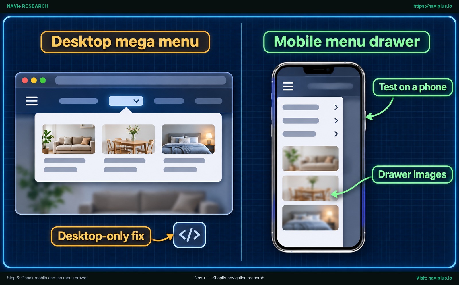
Concept illustration: a desktop mega menu fix next to a mobile menu drawer that still needs its own check.
A frequent oversight when fixing navigation images is testing only on desktop screens. CSS rules placed inside a desktop-only media query do not reach mobile slide-out panels. Furthermore, themes frequently use entirely different markup and classes for their mobile drawer.
In Shopify’s Dawn theme, for example, the mobile drawer uses .menu-drawer__menu. Selectors may differ across theme versions, so always inspect your own theme. If you target only desktop classes, your mobile drawer will continue showing mismatched rows or cropped thumbnails.
To ensure consistent mobile display:
- Audit nested drawer levels: Open your mobile drawer and expand second-level submenus to ensure nested thumbnails do not stretch across full screen widths.
- Test responsive widths: Use DevTools Device Mode to test narrow phone widths, or check directly on a physical phone.
- Separate drawer configurations: If your mobile drawer requires a distinct layout, configure separate desktop and mobile menus so mobile layout changes do not affect your desktop header.
Common mistakes (fixed widths, wrapped labels)
When attempting to force menu images into uniform sizes, avoid these four common pitfalls:
1. Hardcoding rigid pixel or percentage widths
In a Shopify Community thread on menu image resizing, one suggested fix set a fixed width of 18% on each menu item, a value tied to that shop’s theme. Fixed widths can break column wrapping when the number of menu items changes. Apply width: 100% to the image and let the column container handle width distribution.
2. Overlooking multi-line text labels
Even when images share identical square proportions, menu rows can look uneven if item labels wrap onto multiple lines. If one label spans two lines while its neighbor fits on one, the tiles will sit at different baseline heights. To align rows, change the style of your navigation menu by standardizing text padding and font sizing.
3. Overusing !important declarations
Adding !important to image rules can override theme responsive classes, preventing mobile drawers from adapting on handheld screens. If you need to refine your header layout, adjust the size of the whole menu through container settings rather than forcing individual image tags with brute-force declarations.
4. Editing theme code without a backup
Editing base.css directly on your live theme creates risk. A syntax error can affect your entire storefront. Always duplicate your theme before editing stylesheets so you can revert immediately.
Trade-offs: cover vs contain vs re-uploading
Every method for correcting menu image proportions involves a practical trade-off:
| Approach | Primary benefit | Key limitation | When to use |
|---|---|---|---|
object-fit: cover |
Creates uniform square or rectangular boxes across the entire row without re-exporting files. | Clips outer image edges. Wide product photos lose side details. | Best for lifestyle photos or general collection tiles where edge clipping is acceptable. |
object-fit: contain |
Shows the entire photo with zero clipping. | Leaves blank letterbox or pillarbox margins around mismatched images. | Best for footwear, handbags, or products where showing the complete item is essential. |
| Re-uploading source assets | Delivers clean framing at the source without CSS overrides. | Requires manual editing and re-exporting across your catalog. | Best for flagship collections and long-term storefront presentation. |
Furthermore, custom CSS added to theme files can be lost or overwritten when updating your theme to a new version. When planning large menus, choose the right menu type to ensure your layout matches your catalog structure.
When to stop hand-writing CSS: setting image ratio in a menu app
If you prefer not to maintain custom CSS across theme updates, a menu app with built-in image ratio settings provides the same result through visual controls.
In Navi+, the Image ratio (auto-crop) setting enforces uniform image proportions across your navigation without editing code. You can choose from four display options:
- Unchanged (Default): Retains each image’s native uploaded proportions.
- 1:1 square: Enforces an even square box across all active tiles.
- 3:2 landscape: Creates a balanced horizontal rectangular frame.
- 2:3 portrait: Produces an upright editorial card layout.
This setting operates flexibly across menu tiers: you can set a global ratio for the entire menu, assign a distinct ratio for level 2 or level 3 submenus, or set individual items to Unchanged to bypass inherited cropping.
The app applies standard CSS aspect-ratio and object-fit: cover rules directly to designated elements without requiring manual re-uploads. An optional manual cropping tool is also available during upload if you prefer to adjust focal positioning directly.
[!NOTE] The automated Image ratio setting applies specifically to Big image items and Image banner components in Desktop Mega Menus, Mobile Mega Menus, and Mobile Drawers. Small menu icons are intentionally excluded from ratio cropping to preserve their original geometry. Additionally, automated ratio settings do not sharpen low-resolution files; source graphics must still meet the resolution standards outlined in Step 4.
If you want to recreate a menu design from a reference image, built-in ratio controls mean less manual CSS patching. In Navi+ you pick 1:1 square or 3:2 landscape once and every big image in the menu follows it — try it on a copy of your menu first.
Action checklist
Use this seven-point checklist to audit and fix menu image dimensions across your store:
- Identify menu engine: Check whether your navigation is generated by your Shopify theme or by an installed menu app.
- Choose one target ratio: Pick a single proportion (such as 1:1 square or 3:2 landscape) for all images in the row.
- Export source assets: Re-export images at that shared ratio, matching or exceeding display dimensions (double for high-density screens).
- Find the CSS selector: Use browser DevTools (Inspect) to identify the specific class assigned to your menu images.
- Apply aspect-ratio and object-fit: Add uniform dimension rules to your Custom CSS panel or theme stylesheet.
- Verify asset URLs: Check that your menu loads current high-resolution files rather than cached or legacy graphics.
- Test mobile drawer: Verify that drawer selectors and nested menus display properly on mobile viewports.
FAQ
Why are my mega menu images different sizes?
Mega menu images appear at different sizes when source images have mismatched aspect ratios and your theme uses automatic container heights. Without a fixed ratio rule, each container box expands or contracts to match the height of its uploaded image.
Why are my menu images cropped?
Menu images become cropped when the container box has a different aspect ratio than the uploaded image and uses object-fit: cover or background cover rules. The cover rule fills the container and clips overflowing edges; switching to contain displays the whole image without clipping.
Why do menu images look sharp on desktop but blurry on mobile?
Menu images look blurry on mobile when the rendered container is larger than the source graphic or when the theme serves an outdated low-resolution asset. Because Shopify CDN filters never upscale images beyond their native dimensions, undersized files appear soft on high-density mobile screens.
What size should I upload?
Upload source images that are at least as large as the container box where they display on your desktop storefront. For crisp rendering on modern high-density screens, export source assets at approximately twice the display container’s dimensions.
Can I make all menu images square without editing theme code?
Yes, if your navigation menu is built using an app that includes an image ratio setting. For example, Navi+ has an Image ratio setting that applies a 1:1 square ratio to big images and image banners in a menu with CSS, without editing theme code or re-uploading images.
Sources
- MDN Web Docs: CSS object-fit documentation (Web standard for box fitting)
- MDN Web Docs: CSS aspect-ratio documentation (Web standard for element aspect ratios)
- Shopify Developer Documentation: Liquid image_url filter reference (Platform constraints on image resizing)
- Shopify Help Center: Theme images and aspect ratios (Official guidance on storefront image proportions)
- Google Web Developers: Serve responsive images (Device pixel density and responsive descriptors)
- Shopify Community: Fixing blurry images on mega menu (Thread 363359) (Community discussion example; not official documentation)
- Shopify Community: Personalizing image sizes in Dawn mega menu (Thread 255590) (Community discussion example; not official documentation)
- Shopify Community: Resizing and positioning images in mega menu (Thread 182414) (Community discussion example; not official documentation)
- Shopify Community: Alignment and image size in website mega menu (Thread 146397) (Community discussion example; not official documentation)
Explore the topics
This guide links out to focused articles — dive deeper on each.